## Alert Block
1. Hover the gap between two rows and click the `+` button to add a row, then click an empty column and pick **Alert** in the **Add block** dialog.
2. Click the new block to open its settings in the sidebar.
### Setting the Variant
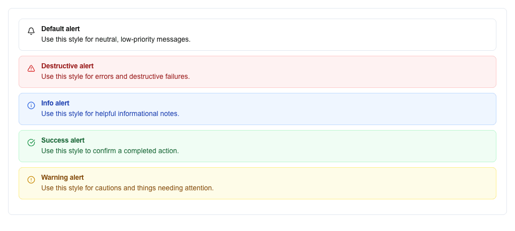
The variant controls the alert's visual style. The Variant card has two tabs:
**Select tab** (default): Pick a variant from the dropdown:
- **Default** -- neutral style
- **Destructive** -- red, for errors
- **Info** -- blue, for informational messages
- **Success** -- green, for confirmations
- **Warning** -- yellow/amber, for caution
**Data tab**: Use the Data Picker to bind the variant to a data field. The field value must be one of: `default`, `destructive`, `info`, `success`, `warning`.
 ### Title and Description
- **Title (Optional)**: Use the Data Picker to set the alert title. You can type static text or pick a dynamic value from your data source using `{{resource.field}}` syntax.
- **Description**: Use the Data Picker to set the alert body text. Same static/dynamic options as title.
 ---
## Badge Block
1. Hover the gap between two rows and click the `+` button to add a row, then click an empty column and pick **Badge** in the **Add block** dialog.
2. Click the new block to open its settings in the sidebar.
### Setting the Variant
Like Alerts, Badges have **Select** and **Data** tabs in the Variant card.
Static variants available:
- Default, Destructive, Info, Success, Warning, Secondary, Outline, Pink, Violet, Light Blue, Disabled
In the Data tab, use the Data Picker to bind the variant to a data field. Valid values: `default`, `destructive`, `info`, `success`, `warning`, `secondary`, `outline`, `pink`, `violet`, `lightBlue`, `disabled`.
### Setting the Value
Use the **Text** field to set the badge text. You can type static text or use the Data Picker with `{{resource.field}}` to pull values dynamically from your data source.
