## Adding a Button Block
1. Add a row if you do not have one yet — hover the gap between two rows to reveal the `+` button, click it, and pick a layout.
2. Click an empty column inside the row to open the **Add block** dialog.
3. Pick **Button** from the list.
4. Click the new block to open its settings in the sidebar.
5. Choose a **Button Type**: **URL Button**, **Action Button**, **Form Submit Button**, or **Form Reset Button**.
---
## URL Button
Opens a URL or makes an API call when clicked.
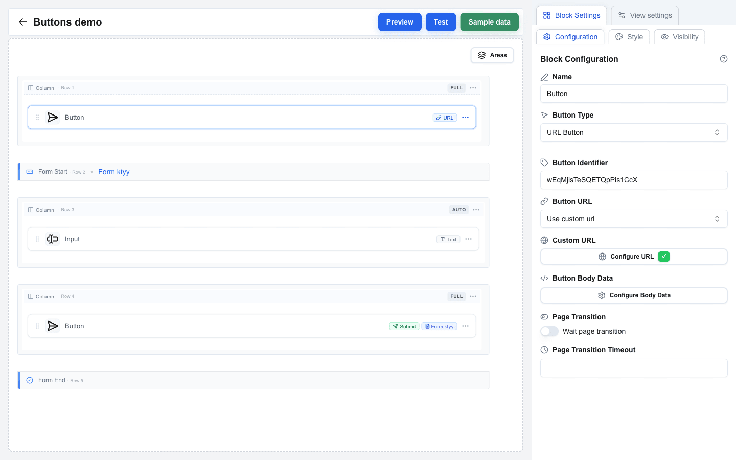
1. Set **Button Type** to **URL Button**.
2. Optionally fill **Button Identifier** -- a unique identifier for tracking this button.
3. Choose the **Button URL** mode:
- **Use view base url** -- appends a path to your view's base URL.
- **Use custom url** -- a fully custom URL.
4. For **Use view base url**, set **Path**. For **Use custom url**, set **Custom URL**. Both support the Data Picker for dynamic values.
5. Optionally configure:
- **Button Body Data** -- JSON or form-encoded body sent with the request.
- **Headers** -- custom HTTP headers (key/value pairs). If the OneClick button this interface is attached to has its **Headers** toggle enabled, those headers are merged into the URL button's request automatically — see [OneClick-Level Headers](/docs/buttons/interface-button/interface-builder/explanation/architecture#oneclick-level-headers).
- **Query parameters** -- URL query parameters (key/value pairs).
- **Wait page transition** -- enable to wait for interstitial messages and redirects from your backend (see below).
- **Page Transition Timeout** -- how long to wait for the backend (in seconds).
 ### How a URL button handles the response
For the request shape your endpoint receives and the polling loop that runs while **Wait page transition** is on, see [URL Button Flow](/docs/buttons/interface-button/interface-builder/explanation/url-button-flow).
When the user clicks a URL button, Interface Builder calls your backend and then:
- **If Wait page transition is off**, the response is used once: a string body becomes a success toast, an `oneclick_data` response can show a toast and/or navigate the user. Nothing else happens.
- **If Wait page transition is on**, Interface Builder keeps polling for updates from your backend for up to **Page Transition Timeout** seconds. Every time your backend writes a new message, the user sees it as a toast. If your backend eventually returns a redirect, the user is navigated there.
Use **Wait page transition** when the action behind the button takes time to complete and you want to show progress (for example, "Validating…", "Charging card…", "Creating invoice…") and then jump the user to a result page when done.
**Response shapes:**
```json
{ "oneclick_data": { "message": "Item added to cart" } }
```
Shown as a success toast.
```json
{
"oneclick_data": {
"message": "Payment successful",
"redirect_view": { "id": "receipt-view", "params": { "order_id": "4321" } }
}
}
```
Shown as a toast, then user is navigated to `receipt-view`.
```json
"Thanks!"
```
A plain string response is shown as a success toast.
See [HTTP Response Format](/docs/buttons/interface-button/interface-builder/reference/data-binding/http-response-format) for every shape the button accepts, and [Messages & Toasts](/docs/buttons/interface-button/interface-builder/how-to/data/messages-and-toasts) for how to format the message text.
If the backend times out or returns an error, the user sees an error toast. No navigation happens.
---
## Action Button
Navigates between views in your interface.
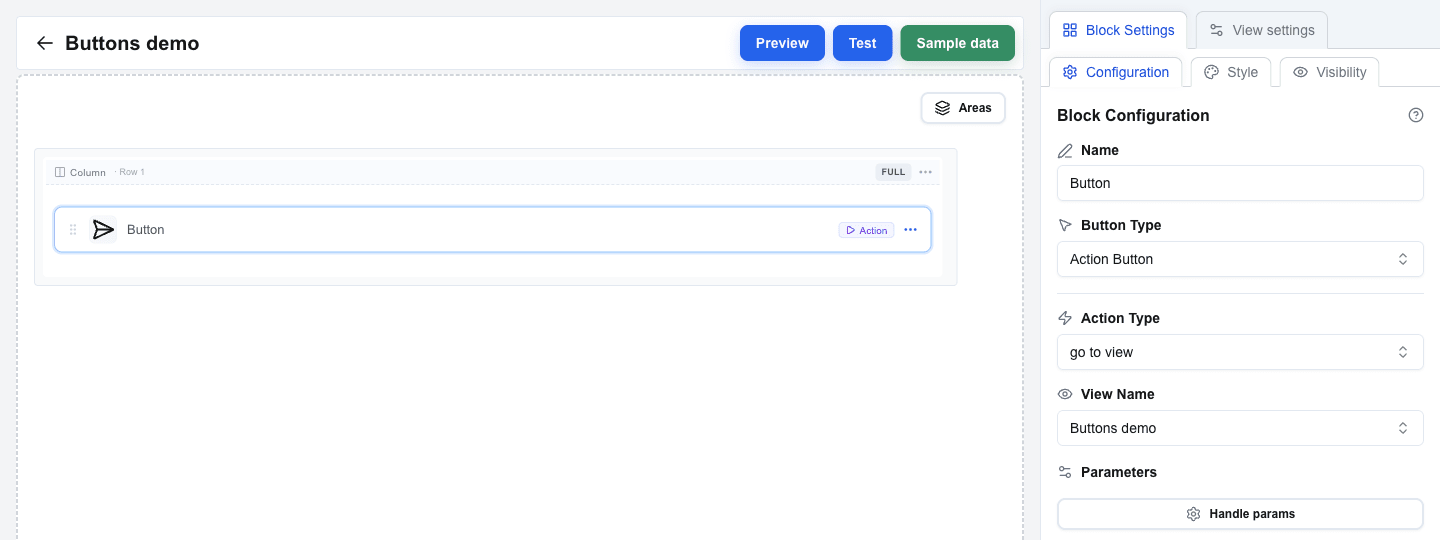
1. Set **Button Type** to **Action Button**.
2. Choose the **Action Type**:
- **go to view** -- navigate to a specific view.
- **back** -- go to the previous view.
3. For **go to view**, select the target view from the **View Name** dropdown.
4. Optionally add **Parameters** -- key-value pairs passed to the target view.
 ---
## Form Submit Button
Submits a form's data.
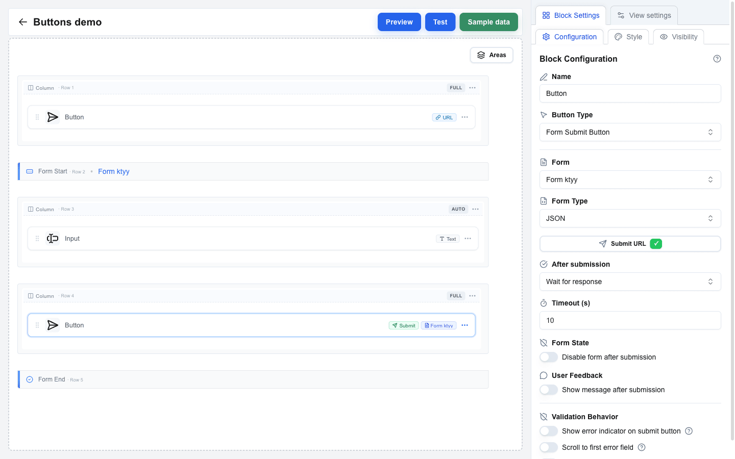
1. Set **Button Type** to **Form Submit Button**.
2. Select the target form from the **Form** dropdown. This links to the **Form Identifier** set on the form.
3. Choose the **Form Type**:
- **JSON** (default) -- sends form data as JSON. Requires a Submit URL.
- **Multipart/Form-Data** -- sends as multipart data (use for file uploads). Requires a Submit URL.
- **Open view with form data** -- passes form data to another view without making an HTTP request. Submit URL is not required.
4. For **JSON** and **Multipart/Form-Data**, set the **Submit URL** -- the endpoint that receives the data.
5. Configure **After submission**:
- **Select view** -- navigate to a chosen view after submission. Optionally pass parameters or forward input values as search params.
- **Wait for response** -- wait for the server response (timeout: 10-60 seconds). Optionally enable **Disable form after submission** to prevent double-submits, or **Show message after submission** to display a confirmation.
6. Optionally configure **Headers** and **Query parameters** for the request.
 See [Configuring Form Submission](/docs/buttons/interface-button/interface-builder/how-to/forms/form-submission) for full details on submission behavior.
---
## Form Reset Button
Clears all fields in a form back to their default values.
1. Set **Button Type** to **Form Reset Button**.
2. Select the target form from the **Form** dropdown.
---
## Asking for Confirmation
Use a confirmation when a click deletes, sends, approves, or clears something. The button then opens a dialog and runs its action only after the user confirms. It works on all four button types.
1. Select the button and scroll to the **Confirmation** section at the bottom of the **Configuration** tab.
2. Turn on **Require confirmation**. The dialog is filled in for you: "Are you sure?", **Confirm**, and **Cancel**, with the Confirm choice copying the button's own variant.
3. Write the **Title** as the question the user answers, for example `Delete {{deal.title}}?`. It supports the Data Picker, so a button inside an Area loop asks about that iteration's record.
4. Optional: add a **Description** with what will happen. It also supports the Data Picker and keeps its line breaks.
5. Optional: adjust **Confirm Button Label** and **Confirm Button Variant** — pick **Destructive** for a delete — and the matching **Cancel** fields.
6. Test the button in the Test view: the dialog must open, and the action must run only after **Confirm**.
Cancel and Escape close the dialog and change nothing. Turning **Require confirmation** back off keeps the texts you wrote, so removing the gate for a test costs nothing.
### On a Form Submit Button
The dialog opens before the form is validated, so a user can confirm and then meet "field required". This is expected: the submission runs unchanged after the confirmation, validation and all. Keep the Title about the action ("Send the application?") rather than about the data being complete.
Pressing Enter in a text input opens the dialog too — the form clicks the gated button for you, so Enter cannot skip the question.
---
## Button Appearance
Variant and size live on the **Style** tab in Block Settings (next to **Configuration** and **Visibility**).
### Button Variant
Choose a visual style from the **Button Variant** selector:
- **Default** -- primary filled button
- **Destructive** -- red/danger style
- **Outline** -- bordered, no fill
- **Secondary** -- muted/secondary fill
- **Ghost** -- no border or fill, text only
- **Link** -- styled as a hyperlink
- **Custom** -- unlocks the rest of the Block Style panel (font size/weight/colours, etc.) so you can build your own look. The other variants ignore those custom style fields.
### Button Size
Choose from: **Small**, **Default**, or **Large**.
### Icons
Both icon slots sit on the same **Style** tab, between **Button Size** and **Button Variant**.
1. Open **Icon before text** and pick a glyph, or **Icon after text** for a trailing one.
2. Pick from the groups **Actions**, **Navigation**, **Communication**, **Files** and **Status**.
3. Choose **No icon** to clear a slot again.
The glyph takes the button's text colour and is always 16 px, so every Button Variant works.
### Making a button icon-only
Use this for a dense row of controls where the words cost more width than they earn.
1. Pick a glyph in **Icon before text**.
2. Turn **Show text** off.
The button becomes a square of the height its **Button Size** already had, keeping its variant colours.
What to expect:
- **Show text** stays unavailable until you pick an icon, and a note below it tells you so. A button with no text and no glyph would be empty.
- **Icon after text** becomes unavailable while the text is hidden. If your only glyph was in that slot, it moves to **Icon before text** when you hide the text.
- The block name is still the button's name: a screen reader announces it, and it appears as a tooltip on hover.
- Your service still receives the block name as the button name in the URL Button metadata.
- On a **Form Submit Button** with **Show error indicator on submit**, the hover reports the invalid field count while the form has errors; the name tooltip returns once the errors are fixed. The badge and the loading spinner are unaffected.