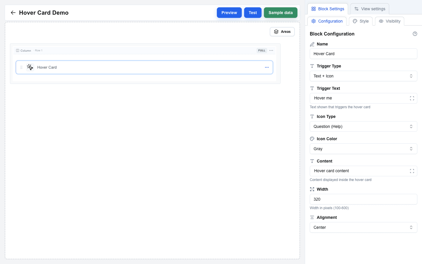
## Adding a Hover Card Block
1. Hover the gap between two rows and click the `+` button to add a row (pick any layout in the **Add row** dialog).
2. Click an empty column inside the row, then pick **Hover Card** in the **Add block** dialog.
3. Click the new block to open its settings in the sidebar.
## Trigger Type
Choose what the user hovers over to reveal the card. Set **Trigger Type** to:
- **Text Only** — displays trigger text only (default)
- **Icon Only** — displays an icon only
- **Text + Icon** — displays both text and an icon
When the trigger includes text, fill the **Trigger Text** field. You can use static text or bind it dynamically with the Data Picker.
## Icon Configuration
When the trigger type includes an icon (**Icon Only** or **Text + Icon**), the sidebar shows two extra fields:
- **Icon Type** — pick the icon style: **Warning (Triangle)**, **Info (Exclamation)**, or **Question (Help)**. Default: **Question (Help)**.
- **Icon Color** — pick the icon color: **Gray**, **Red**, **Yellow**, **Blue**, or **Green**. Default: **Gray**.
## Content, Width, Alignment
- **Content** — the hover card body content. Use static text or the Data Picker for dynamic values.
- **Width** — set the card width in pixels (100–600). Default: 320.
- **Alignment** — set card alignment relative to the trigger: **Start**, **Center**, or **End**. Default: **Center**.