## Adding a Navbar Block
1. Hover the gap between two rows and click the `+` button to add a row — usually a full-width row at the top of the view.
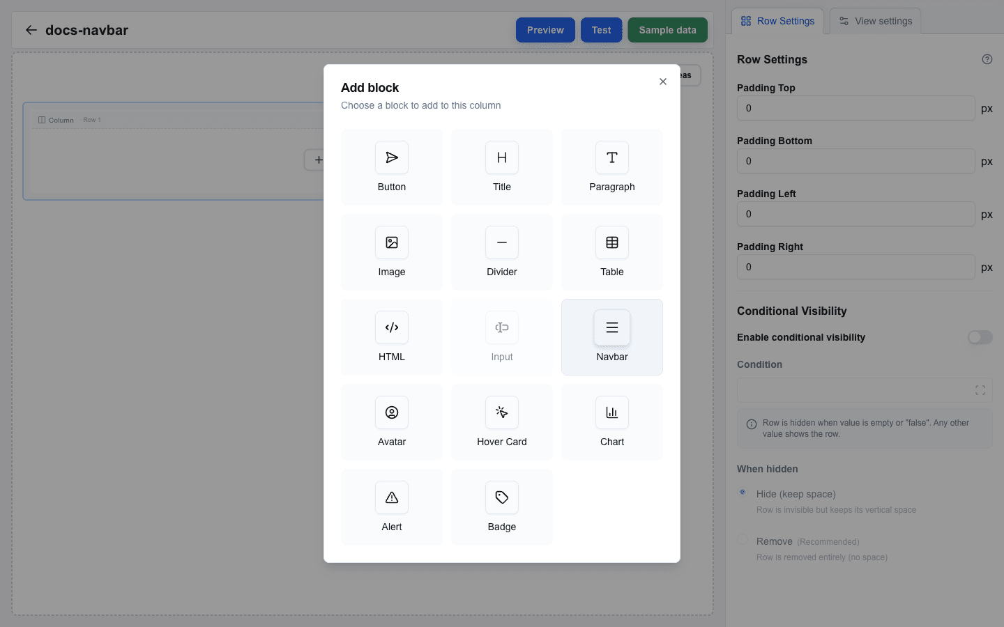
2. Click an empty column inside the row, then pick **Navbar** in the **Add block** dialog.
3. Click the new block to open its settings in the sidebar.
 ## Adding Links
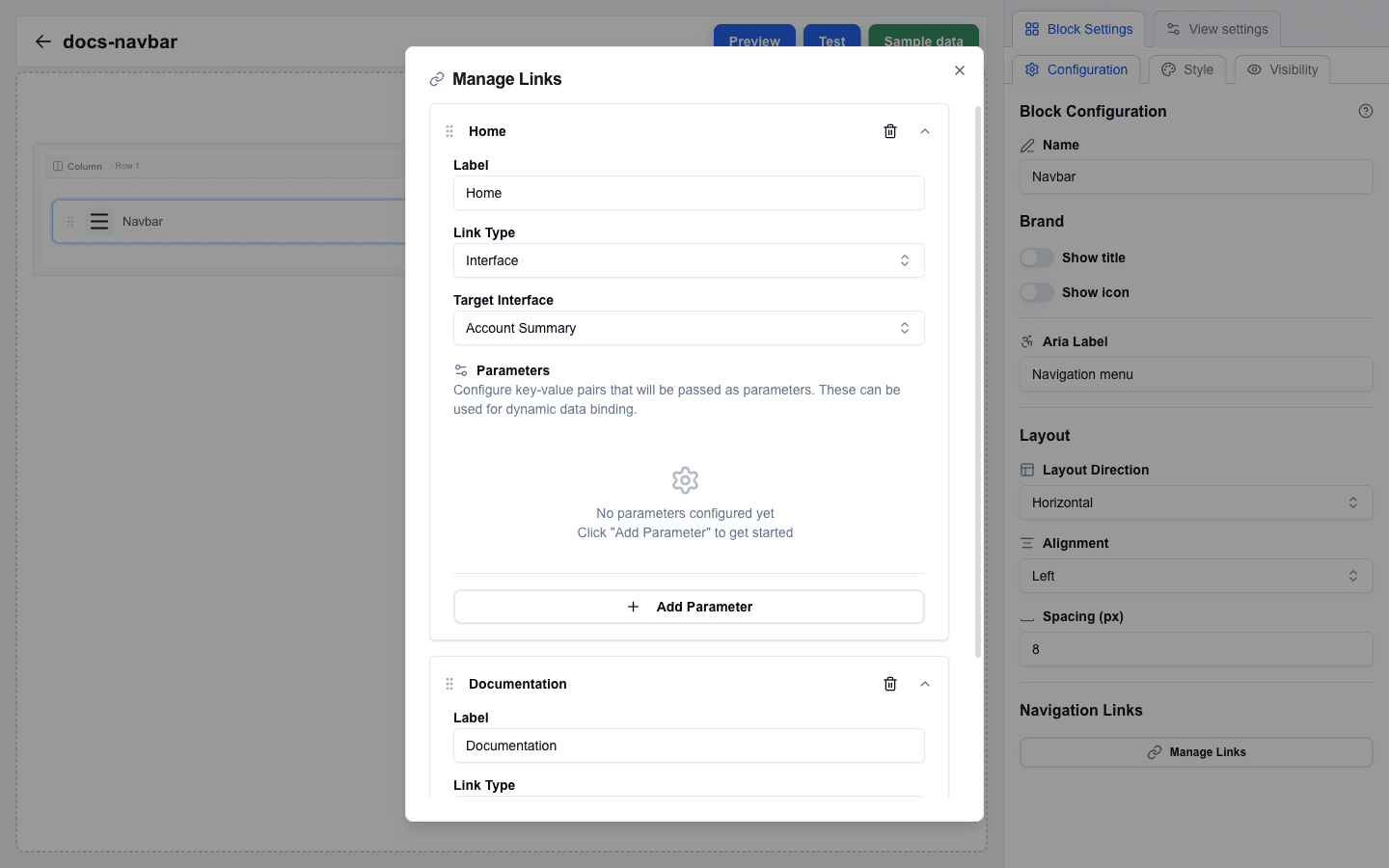
Scroll the sidebar to the **Navigation Links** section and click **Manage Links**. A dialog opens where you can add and reorder links.
1. Inside the dialog, click **Add** to create a new link. The link expands into an editable card.
2. Fill in the link fields:
- **Label** — the text shown to the user. Required.
- **Link Type** — pick **Interface** to navigate to another view inside this interface, or **External URL** to open an external address.
- For **Interface** links: pick the destination from the **Target Interface** dropdown and optionally add **Parameters** (key-value pairs passed to the target view).
- For **External URL** links: enter the address in the **URL** field. The URL field supports the Data Picker.
3. Drag the grip handle on the left of each link card to reorder links.
## Styling Links
Each link card has a **Variant** dropdown that controls the link's visual style. The options are the same as on the Button block: **Default**, **Link**, **Destructive**, **Outline**, **Secondary**, **Ghost**, and **Custom**.
Leave the dropdown on **Navbar default** to keep the classic navbar look. Note that picking **Ghost** explicitly is not the same as **Navbar default** — an explicit variant styles the link entirely on its own.
### Custom colors
Pick **Custom** to choose the colors yourself:
1. Set **Text Color** with the color picker. Required.
2. Set **Background Color**. Required — or check **Transparent** for no background.
3. Optionally check **Enable** next to **Hover Background Color** and pick the background color shown while hovering.
### Same style for every link
Set up one link the way you want, then click **Apply to all links**. This copies that link's Variant and custom colors onto every other link. The button appears when the navbar has more than one link.
 ## Brand: Title and Logo
Both the title and the logo are configured inside the **Brand** section at the top of the sidebar.
### Title
Turn on **Show title** to display a title in the navbar.
- **Title Text** — the title string.
- **Font Size (px)** — between 12 and 48.
- **Font Weight** — **Normal**, **Medium**, **Semibold**, or **Bold**.
- **Title Color** — the title's color (color picker).
### Logo
Turn on **Show logo** to display a logo image.
- **Image URL** — the logo image URL.
- **Alt Text** — alternative text for screen readers and for when the image fails to load.
- **Width (px)** — between 16 and 200.
- **Height (px)** — between 16 and 200.
## Layout
The **Layout** section controls how items are arranged inside the navbar.
- **Layout Direction** — **Horizontal** (links in a row) or **Vertical** (links stacked).
- **Alignment** — **Left**, **Center**, **Right**, or **Space Between**.
- **Spacing (px)** — gap between items, 0 to 50.
## Accessibility
- **Aria Label** — screen-reader name for the navigation region. Default placeholder: "Navigation menu".
