This guide covers the everyday picker workflow. For the full breakdown of every tab, type filter, and badge — see the [Data Picker reference](/docs/buttons/interface-button/interface-builder/reference/data-binding/data-picker).
## Inserting Your First Placeholder
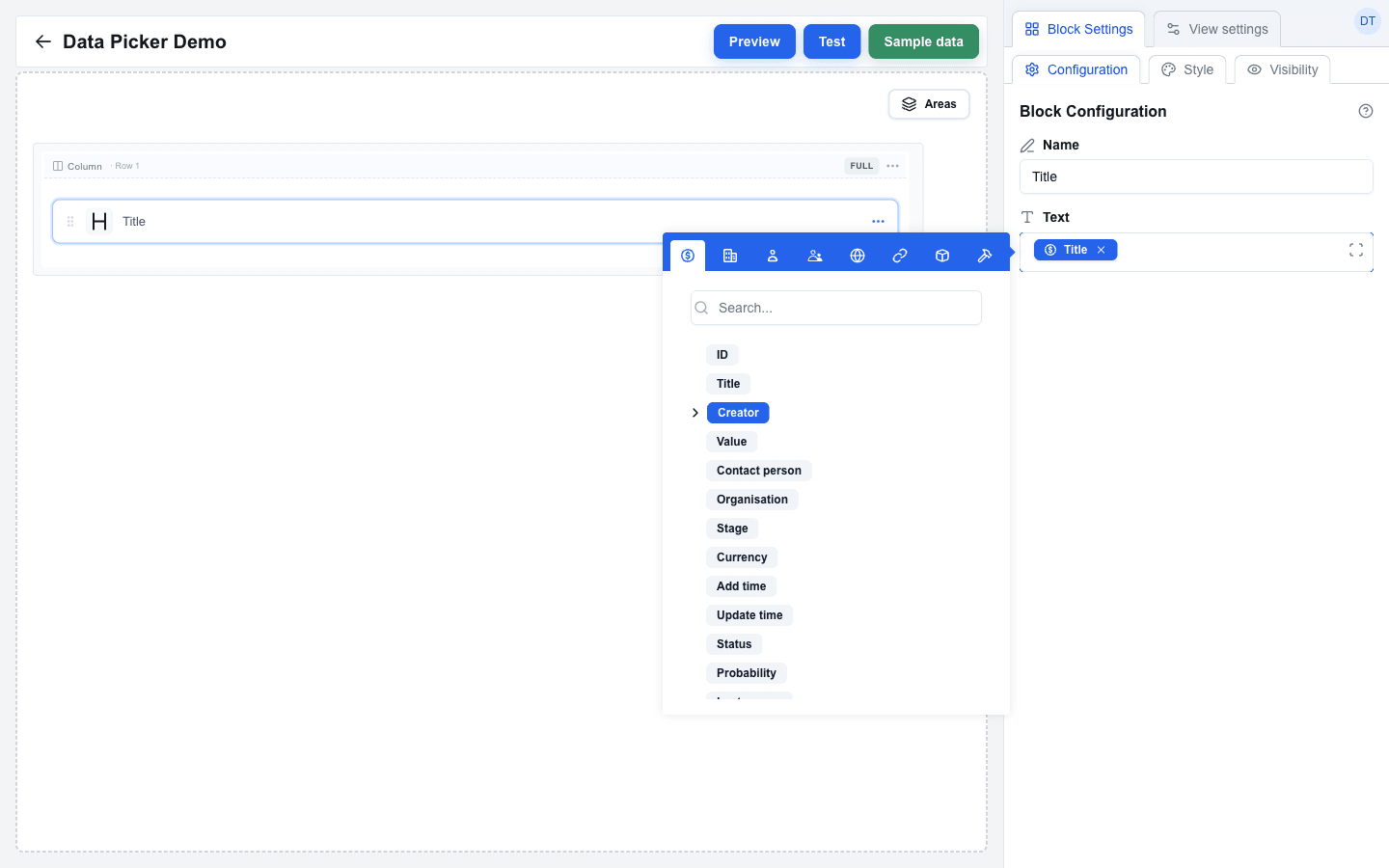
1. Click into any block setting that supports the Data Picker — for example a Title block's **Text** field.
2. The picker opens as a tooltip beside the field.
3. Pick the tab whose data you want (Deal, Organization, Person, User, Custom, Search Params, Variable, Functions, Context, or — inside a looping area — Loop item).
4. Click a field in the tree. A blue badge appears in the field as a single unit; the placeholder it represents (for example `{{deal.title}}`) is what gets resolved at render time.
On a [floating window button](/docs/buttons/interface-button/interface-builder/explanation/floating-window-buttons) the **Deal**, **Organization** and **Person** tabs are not in the strip at all, because that button's views get no Pipedrive record.
 ## Combining Static Text and Placeholders
You can mix plain text with badges in the same field. Type freely before, between, and after badges — the picker treats text as text and badges as atomic units.
A typical Paragraph **Value** might read:
```
Deal: {{deal.title}} — {{deal.value}} {{deal.currency}}
```
At render time the three placeholders resolve to live values from the deal record (for example `Deal: Legendary 1995 — 3193 EUR`).
## Removing a Placeholder
Three ways:
- Click the small **×** on the badge.
- Place the cursor after the badge and press **Backspace** — the whole badge disappears in one keystroke.
- Select across the badge and type — the badge is replaced by whatever you type.
## Editing Complex Expressions in the Larger Dialog
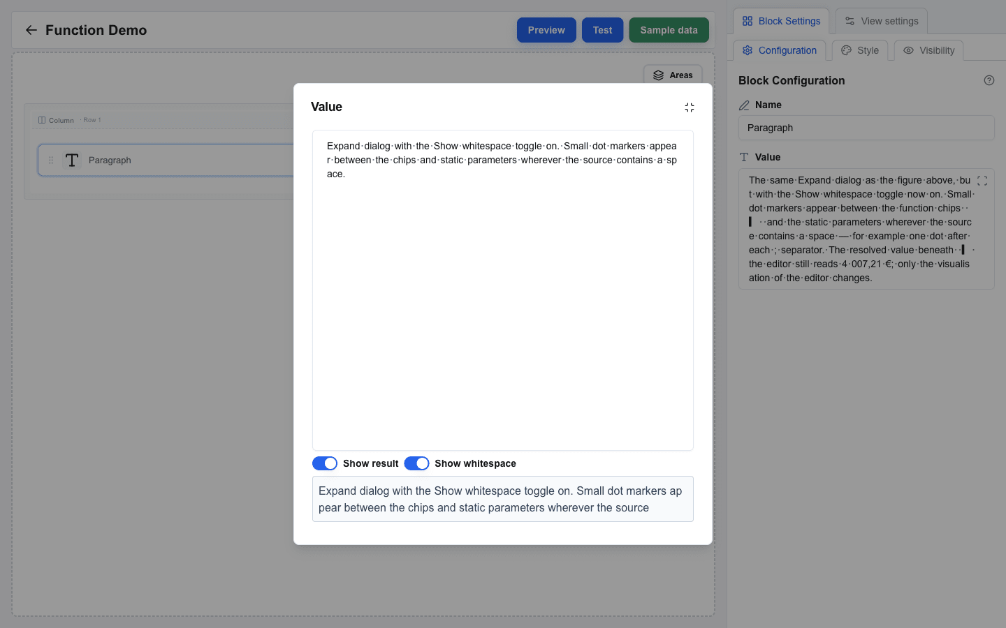
Once a field has more than one or two placeholders — or when you start mixing in functions like `if`, `formatCurrency`, or `daysBetween` — the inline picker gets cramped. Click the **expand** icon at the right edge of the Data Picker input to open the same field in a larger dialog. Toggle **Show result** to preview the rendered value (resolved against the active sample data) and **Show whitespace** to make spaces visible. For the **HTML** block specifically, **Show result** renders the compiled output as actual HTML (using the same sanitiser as the live view) so you can see the visual result without switching to Preview mode — see [How to Use the HTML Block](/docs/buttons/interface-button/interface-builder/how-to/blocks/html#previewing-without-leaving-the-dialog).
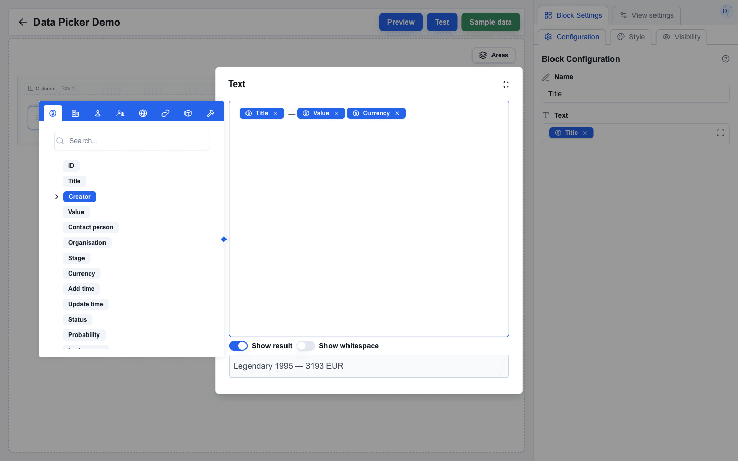 The dialog ignores clicks outside, so you can keep clicking around the canvas without losing your edits — only the minimize icon (top right) closes it.
**Show whitespace** is useful when something looks "off" in the rendered output and you suspect a stray or missing space — for example a placeholder that touches the next word, or two spaces between values. Switch the toggle on to see every space in the field as a small dot. The toggle is a **global** preference that applies to every Data Picker field in the builder and is remembered across reloads, unlike **Show result** which is set per field.
 ## Working Inside a Looping Area
When the field is inside an [area with looping enabled](/docs/buttons/interface-button/interface-builder/how-to/layout/areas#looping-an-area), the picker grows an extra **Loop item** tab (a repeat icon). Open it to:
- pick a field of the current iteration's array item (the `index` field is shown last in the list) — placeholders resolve per repetition, so `{{deal.products.name}}` reads a different product on each loop;
- pick `index` — the iteration number, starting at **1**.
If the field is **not** inside a looping area, the Loop item tab does not appear.
## Type-Filtered Contexts
Some block settings only accept a specific data type. The picker greys out fields that do not match:
- **Table > Target Array** and **Area > Loop > Target array** accept only arrays.
- **Visibility > Condition** accepts any value but is most useful with strings or booleans.
- Most text-based settings exclude objects from the clickable set — clicking an object's badge only expands its children.
You do not choose the filter manually — the surrounding setting decides it for you.
## Reusing the Last-Opened Tab
The picker remembers which tab you opened last across fields. If you spend a session inserting Deal fields, the next picker you open also lands on the Deal tab. Switch tabs once and that becomes the new default. Useful when you are building a row of similar inputs.