## Add the Form
1. Hover the gap between two rows on the canvas (or above the first row). A small `+` button appears.
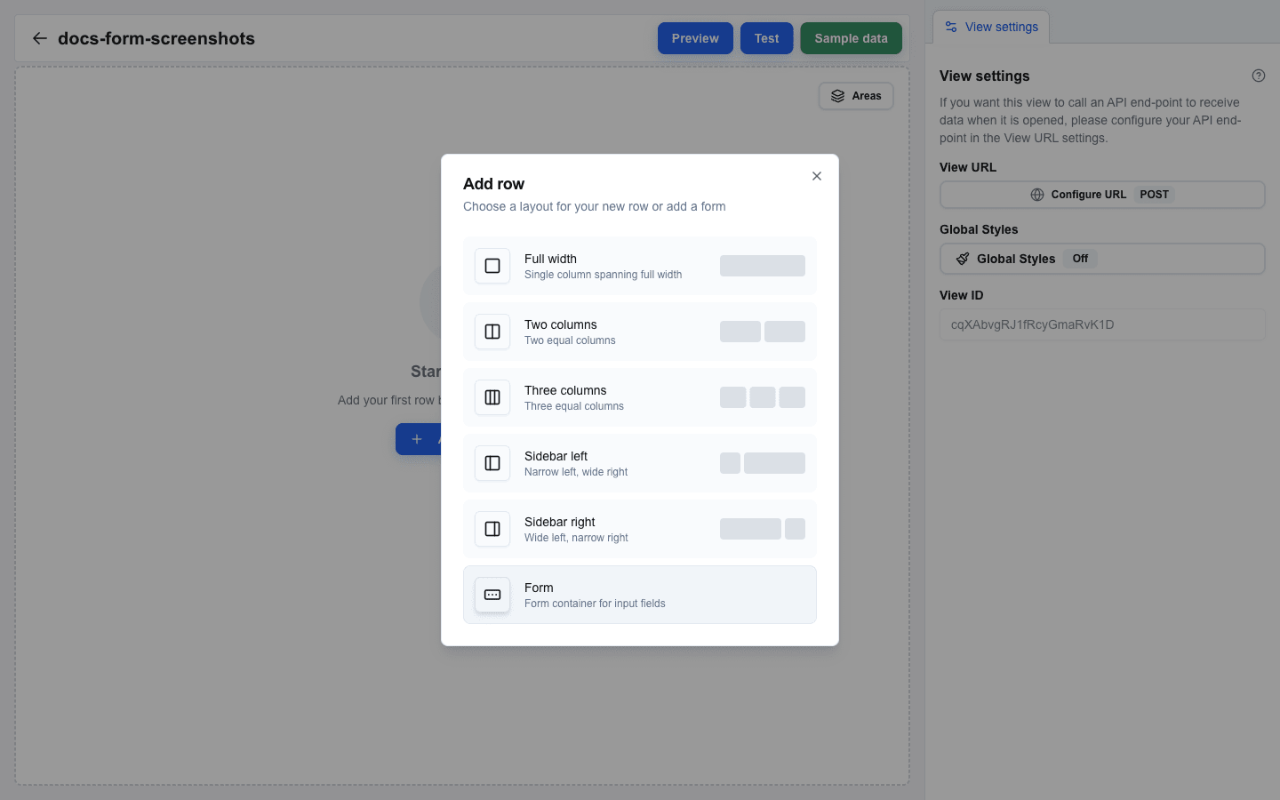
2. Click `+` to open the **Add row** dialog.
3. Pick **Form** from the layout list.
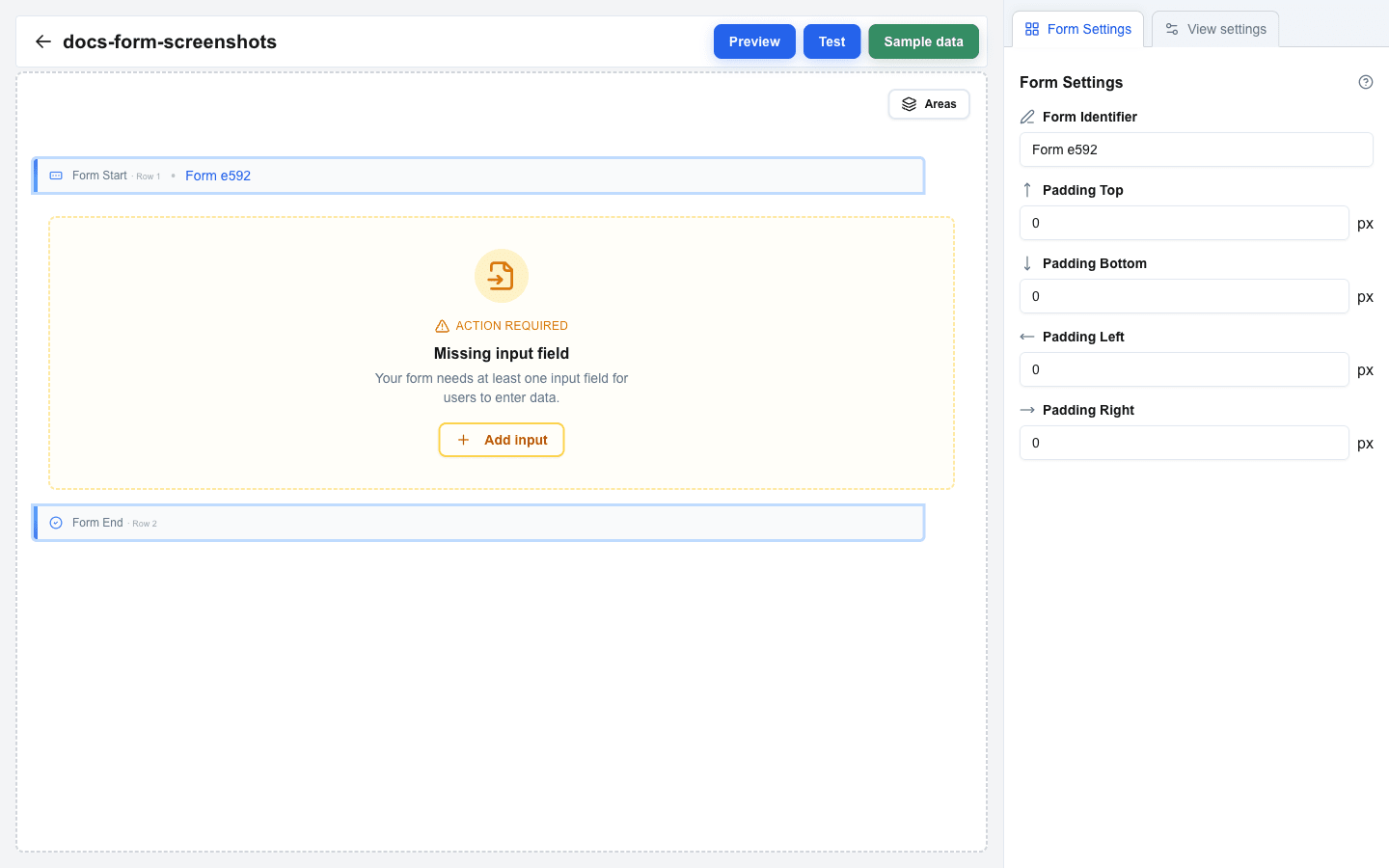
 The dialog closes and two new marker rows appear on the canvas:
- **Form Start** — marks the beginning of the form (shown with a left-edge accent and a row label).
- **Form End** — marks the end of the form (shown with a left-edge accent and a row label).
 The **Form** option is hidden in the **Add row** dialog when you are already inside a form — forms cannot be nested.
## Set the Form Identifier
1. Click either the **Form Start** or **Form End** row to open the **Form Settings** tab in the sidebar.
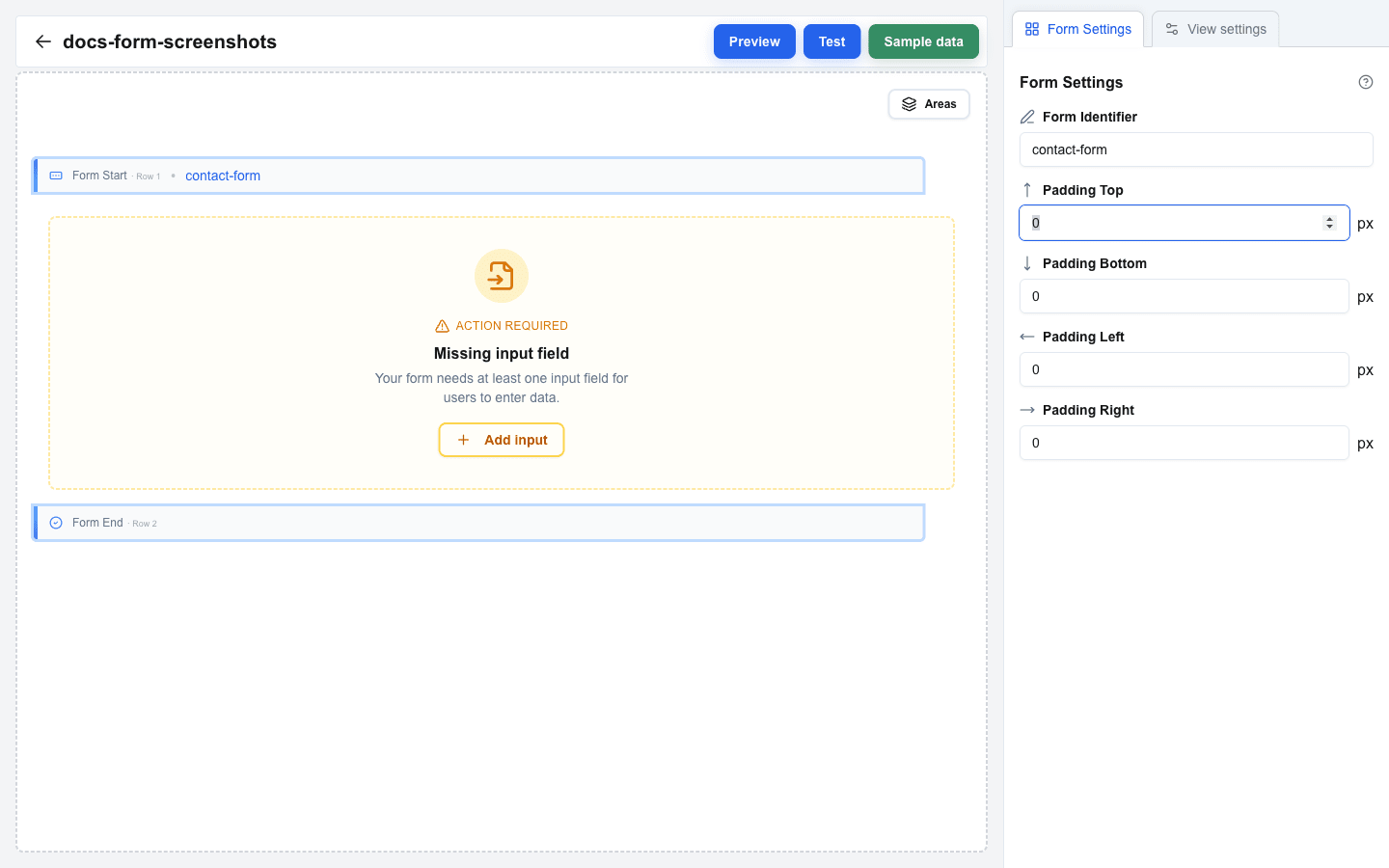
2. Enter a unique name in the **Form Identifier** field — for example, `contact-form`.
3. The identifier appears as a badge next to **Form Start** on the canvas and is used by Submit and Reset buttons to target this form.
 ## Adjust Form Padding (Optional)
In the **Form Settings** tab you can set inner padding for the rendered form:
- **Padding Top** (px)
- **Padding Bottom** (px)
- **Padding Left** (px)
- **Padding Right** (px)
## Add Rows Inside the Form
Hover the area between the Form Start and Form End markers, then click the `+` button that appears to open **Add row**. Pick any layout (Full, Two Column, etc.) — note that the **Form** option is hidden inside an existing form. Rows added in this area become part of the form.
## Place Input Fields
Click an empty column inside the form to open **Add block**, then pick **Input**. The dialog only allows the **Input** block when the surrounding row is inside a form. For details on input types and settings, see [Input Field Types](/docs/buttons/interface-button/interface-builder/how-to/forms/input-field-types).
## Validation Warnings
While you build, the canvas highlights warnings when the form is incomplete. Each warning includes a quick action button to fix the problem:
- **Missing input field** — the form has no input blocks between Form Start and Form End. Add at least one Input block.
- **Missing submit button** — no button anywhere in the view targets this form's Form Identifier. Add a Button block, set its **Button Type** to **Form Submit Button**, and pick this form from the **Form** dropdown.