## Required Fields
1. Select an input field inside your form.
2. Toggle **Required** on in the input settings.
3. When enabled, the form cannot be submitted until the user fills in this field.
:::caution[Hidden inputs ignore Required]
The Required toggle is forced off when the input type is Hidden — there is no way to require a hidden field.
:::
### Required from data
Use data when some records need the field and others do not.
1. Click the ⇄ button beside the **Required** label. A Data Picker field replaces the switch.
2. Bind the field to a value, for example {{deal.must_fill}}.
3. The field is required when the value is `true`, `yes` or `1`. Case and surrounding spaces do not matter.
Any other value leaves the field optional. This includes an empty value, `no`, `0`, `false` and a value that does not resolve, so an empty Data Picker field shows no warning. The value comes from the view data (Sample data, Received data, variables, System context). It does not read other inputs in the same form.
Click ⇄ again to go back to the switch. The switch keeps its earlier position, and the Data Picker value is kept too.
**Disabled** has the same choice and follows the same rule. A disabled field sends its **Default Value** when the form is submitted, and its validation (Required, Pattern, bounds) does not run.
## Pattern Validation
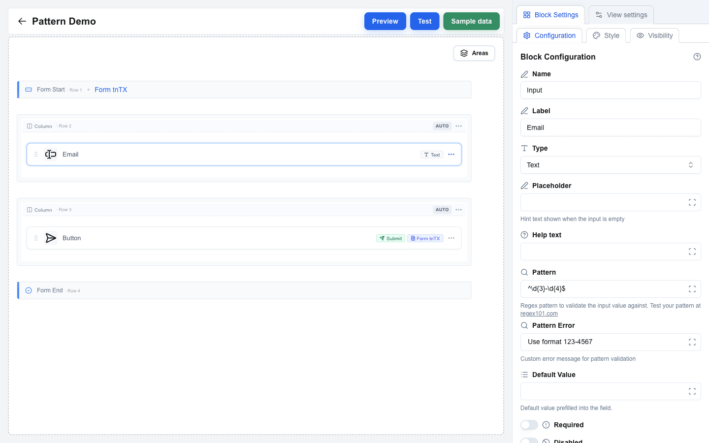
Use regex patterns to enforce custom input formats:
1. Select a text-based input field (**Text**, **Textarea**, **Email**, **Number**, **URL**, or **Date** type).
2. Enter a regex expression in the **Pattern** field (e.g., `^\d{3}-\d{4}$` for a phone format like `123-4567`). The field accepts a literal regex, or a Data Picker placeholder (e.g. `{{validation_rules.email_pattern}}`) that resolves to one at submit time.
3. Once Pattern has a value, a **Pattern Error** field appears underneath. Set it to override the default error message shown when the input does not match. Pattern Error also supports the Data Picker, so the message can be localised or context-dependent.
If no custom error message is set, a default validation error is shown.
When the **value** a user submits is itself a Data Picker placeholder (e.g. a prefilled field bound to a template variable), the regex check is skipped -- the resolved value is trusted to be validated by the backend.
 ## Number Min/Max Validation
For **Number** type inputs, bound the accepted range:
1. Select a **Number** input field.
2. Set **Min** and/or **Max** to the desired bounds. Both accept either a literal number or a Data Picker placeholder that resolves to one (e.g. `{{user.min_age}}`).
3. Once Min has a value, a **Min Error** field appears; once Max has a value, a **Max Error** field appears. Use these to customise the messages shown when the submitted value falls outside the bounds.
Bounds are enforced at submit. If the value is below **Min** or above **Max**, the form does not submit and the error message appears next to the field. Changing the input **Type** away from **Number** clears all four fields (Min, Max, Min Error, Max Error) automatically.
## Built-in Type Validation
Certain input types have automatic validation:
- **Email** -- validates email address format.
- **URL** -- validates URL format.
- **Number** -- only accepts numeric input.
No extra configuration is needed -- these validate automatically on form submission.
## File Type Limits
Set **Accepted file types** on a File input to take only some kinds of file. Write one comma-separated list of extensions and MIME types:
```
.pdf, .docx, image/*
```
- A bare word such as `pdf` reads as `.pdf`. Case does not matter, and extra commas are ignored.
- An entry that is neither an extension nor a MIME type, such as `*.pdf` or `image/`, shows an error under the field.
- An empty list accepts every file.
The file dialog offers only the listed types. The drop zone hint starts with the list, such as `.pdf, .png, image/* · One file · max 10 MB`; after three types it shows `+N more`. While a user drags a file of another type over the drop zone, the zone turns red and reads `File type not accepted (.pdf, .png)`. During a drag the browser shows only the file's MIME type, so the warning needs a MIME type for every entry: it never comes while the list holds an extension whose MIME type the field does not know.
A file of another type can still arrive, for example by a drop. It joins the selection, its row turns red, and the form does not submit until the user removes it. The message names the file and the list:
```
File "setup.exe" is not an accepted type (.pdf, .png)
```
This is a check in the browser only. The server does not read the list, so do not rely on it to keep a file type out of your endpoint.
## File Size Limits
A file input is guarded in two places -- your own limits in the browser, and the server's budget -- and they fail with different messages.
### 1. Your own limits, in the browser
You set up to three limits on the field. Each one has its own message, so the user is told which limit they passed and by how much. The form does not submit until the selection clears all three.
**Max File Size (MB)** applies to **each file on its own**, never to the selection added up -- three 5 MB files pass a 10 MB limit. An oversized file also turns its own row in the field red as soon as it is picked, and the message names the file:
```
File "contract.pdf" is 12.4 MB, which exceeds the 10 MB limit
```
**Max Total Size (MB)** applies to the selection added up. Only a field with **Allow multiple files** on has it:
```
The selected files total 12.4 MB, which exceeds the 10 MB limit
```
**Max Number of Files** caps how many files the field takes. It too belongs to a multi-file field alone, and it is the only limit that stops a user attaching hundreds of tiny files:
```
14 files selected, which exceeds the limit of 10 files
```
The range you may set for the two size limits depends on the surrounding form's **Form Type**: **JSON** forms allow up to **10 MB**, **Multipart/Form-Data** forms allow up to **100 MB**. The count may go up to **25** on JSON forms and **50** on Multipart/Form-Data, and arrives pre-filled with **10**. The label inside Block Settings shows the active ceiling for each, and the size fields arrive pre-filled with it -- lower a number yourself if you want a tighter check.
When a selection breaks more than one limit at once, the user reads the file type message first, then the per-file size message, then the count, then the total size. A file of the wrong type must go whatever its size, and the two per-file messages are the ones that name a file, so they say what to drop.
### 2. The submission budget, on the server
Setting your own limits low enough does *not* guarantee the submission goes through. The server never sees them; it weighs every file field of the submission together against one budget of its own, so files that each passed check 1 can still be refused as a group. The user gets an error toast naming both numbers, and the form is never sent:
```
The submission carries 12.6 MB of files, more than the 10 MB this form accepts. Send fewer or smaller files.
```
To stay clear of it, keep the whole form's uploads under the budget for its **Form Type**, and move a form that needs more than 10 MB onto **Multipart/Form-Data**. The numbers, the reason they differ, and the one case that fails without this message are in [File Size Limits](/docs/buttons/interface-button/interface-builder/reference/data-binding/form-submission-types#file-size-limits).
:::caution[No file inputs in "Open view with form data"]
A form whose **Form Type** is **Open view with form data** *cannot* contain a file input -- the builder shows a clear validation error if you try.
:::
## Builder Validation Warnings
The builder itself validates form structure and shows **Action required** cards directly on the canvas inside an empty form:
- **Missing input field** -- with an **Add input** quick-fix button. Add an input block between the `Form Start` and `Form End` rows.
- **Missing submit button** -- with an **Add submit button** quick-fix button. Add a button anywhere in the view, set **Button Type** to **Form Submit Button**, and select this form in the **Form** dropdown.
Each card includes a one-click action button that drops the missing block in the right place.
 Other validation rules block save until they are resolved -- see [Saving](/docs/buttons/interface-button/interface-builder/how-to/views/publishing) for the full list (duplicate input names, submit/reset buttons that point at a non-existent form, file inputs in `Open view with form data` forms, missing URLs).
## Unique Input Names
Each input has a **Name** field (the first row in Block Settings) that becomes the field key when the form is submitted. The builder generates an initial name like `Input` and appends a numeric suffix on duplicates -- a second input becomes `Input_2`, a third becomes `Input_3`, and so on.
You can rename inputs from the **Name** field whenever you want to make the submitted JSON more readable.
:::caution[Input names must be unique]
If two inputs end up sharing a name (typically by manual editing), the builder flags an `Input name must be unique` validation error and blocks save until you change one.
:::