## Adding an Input Field
1. Make sure you have a row inside a form. If you do not, see [Creating a Form](/docs/buttons/interface-button/interface-builder/how-to/forms/creating-a-form) first.
2. Click an empty column inside that row to open the **Add block** dialog.
3. Pick **Input** from the list. (The **Input** entry is only enabled when the row sits between a `Form Start` and a `Form End`.)
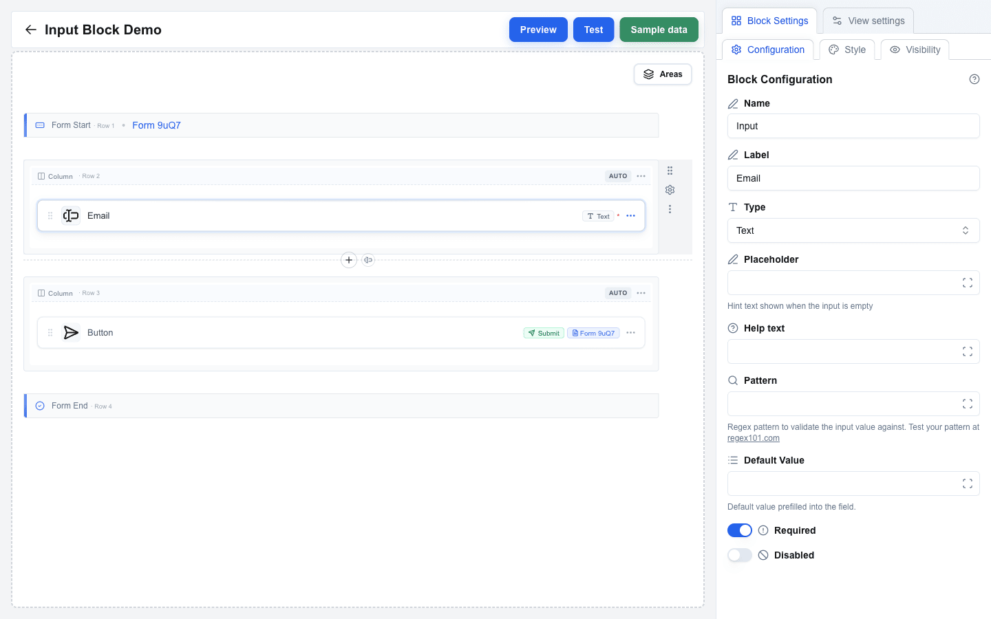
4. Click the new block to open its settings in the sidebar.
5. Choose the input **Type** from the dropdown.
 ---
## Basic Types
- **Text** -- standard single-line text input.
- **Textarea** -- multi-line text input.
- **Email** -- text input with email format validation.
- **Number** -- numeric-only input.
- **URL** -- text input with URL format validation.
- **Date** -- date picker.
- **Hidden** -- invisible field, useful for passing data without user interaction. Hidden inputs can never be **Required** or **Disabled**: a change to Hidden turns both switches off and sets both settings back to a switch.
- **File** -- file upload field. See [File Input](#file-input) below for the form-type rules.
### Textarea Input
For **Textarea** type inputs, configure:
- **Rows** -- the number of visible text rows (1--20, default 3).
- **Max Length** -- the maximum number of characters the user can enter. Leave blank for no limit.
### File Input
The rendered field is a row that reads **Drop a file here** (or **Drop files here**), with a **Browse** button on the right. The user either drops files onto the row or clicks anywhere on it to open the file dialog. Under the title, a hint lists the limits you set, such as `One file · max 10 MB` -- a limit you leave empty is left out of the hint. A dropped file goes through the same checks as a picked one.
 A single-file input refuses a drop of several files at once: the row turns red and reads **Only one file allowed. Drop a single file.** as soon as the files are dragged over it, and a drop selects nothing. Once a file is selected, the row is hidden; the user removes the file with **X** to choose another.
For **File** type inputs:
- The maximum upload size is **Max File Size (MB)**. It applies to **one file at a time**, not to the selection as a whole. The allowed range depends on the surrounding form's **Form Type**: **JSON** forms allow up to **10 MB**, **Multipart/Form-Data** forms allow up to **100 MB**. The label inside Block Settings shows the active limit, and the field arrives pre-filled with it -- lower the number yourself if you want a tighter check. Switching the form type lowers a value that is too high for the new type, but never raises one you set yourself.
- **Accepted file types** limits the field to the kinds of file you list, such as `.pdf, .png, image/*`. Leave it empty to accept every file. The file dialog offers only the listed types. A file of another type still joins the selection, but its row turns red and the form does not submit until the user removes it. See [File Type Limits](/docs/buttons/interface-button/interface-builder/how-to/forms/form-validation#file-type-limits).
- A form whose **Form Type** is **Open view with form data** *cannot* contain a file input -- that mode forwards values as URL search parameters and cannot carry files. The builder shows a clear error if you try.
#### Accepting several files
Turn **Allow multiple files** on to let one field carry more than one file. The setting appears on the **File** type only and is off by default.
The field then behaves like this:
1. The row reads **Drop files here**, its hint shows the limits (`Up to 10 files · 100 MB total · 10 MB each`), and the file dialog lets the user select several at once.
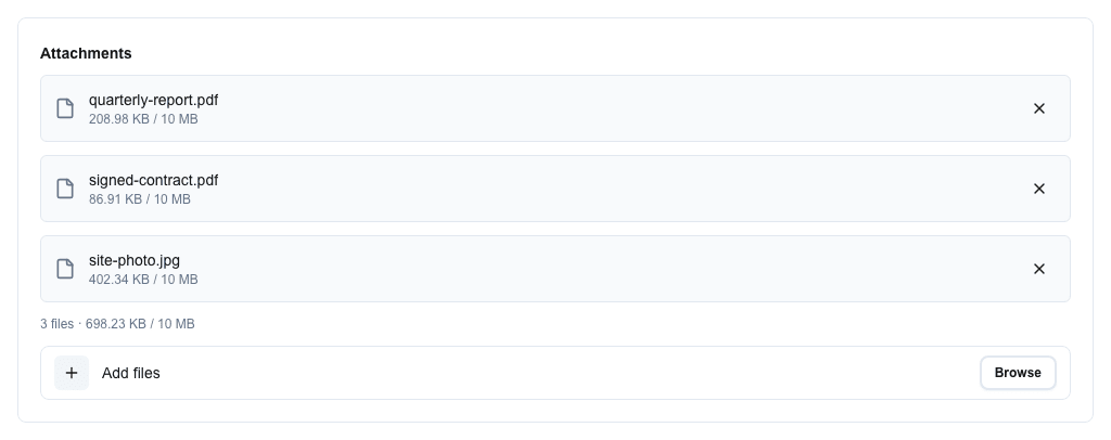
2. Each selected file gets a row showing its name and size. When **Max File Size (MB)** is set, the row shows `size / limit`, and a file over the limit turns red. A file that is not one of the **Accepted file types** turns red too.
3. Under the rows, a running summary reads `3 files · 12.4 MB / 100 MB` -- the count, the size of the selection so far, and the total-size limit when one is set. It turns red as soon as the selection breaks **Max Number of Files** or **Max Total Size (MB)**; a file that is too large or of another type turns its own row red instead.
4. The **X** on a row removes that one file; the rest stay selected.
5. Under the summary, a slimmer row reads **Add files** -- dropping or picking again *adds* to the selection instead of replacing it. A file that is already in the list is skipped.
 **Which limits to set.** A multi-file field has three:
| Setting | Set it to |
|---|---|
| **Max File Size (MB)** | The largest single file the endpoint can handle. |
| **Max Total Size (MB)** | What the endpoint can take in one request. Keep it at or under the budget for the form type, or the server refuses the submission even though the field accepted it. |
| **Max Number of Files** | How many attachments the field is for. Pre-filled with 10; the highest you may set is 25 on JSON forms and 50 on Multipart/Form-Data. |
Each limit has its own message, so the user is told which one they passed rather than being left to guess. Put a form meant for several sizeable files on **Multipart/Form-Data**. See [File Size Limits](/docs/buttons/interface-button/interface-builder/reference/data-binding/form-submission-types#file-size-limits).
**Before you turn it on for a live field:** the setting changes what the endpoint receives, so update the integration first. See [File Fields](/docs/buttons/interface-button/interface-builder/reference/data-binding/form-submission-types#file-fields).
---
## Selection Types
Selection inputs let users choose from a list of options:
- **Checkbox** -- multiple selections with checkboxes.
- **Radio** -- single selection with radio buttons.
- **Single Select** -- dropdown for a single selection.
- **Multi Select** -- dropdown for multiple selections.
Each selection type has an **Options Type** dropdown with two values: **Static** or **Dynamic**.
### Static Options
1. Set **Options Type** to **Static**.
2. Click **Manage options** to open the editor and add rows. Each row has:
- **Label** -- text shown to the user. Required.
- **Value** -- value submitted when this option is selected. Required.
3. Use the editor's **Add Option** button to append rows; click **Save Options** to commit.
Both Label and Value must be at least 1 character long.
### Dynamic Options
1. Set **Options Type** to **Dynamic**.
2. Fill the fields:
- **Labels Delimiter** -- character used to split the resolved labels string. Default: `,`.
- **Values Delimiter** -- character used to split the resolved values string. Default: `,`.
- **Labels** -- Data Picker expression that resolves to the option labels.
- **Values** -- Data Picker expression that resolves to the option values.
A warning banner inside Block Settings reminds you that if your data contains the delimiter character, the options may be split incorrectly.
---
## Default Values
Use the **Default Value** field to pre-fill the input. The field supports the Data Picker, so you can bind the default to any resource field or variable. Help text under the field changes per Type to describe what is expected (for example `YYYY-MM-DD format` for Date, `Coerced to a number` for Number).
For selection inputs with **Static** options, the **Default Value** field gains a small swap button next to its label. The button toggles between two modes:
- A **dropdown** of the static options (the selection's stored value is the option's `value`).
- A **plain-text input** that supports template variables -- type the option's `value` directly, optionally as a Data Picker expression. For multi-value selections (Checkbox / Multi Select) separate values with commas.
## Labels and Help Text
- **Label** -- text label displayed above the input field.
- **Help text** -- smaller hint text shown below the input. Supports the Data Picker.
- **Placeholder** -- hint text shown inside the empty input. Available on **Text**, **Textarea**, **Email**, **Number**, **URL**, **Single Select**, and **Multi Select** only -- Checkbox, Radio, Date, File, and Hidden inputs hide the Placeholder field. Supports the Data Picker.
## Validation Settings
- **Required** -- toggle to make the field mandatory. Click the ⇄ button beside the label to take the value from data instead: see [Required from data](/docs/buttons/interface-button/interface-builder/how-to/forms/form-validation#required-from-data). Hidden inputs cannot be Required.
- **Pattern** -- regex pattern for custom validation. Available on Text, Textarea, Email, Number, URL, and Date. Must be a valid regular expression.
- **Pattern Error** -- custom error message shown when pattern validation fails. Only appears once Pattern has a value.
- **Disabled** -- toggle to make the field read-only. A disabled field sends its **Default Value** and skips its validation. Click the ⇄ button beside the label to take the value from data instead; the same `true` / `yes` / `1` rule applies as for Required. Hidden inputs cannot be Disabled.
For numeric bounds (**Min**, **Max**, **Min Error**, **Max Error**) and file size limits, see [Form Validation](/docs/buttons/interface-button/interface-builder/how-to/forms/form-validation).
## Style and Visibility
The Input block uses the standard **Style** sub-tab (background, font, borders, radius) and **Visibility** sub-tab in Block Settings, the same as every other block. See [Block Styles](/docs/buttons/interface-button/interface-builder/how-to/layout/block-styles) and [Conditional Visibility](/docs/buttons/interface-button/interface-builder/how-to/visibility/conditional-visibility).