## Opening the Style Sub-tab
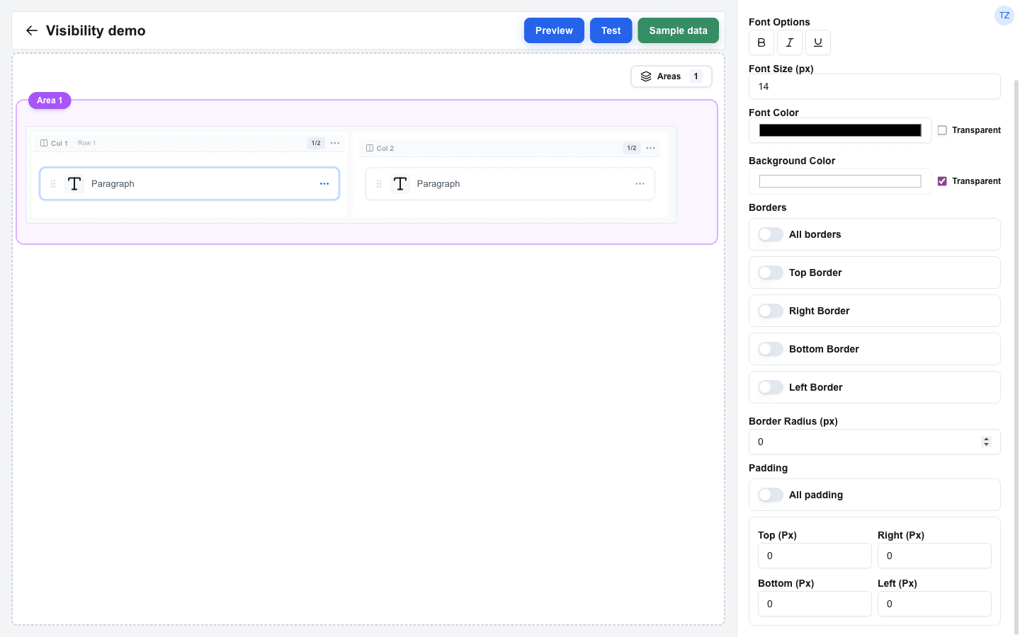
1. Select a block on the canvas.
2. In the Block Settings panel, switch to the **Style** sub-tab (next to **Configuration** and **Visibility**).
 > Badge and Alert blocks use variant-based styling, so their **Style** sub-tab shows an info card explaining that custom block styles are not applied. See the [Badge](/docs/buttons/interface-button/interface-builder/reference/block-types/badge) and [Alert](/docs/buttons/interface-button/interface-builder/reference/block-types/alert) reference pages for the variants they offer instead.
## Background Color
1. Click the **Background Color** swatch and pick a colour.
2. Tick the **Transparent** checkbox to clear the background.
The **Image**, **Avatar**, and **Divider** blocks omit the Background Color row entirely -- the Style sub-tab simply does not render it for them.
## Font Settings
Text-based blocks (Title, Paragraph, Button, Input, HTML, Table, Hover Card, Chart, Navbar) have font controls:
| Setting | Description |
|---|---|
| **Font Options** | A toggle group with **Bold**, **Italic**, and **Underline**. |
| **Font Size (px)** | Text size in pixels. |
| **Font Color** | Pick a colour, or tick **Transparent** to clear the colour. |
The **Image**, **Avatar**, and **Divider** blocks have no text, so the font controls are hidden.
## Borders
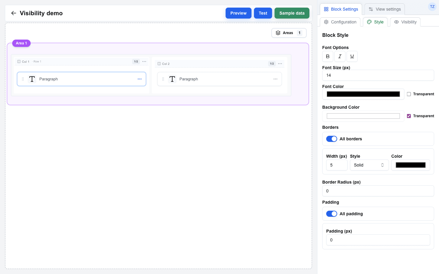
Each block has four independent border sides: **Top Border**, **Right Border**, **Bottom Border**, and **Left Border**.
1. Turn a side on with its switch. The width / style / colour fields appear underneath.
2. Configure:
- **Width (px)** -- border thickness in pixels. New blocks default to `1`, so toggling a side on draws a visible border immediately.
- **Style** -- pick **Solid**, **Dashed**, or **Dotted**.
- **Color** -- a colour picker.
### All borders
Turn the **All borders** switch on (above the four side switches) to drive all four sides from a single Width / Style / Color card. The four per-side switches and their cards are hidden while All borders is on; turning it back off restores them with their previous values. Tables (which have extra Row / Cell border switches) do not show the All borders option.
 ## Table Borders and Padding
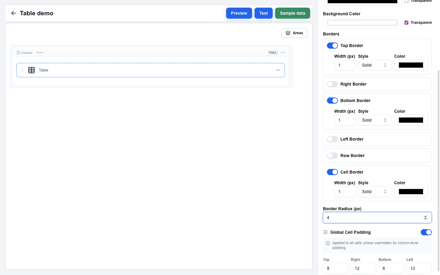
The Table block adds three controls inside its **Borders** section on top of the four side borders:
- **Row border** -- lines between rows (same Width / Style / Color controls).
- **Cell border** -- lines between cells (same controls).
- **Global Cell Padding** -- when on, four pixel inputs (**Top / Right / Bottom / Left**) apply to every cell unless a column overrides them via its own Styling > Cell Padding.
 ## Border Radius
**Border Radius (px)** rounds the block's corners. A value of `0` leaves them square; large values produce circular shapes (useful for Avatar and Image).
## Padding
Padding adds space between the block's content and its outer edge -- once a border is drawn, padding is the distance between the border and the text. Each side has its own pixel input: **Top (Px)**, **Right (Px)**, **Bottom (Px)**, **Left (Px)**. Defaults to `0` on every side.
Turn the **All padding** switch on to drive all four sides from a single **Padding (px)** input. The four per-side inputs are hidden while All padding is on; turning it back off restores them with their previous values.
## Overriding Global Styles
When the view has **Enable Global Styles** turned on with a font size or font colour set, every block inherits those values by default.
To override a global value on a specific block:
1. In the block's **Style** sub-tab, look for a `Global: ` badge next to **Font Size (px)** or **Font Color** -- for example `Global: 16px`, or for the colour a small swatch followed by the hex code.
2. A **Use custom style** switch sits beneath the badge. Turn it on, and the block's own input becomes editable.
3. Type the per-block value.
When the switch is off, the block uses the global value and its own input is disabled. The same **Use custom style** label is used for both Font Size and Font Color overrides; the switch's effect is local to the field it sits beside.
See [Using Global Styles](/docs/buttons/interface-button/interface-builder/how-to/layout/global-styles) for the dialog itself and the per-row gap overrides.