## Block Visibility
To conditionally show or hide a single block:
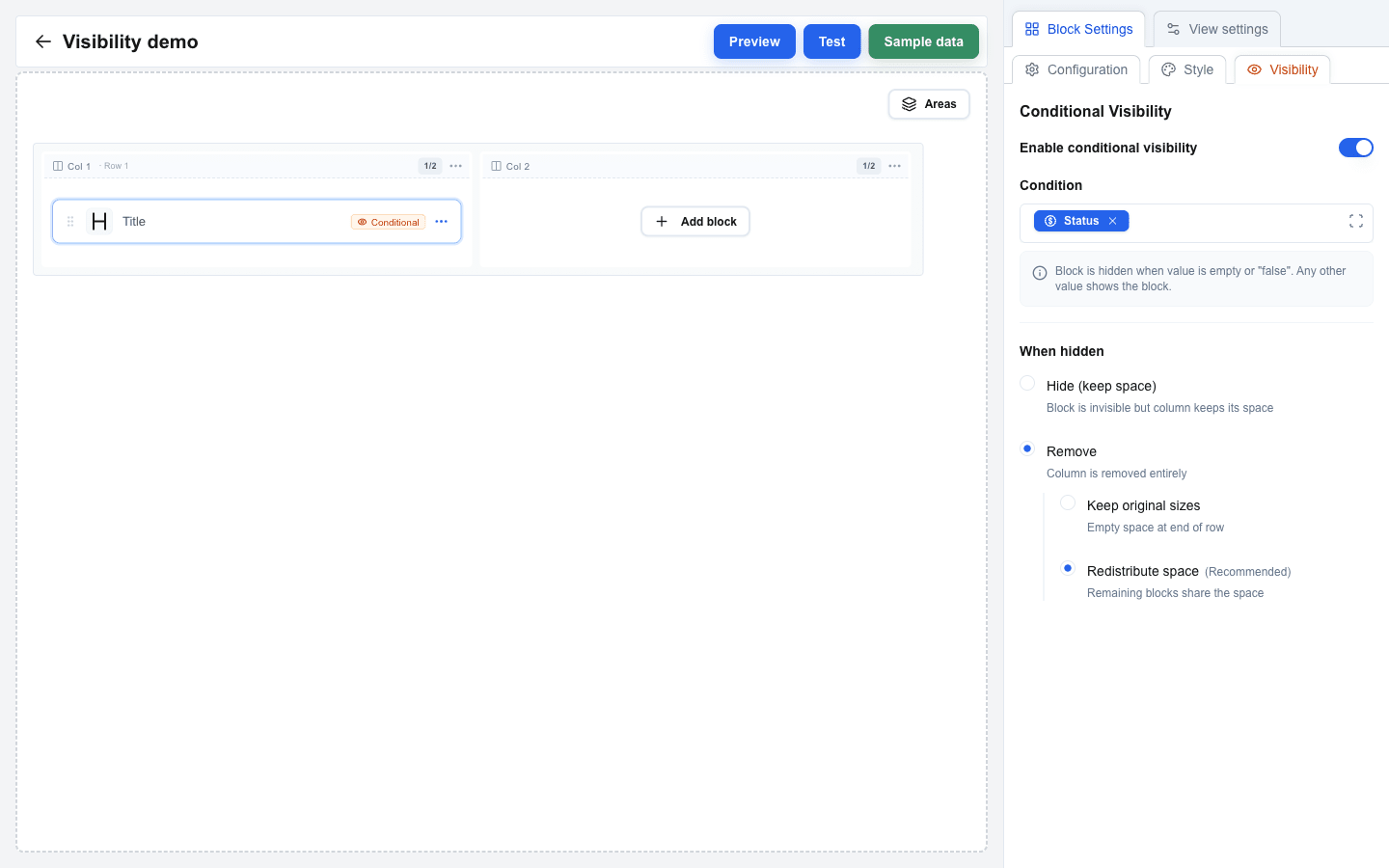
1. Select the block in the builder.
2. In Block Settings, switch to the **Visibility** sub-tab (next to **Configuration** and **Style**).
3. Toggle **Enable conditional visibility** on.
4. In the **Condition** field, insert a Data Picker tag for the value that should drive visibility.
5. Under **When hidden**, pick:
- **Hide (keep space)** -- the block becomes invisible but its column keeps the same space.
- **Remove** -- the block is removed from the layout.
6. When the mode is **Remove** and the row has more than one column, choose how the freed column space is handled:
- **Keep original sizes** -- the empty space stays at the end of the row.
- **Redistribute space** *(Recommended)* -- the remaining blocks share the freed space.
 ## Row Visibility
To conditionally show or hide an entire row:
1. Open Row Settings -- click the row's column-header on the canvas, or pick **Settings** from the row's "..." menu.
2. Scroll to the **Conditional Visibility** section.
3. Toggle **Enable conditional visibility** on.
4. In the **Condition** field, insert a Data Picker tag.
5. Under **When hidden**, pick:
- **Hide (keep space)** -- the row is invisible but retains its vertical space.
- **Remove** *(Recommended)* -- the row is removed entirely so the layout closes up.
 ## Area Visibility
Areas support the same visibility rules. When an area is hidden, every row inside it disappears together.
1. Click the area's coloured **badge** on the canvas to open Area Settings.
2. Toggle **Enable conditional visibility** on.
3. Insert a Data Picker tag in the **Condition** field.
4. Pick **Hide (keep space)** or **Remove** *(Recommended)*.
See the [Areas reference](/docs/buttons/interface-button/interface-builder/reference/layout/areas) for full details on what areas can do.
## Writing Conditions
The condition is evaluated at render time. The element is hidden when the value is **empty** or equals `"false"`. Any other value shows the element.
Examples (the compiled syntax behind a Data Picker tag is shown):
| Condition | Shows when... |
|---|---|
| `{{deal.value}}` | The deal has a value set (non-empty) |
| `{{user.id}}` | A user ID exists (always true for logged-in users) |
| `{{deal.status}}` | The deal status field is not empty |
| `{{custom.is_premium}}` | The custom data source returns a truthy `is_premium` field |
| `{{variable.show_section}}` | The interface variable `show_section` is not empty or `"false"` |
Use the Data Picker to build conditions: click the Condition field, switch to the relevant tab (Deal, Variable, Custom, ...), and click the field. The tag is inserted as a blue chip; the curly-brace syntax above is what it compiles to at render time.
## Empty Condition Warning
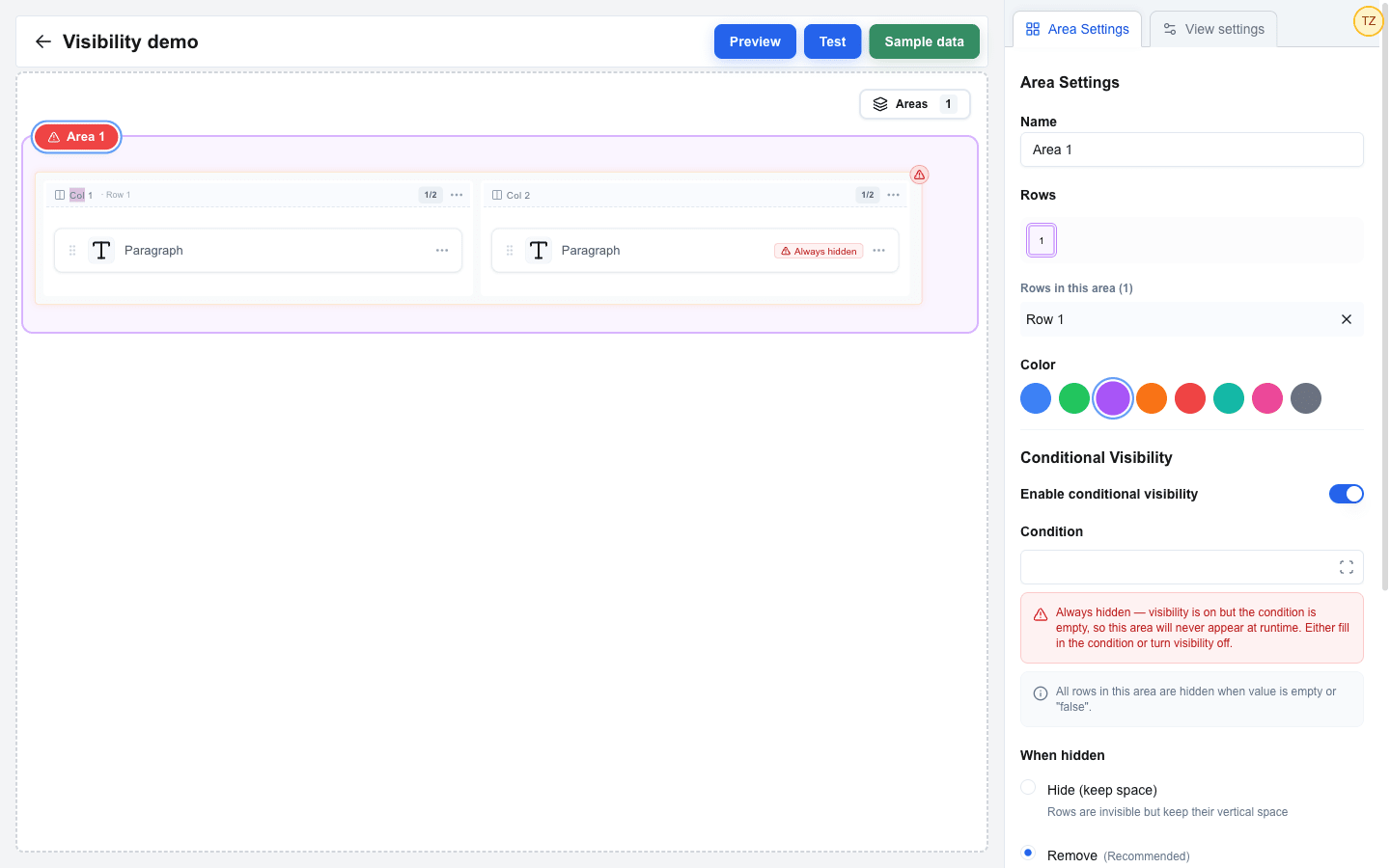
If you turn **Enable conditional visibility** on but leave the **Condition** field empty, the element will never appear at runtime — an empty condition resolves to "hidden" (see the [Visibility System explanation](/docs/buttons/interface-button/interface-builder/explanation/visibility-system#how-conditions-are-evaluated)). The builder flags this state on three surfaces so it doesn't ship by accident:
- An **Always hidden** banner appears under the Condition field in the visibility settings panel.
- The block, row, or area's eye indicator on the canvas turns red and switches to a warning triangle.
- An area badge with this state takes a red background regardless of its chosen colour.
The data still saves — the warning is purely a builder-time signal. Either fill in a condition or turn the toggle off to clear the warning.
 ## Hide vs Remove
The two modes affect how the layout reacts when the element is hidden:
- **Hide (keep space)** -- the element becomes invisible but its slot is reserved. The surrounding layout doesn't shift, so nothing jumps when the condition flips. Use this when you need a stable layout.
- **Remove** -- the element is taken out of the layout entirely. Surrounding content reflows to fill the gap.
For blocks inside a multi-column row, the **Remove** mode adds a second choice -- **Keep original sizes** leaves an empty slot, **Redistribute space** *(Recommended)* lets the remaining blocks expand to fill the freed column.