 ## Creating a New Interface
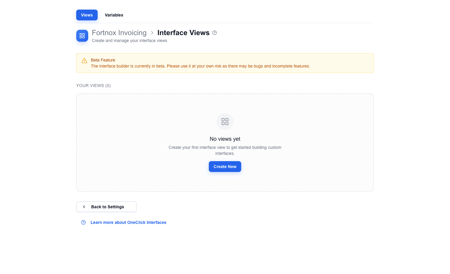
1. On the Interface Selection Page, click the **Create New** button next to the **Your Views** heading.
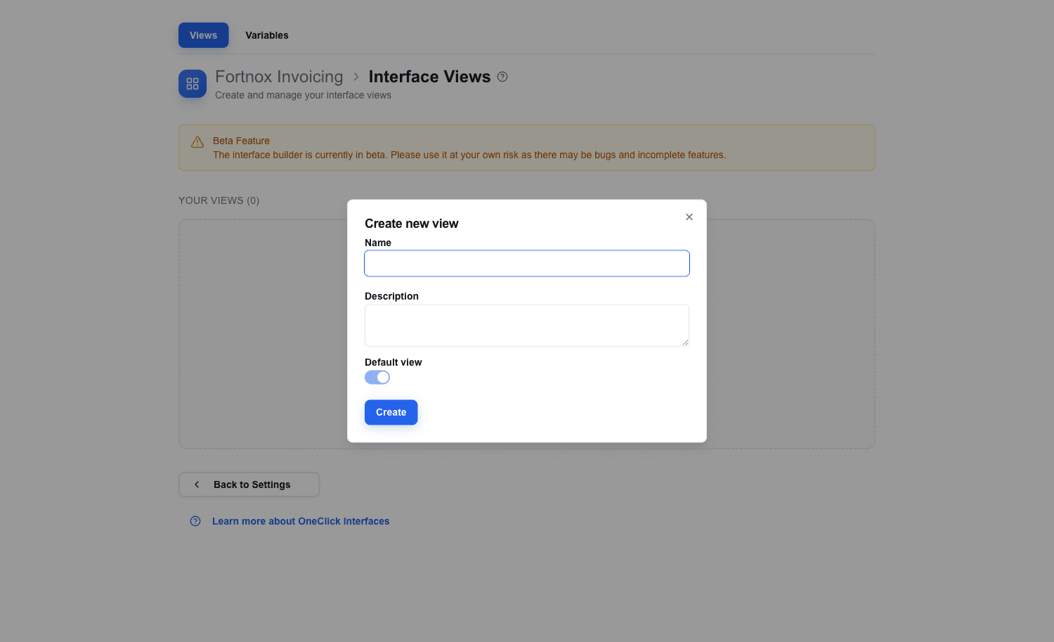
2. The **Create new view** dialog opens.
3. Enter a descriptive **Name** — this name is how you will reference it later when setting up navigation between views. The optional **Description** and **Default view** toggle can be left at their defaults.
4. Click **Create**. The new view opens in the Builder.
 ## Understanding the Builder
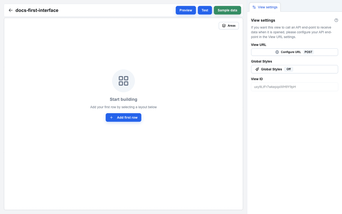
When you open a view, the Builder loads with three main areas:
- **Canvas** (left side) — the main working area where you build your interface by arranging rows and blocks.
- **Sidebar** (right side) — shows configuration options for whatever is selected. It has two main tabs at the top: the current selection tab (Block Settings, Row Settings, etc.) and **View settings**.
- **Top Bar** — a navigation bar at the top of the canvas with the interface name, a back arrow to return to the view list, and three buttons on the right: **Preview**, **Test**, and **Sample data**.
The top bar also shows a **Saving...** spinner indicator whenever your changes are being auto-saved.
 ## Adding a Row
Before you can place any content blocks, you need a row. Rows define the column layout of your interface.
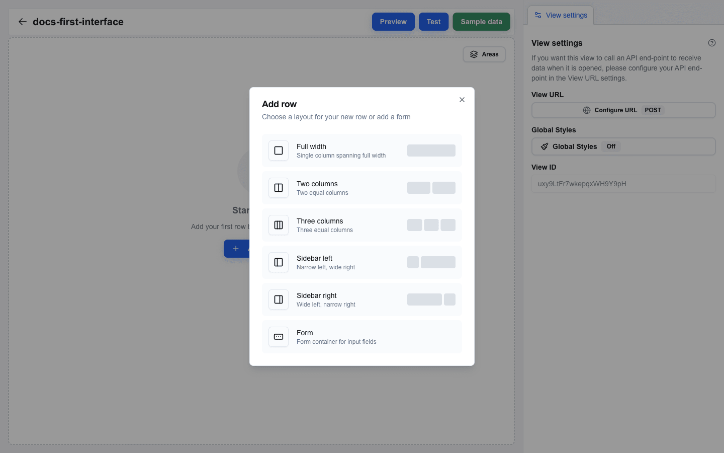
1. On an empty canvas, click the **Add first row** button. On a non-empty canvas, hover the gap between two rows and click the `+` button that appears.
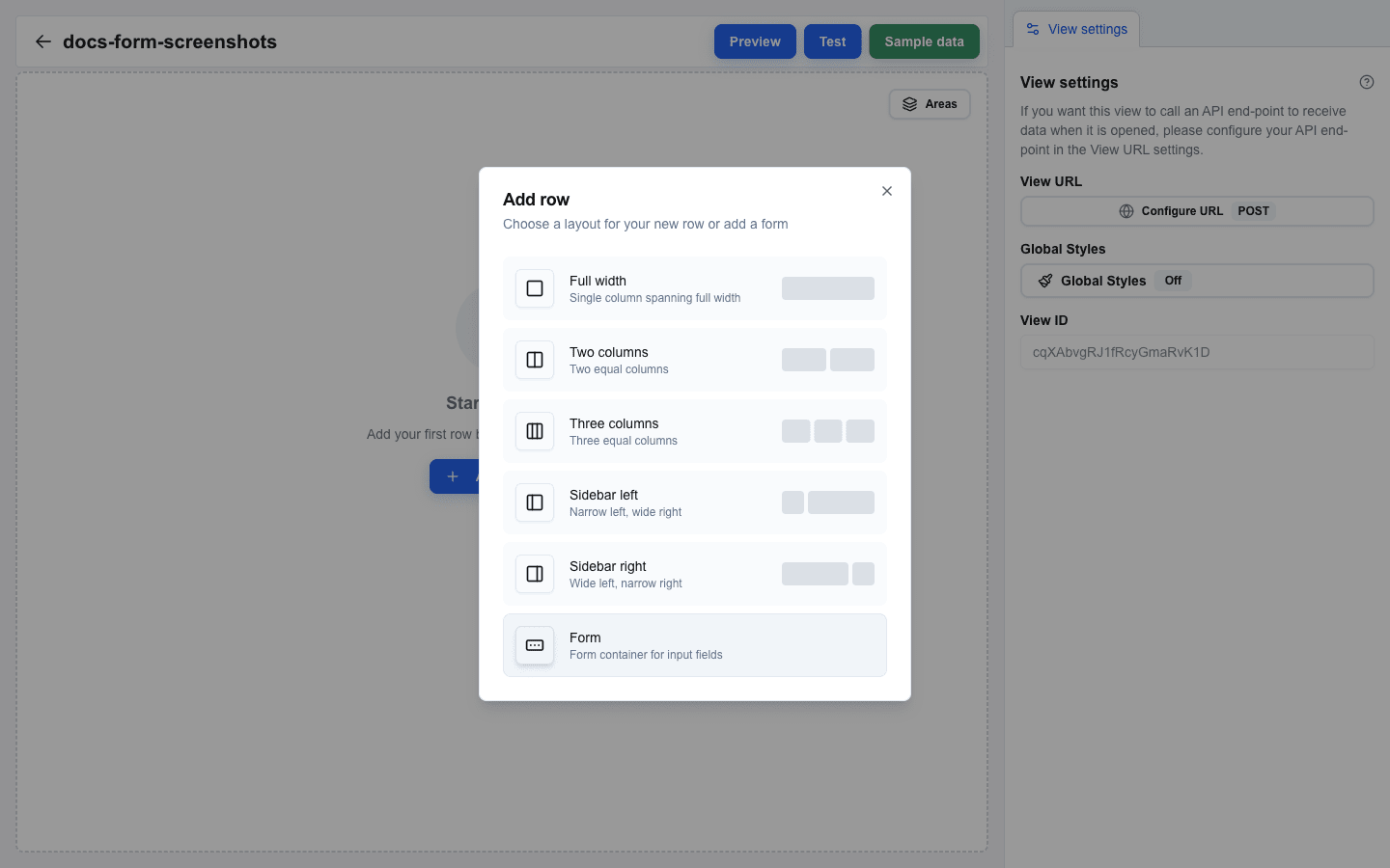
2. The **Add row** dialog opens.
3. Pick a layout:
- **Full width** — a single column at 100% width
- **Two columns** — two equal 50/50 columns
- **Three columns** — three equal 33/33/33 columns
- **Sidebar left** — 25/75 split
- **Sidebar right** — 75/25 split
- **Form** — adds a Form Start + Form End marker pair (covered in [Building a Form](/docs/buttons/interface-button/interface-builder/tutorials/03-building-a-form))
4. The dialog closes and the new row appears on the canvas as an empty container with a grey column placeholder.
 ## Adding a Title Block
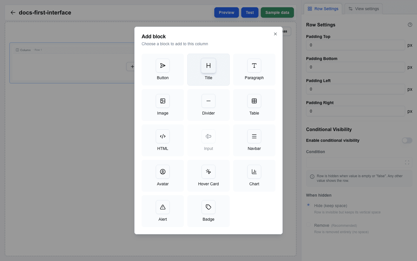
1. Click an empty column inside the row you just created. The **Add block** dialog opens.
2. Pick **Title** from the list.
3. The block appears on the canvas with an empty text value.
 ## Editing Block Content
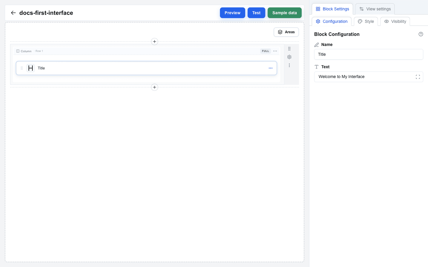
1. Click on the Title block in the canvas to select it.
2. The sidebar switches to the **Block Settings** tab.
3. You will see a **Text** field. This is a Data-Picker-enabled input that supports both static text and dynamic data placeholders.
4. Type your title text, for example: `Welcome to My Interface`.
5. The canvas updates in real-time to reflect your changes.
 ## Adding a Paragraph Block
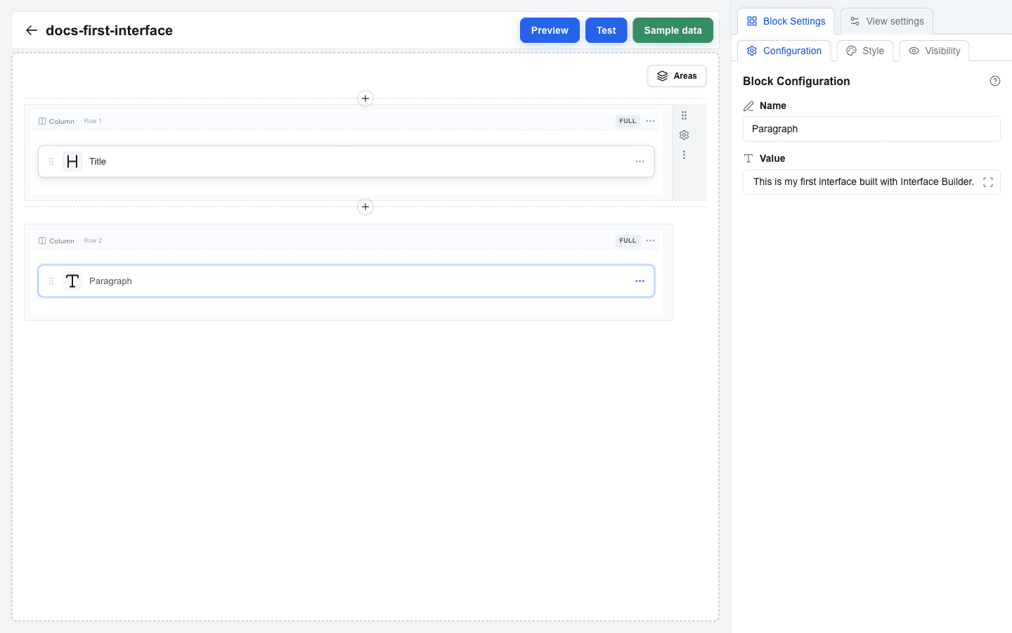
1. Add another row using the `+` button (or use a multi-column row from before).
2. Click an empty column to open **Add block** and pick **Paragraph**.
3. Click the new Paragraph block to select it.
4. In the **Block Settings** tab you will see a **Value** field — the same Data-Picker-enabled input as the Title block's **Text** field.
5. Type your paragraph text, for example: `This is my first interface built with Interface Builder.`
 ## Previewing Your Interface
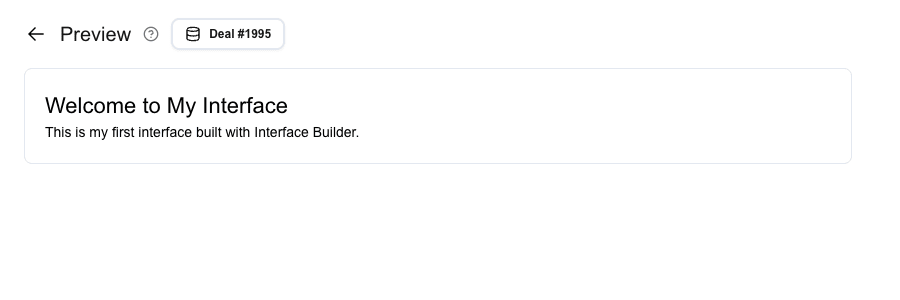
1. Click the **Preview** button in the top bar.
2. The view switches from the Builder to Preview mode.
3. In Preview mode, you see your interface rendered as it will appear to end users. Click the **Pipedrive resource** button at the top to pick a specific deal, person, or organization to test with.
4. To return to the Builder, click the back arrow at the top-left of the Preview screen.
 ## Saving
Your work is saved automatically. After a brief pause in editing, the Builder saves your latest changes to the server. You will see a **Saving...** indicator with a spinner in the top bar while the save is in progress.
There is no manual save button — just keep building and your changes are persisted.
## Summary
In this tutorial you learned to:
- Open Interface Builder from the Interface Selection Page
- Create a new view via the **Create New** button and the **Create new view** dialog
- Understand the Builder layout: canvas, sidebar, and top bar
- Add rows from the **Add row** dialog and pick column layouts
- Add Title and Paragraph blocks from the **Add block** dialog
- Edit block content via the sidebar
- Preview your interface
- Rely on auto-save for persisting your work
---
# Displaying Pipedrive Data in Your Interface
Source: https://help.theoneclick.io/docs/buttons/interface-button/interface-builder/tutorials/02-data-binding-basics.md
## What is Data Binding?
Interfaces display data from Pipedrive resources -- deals, persons, organizations, and more. Instead of typing fixed text, you bind a block's text input to a field through the **Data Picker**, and the field's current value is rendered at run time.
The Data Picker inserts each field as a small **blue tag** into the editor. The compiled syntax behind the tag is `{{resource.field}}` (for example `{{deal.title}}`), but in the builder you do not type that syntax yourself -- you click the tag you want and the editor renders it as a tag.
## Opening the Data Picker
1. Select a block on the canvas (for example, a Title or Paragraph block).
2. In the Block Settings panel, find a **Data Picker-enabled input**: Title's **Text** field, Paragraph's **Value** field, and similar fields on other blocks.
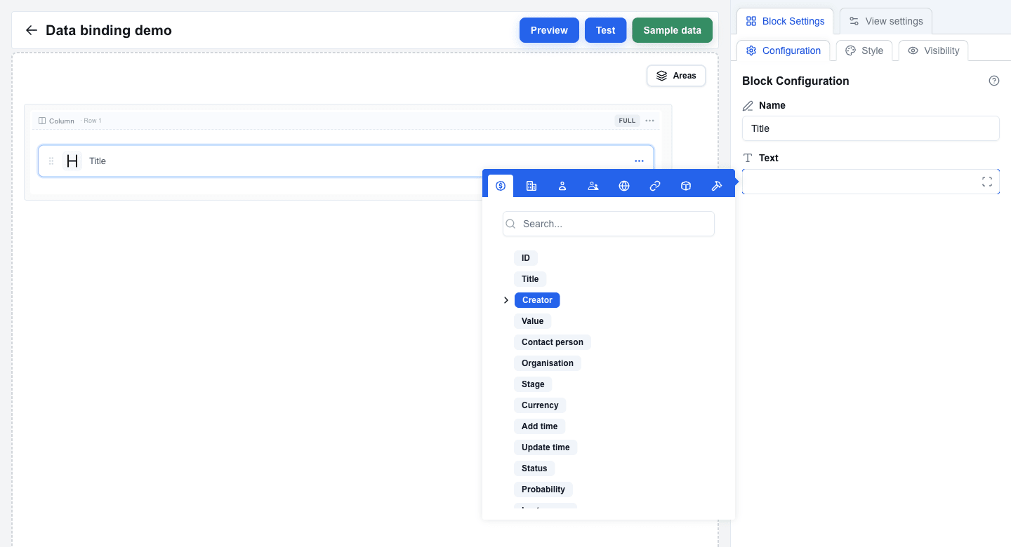
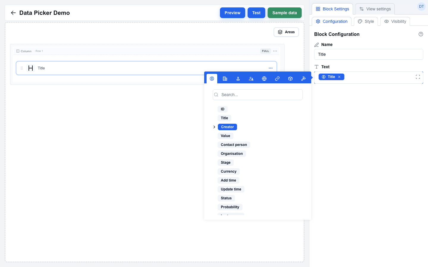
3. Click inside the input. A **Data Picker tooltip** appears next to the field.
4. The tooltip's top bar contains an icon-only row of tabs:
- **Deal** -- deal fields (title, value, currency, owner, ...)
- **Organization** -- organization fields (name, address, ...)
- **Person** -- person fields (name, email, phone, ...)
- **User** -- the current logged-in user
- **Custom** -- the JSON payload returned by your view's API endpoint or your saved Sample data
- **Search Params** -- URL parameters passed in from another view
- **Variable** -- interface-level variables you define in the Variables tab
- **Functions** -- built-in helper functions
 ## Browsing Available Data
1. Click a tab to see the fields for that resource.
2. Simple fields (such as `title` or `value`) can be clicked directly to insert them as a tag.
3. Nested fields are expandable. For example, the deal's owner is an object -- expand it to pick `owner_id.name`.
4. The Data Picker remembers which tab you last opened.
## Binding a Deal Title to a Title Block
1. Add a **Title** block to your canvas (or select an existing one).
2. In Block Settings, click the **Text** field. The Data Picker opens.
3. Select the **Deal** tab.
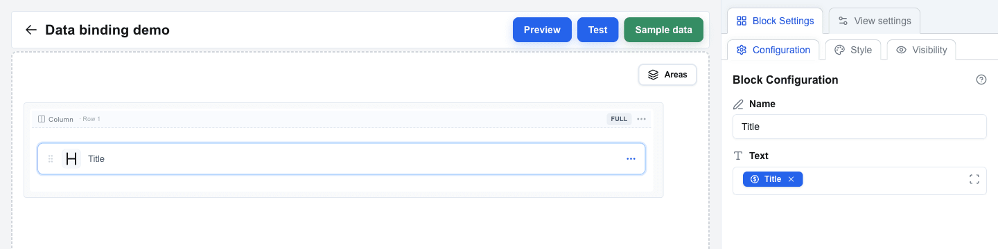
4. Click on **Title**.
5. A blue **Title** tag is inserted into the Text field. The compiled value is `{{deal.title}}`, but you don't see the curly-brace syntax -- you see the tag.
 ## Combining Static Text and Dynamic Data
You can mix typed text with multiple tags in a single field.
1. Add a **Paragraph** block and select it.
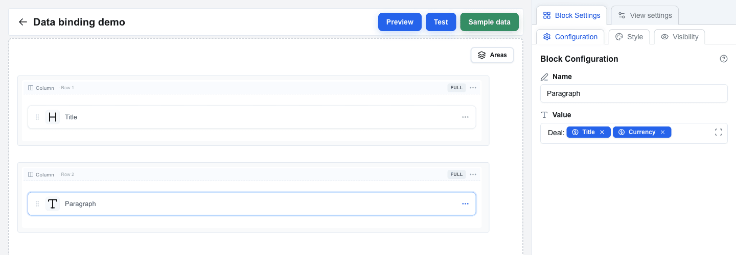
2. In the **Value** field, type: `Deal: `
3. Open the Data Picker and insert the deal **Title** tag.
4. Insert the deal **Currency** tag right after it (or with a space between them).
The editor now shows: `Deal:` followed by a Title tag and a Currency tag. The compiled output is `Deal: {{deal.title}} {{deal.currency}}`.
This technique works in any Data Picker-enabled field across all block types.
 ## Testing with Real Data
1. Click **Preview** in the top bar to switch to Preview mode.
2. In the Preview top bar, next to the **Preview** title, there is a **Pipedrive resource** button labelled with the active resource (for example `Deal #1995`). Click it to open the **Pipedrive resource** dialog and pick a different deal, person, or organization from your account.
3. The system fetches the real data for the selected resource and replaces every Data Picker tag with the actual value.
4. Your Title and Paragraph blocks render with live Pipedrive data.
If a tag references a resource that is not present (for example a person tag when no person is linked), the rendered value may be empty.
 ## Understanding Data Types
The Data Picker organises fields by data type:
- **String** -- text values such as names, titles, emails.
- **Number** -- numeric values such as deal amounts and phone numbers.
- **Object** -- nested structures (for example `deal.owner_id` containing `name`, `email`, ...). Expand the object to pick a sub-field; the resulting tag follows the path.
- **Array** -- lists of items (for example deal products). Arrays are used by blocks that iterate, such as the Table block (covered in a later tutorial).
When you pick a sub-field of an object, the Data Picker creates a tag that renders the dotted path (for example `owner_id.name`).
## Summary
In this tutorial you learned to:
- Bind block fields by inserting Data Picker tags instead of typing placeholder syntax
- Browse the eight Data Picker tabs (Deal, Organization, Person, User, Custom, Search Params, Variable, Functions)
- Mix static text and multiple tags in a single field
- Preview your interface with a chosen Pipedrive resource via the Preview top-bar dialog
- Work with nested object fields by expanding them in the Data Picker
---
# Building a Form
Source: https://help.theoneclick.io/docs/buttons/interface-button/interface-builder/tutorials/03-building-a-form.md
## How Forms Are Structured
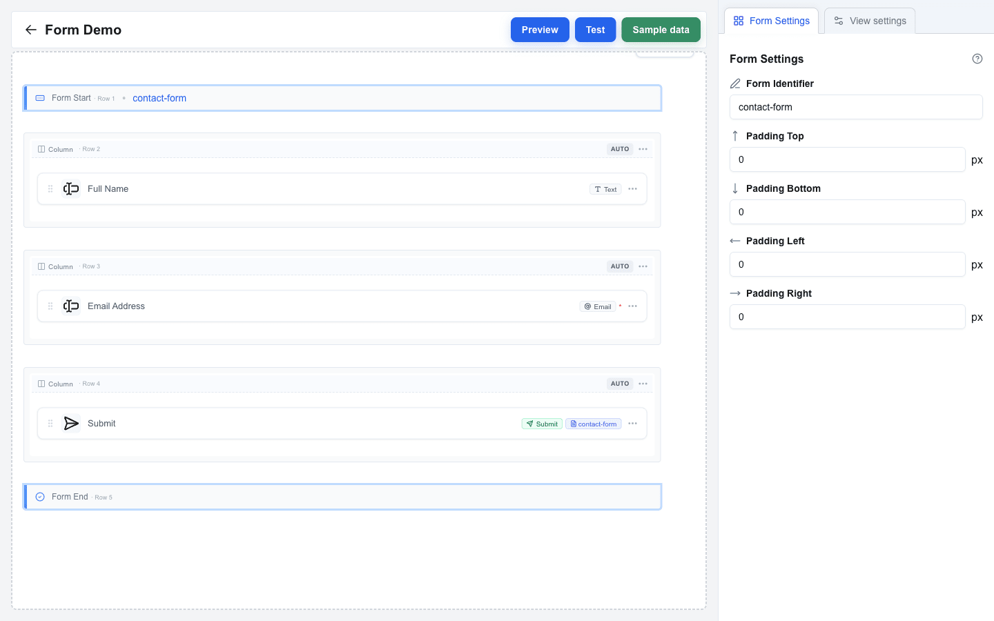
A form in Interface Builder is defined by two marker rows on the canvas -- **Form Start** at the top and **Form End** at the bottom -- with your content rows in between. Every input placed between those markers belongs to the form. A **Submit button** links to the form by its **Form Identifier** and is what users click to send their answers.
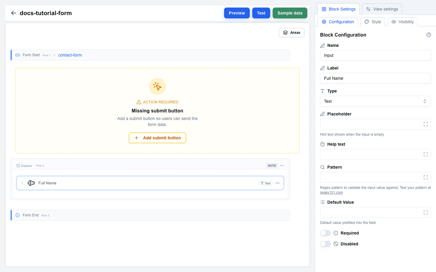
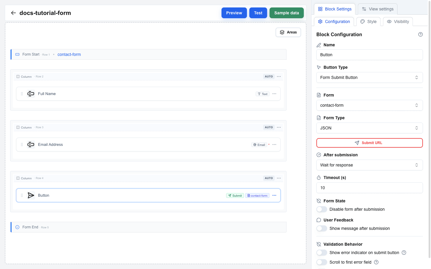
The screenshot below shows the finished tutorial form on the canvas: Form Start carries the `contact-form` identifier badge, and the Submit button shows the same `contact-form` badge — that match is how the button knows which form to send.
 ## Step 1: Add a Form Element
1. Hover the canvas (or the gap between two rows) to reveal a small `+` button.
2. Click `+` to open the **Add row** dialog.
3. Pick **Form** from the layout list.
Two marker rows appear on the canvas: **Form Start** on top and **Form End** at the bottom, with empty space between them.
 ## Step 4: Add an Email Input
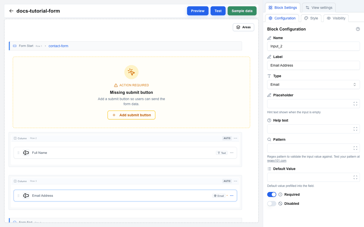
1. Repeat the same steps to add another row inside the form.
2. Add a second Input block in the new column.
3. Set **Label** to `Email Address`.
4. Change **Type** to **Email**.
5. Turn on the **Required** switch.
 ## Step 5: Add a Selection Input (Optional)
If you want a drop-down or multi-choice field, pick one of these selection types for **Type**: **Single Select**, **Multi Select**, **Checkbox**, or **Radio**. An **Options Type** selector then appears with two choices:
- **Static** -- you define label/value pairs manually. Use the options editor that appears to add each pair.
- **Dynamic** -- options come from data at render time using the Data Picker. Enter Data Picker expressions for **Labels** and **Values**.
## Step 6: Add Pattern Validation (Optional)
For the simple input types (Text, Email, Number, URL, Date) you can add regex validation:
1. In the input settings, scroll to the **Pattern** field and enter a regex (for example, `^[A-Za-z ]+$`).
2. Optionally fill **Pattern Error** with a custom message shown when the pattern fails.
Test your regex at [regex101.com](https://regex101.com/) before pasting it in.
## Step 7: Add a Submit Button
1. Add a new row using the `+` button. It can be inside or outside the form boundaries — both work.
2. Click an empty column in the new row, then pick **Button** in the **Add block** dialog.
3. Click the new Button to open its settings. Set **Button Type** to **Form Submit Button**.
4. A **Form** dropdown appears. Pick `contact-form` from the list.
 ## Step 8: Configure Submission
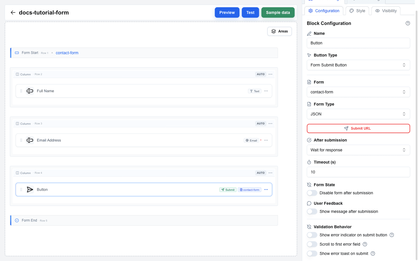
Once Button Type is Form Submit Button, extra settings appear. You will set **Form Type**, **Submit URL**, and an **After submission** behavior.
### Form Type
- **JSON** (default) -- posts form values as a JSON payload to the Submit URL.
- **Multipart/Form-Data** -- use this whenever any input has **Type = File**.
- **Open view with form data** -- instead of posting anywhere, navigates to another view and passes input values as URL search parameters.
### Submit URL
For **JSON** and **Multipart/Form-Data**, enter the endpoint in **Submit URL**. Opening the URL input reveals an advanced dialog where you can also add:
- **Headers** -- custom HTTP headers (key/value pairs; values support the Data Picker).
- **Query parameters** -- additional query string pairs.
### After submission
Pick one of:
- **Wait for response** -- waits up to **Timeout (s)** seconds (10--60) for the server to reply. You can turn on **Disable form after submission** (prevents double-submits) and **Show message after submission** (displays the server's confirmation).
- **Select view** -- immediately navigates to a chosen **View ID** after sending. You can pass static parameters, and optionally forward every input value as search parameters to the target view.
 ## Step 9: Add a Reset Button (Optional)
To let users clear the form:
1. Add another Button block (use the `+` button to add a row, then **Add block** → **Button**).
2. Set **Button Type** to **Form Reset Button**.
3. In the **Form** dropdown, pick `contact-form`.
## Step 10: Test the Form
1. Click **Preview** in the top bar. The form renders with live inputs.
2. Fill in the fields and click the submit button to see the behavior you configured.
3. For an end-to-end test, click **Test** in the top bar -- test mode runs the interface closer to production.
 ## Summary
In this tutorial you learned how to:
- Pick **Form** in the **Add row** dialog and work with the **Form Start** / **Form End** markers on the canvas
- Set a **Form Identifier** to name the form
- Add **Input** blocks with different **Types** (Text, Email, and selection types)
- Configure selection inputs with **Options Type** (Static or Dynamic)
- Add **Pattern** validation with a custom **Pattern Error** message
- Add a **Form Submit Button** and link it to the form
- Configure **Form Type**, **Submit URL**, **Headers**, and **After submission**
- Add a **Form Reset Button** to clear the form
- Test the form in Preview and Test modes
---
# Building a Multi-View Application
Source: https://help.theoneclick.io/docs/buttons/interface-button/interface-builder/tutorials/04-multi-view-app.md
## What are Views?
An interface can contain multiple **views** (pages). Each view is a separate canvas with its own rows and blocks. One view is marked as the **default view** -- it carries a green **Start** badge in the views list and is the view displayed by default when the interface loads.
Users navigate between views using:
- **Action buttons** with the "go to view" action
- **Navbar blocks** with interface-type links
Views are managed from the **Interface Views** page, where every view in the current interface is shown as a card.
## Creating a Second View
1. Go back to the **Interface Views** page by clicking the back arrow in the top bar of the Builder.
2. Click **Create New** to open the **Create new view** dialog.
3. Give it a descriptive name (for example `Order summary`) and click **Create**.
4. Back on the Interface Views list, click the **Edit** button on the new view's card to open it in the Builder.
 ## Building the Second View
1. With the new view open in the Builder, add rows and blocks as needed.
2. For example, add a Title block bound to `{{deal.title}}` and a Paragraph block showing deal details.
3. This view will serve as a detail page that users navigate to from the first view.
## Adding Navigation with an Action Button
On the first view, set up a button that navigates to the second view:
1. Go back to the Interface Views page and open your first view.
2. Add a **Button** block to the canvas.
3. In Button settings, set the **Button Type** to `Action Button`.
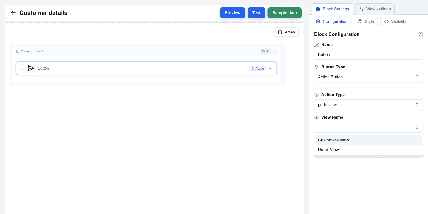
4. A new **Action Type** dropdown appears with two options:
- **back** -- navigates to the previous view
- **go to view** -- navigates to a specific view
5. Select **go to view**.
6. A **View Name** dropdown appears, listing all views in this interface. Select the second view you just created.
7. The button now navigates users to that view when clicked.
 ## Adding a Back Button
On the second view, add a way to return to the first view:
1. Open the second view in the Builder.
2. Add a **Button** block.
3. Set the **Button Type** to `Action Button`.
4. Set the **Action Type** to **back**.
5. This button returns users to whatever view they came from.
The settings panel looks the same as for "go to view" — just without the **View Name** dropdown.
## Passing Parameters Between Views
Action buttons can pass data from one view to another using parameters. The receiving view accesses these values via the **Search Params** tab in the Data Picker.
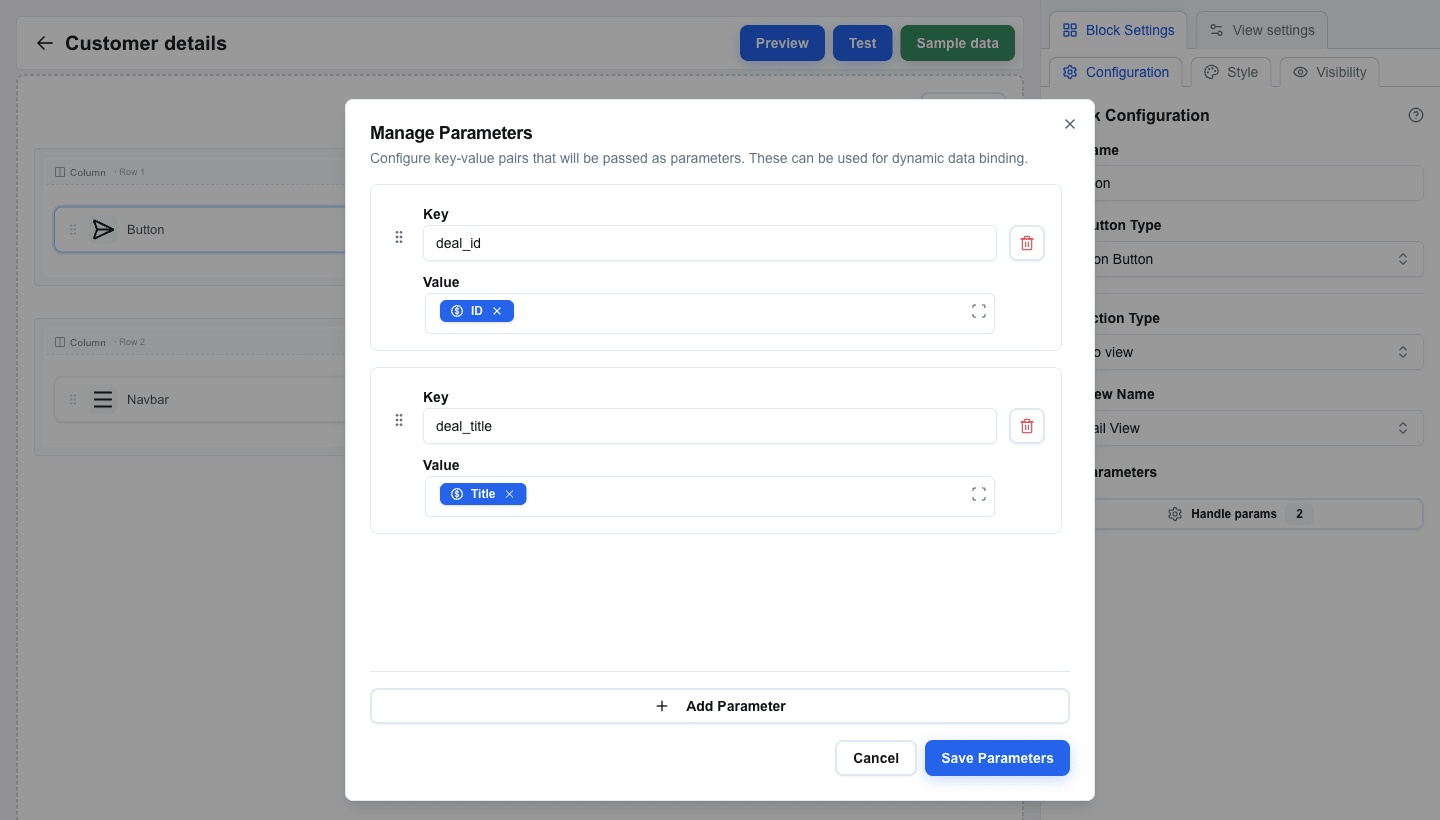
1. On the first view, select your "go to view" Action Button.
2. Below the View Name dropdown, you will see a **Parameters** section.
3. Click to open the parameters dialog.
4. Add key-value pairs. For example:
- Key: `deal_id`, Value: a Data Picker tag pointing to the deal's **ID** field.
- Key: `deal_title`, Value: a Data Picker tag pointing to the deal's **Title** field.
5. Values support Data Picker expressions, so you can pass dynamic data.
On the receiving view:
1. Select a block (for example, a Title block).
2. Open the Data Picker and switch to the **Search Params** tab (the icon-only tab in the picker's top bar).
3. You will see the parameter keys you defined. Selecting one inserts a tag that compiles to `{{searchparams.deal_id}}`.
 ## Using Navbar for Navigation
For persistent navigation across your interface, use a **Navbar** block:
1. Add a **Navbar** block to a row on your view. It typically goes in a full-width row at the top.
2. Click the Navbar block to open its settings. The settings are divided into sections.
### Brand
- Toggle **Show title** to display a text title in the navbar. Configure **Title Text**, **Font Size (px)** (12–48), **Font Weight** (Normal, Medium, Semibold, Bold), and **Title Color**.
- Toggle **Show logo** to display a logo image. Provide the **Image URL**, **Alt Text**, and **Width / Height (px)**.
### Aria Label
Below the Brand section, set the **Aria Label** for the navigation element (defaults to "Navigation menu"). This helps screen readers identify the navigation purpose.
### Layout
- **Layout Direction** — Horizontal or Vertical
- **Alignment** — Left, Center, Right, or Space Between
- **Spacing (px)** — pixel spacing between nav items (0–50)
### Navigation Links
1. Click the **Manage Links** button to open the links dialog.
2. Click **Add** to create a new link. Each link has:
- **Label** — the text displayed in the navbar
- **Link Type** — choose between:
- **Interface** — navigates to another view within this interface. Select the target view from the **Target Interface** dropdown. You can also add **Parameters** (key-value pairs) that are passed to the target view.
- **External URL** — opens an external URL (supports Data Picker expressions)
3. Add links for each view you want in your navigation.
4. Reorder links by dragging the grip handle on each link card.
5. Delete links using the trash icon.

 ## Summary
In this tutorial you learned to:
- Create multiple views from the Interface Views page
- Use Action Buttons with the "go to view" action to navigate between views
- Add "back" buttons for return navigation
- Pass parameters between views using key-value pairs and Data Picker expressions
- Access passed parameters on the receiving view via the Search Params tab
- Set up a Navbar block with interface-type links for persistent navigation
- Configure navbar Brand, Aria Label, Layout, and link settings
---
# Building a Table View
Source: https://help.theoneclick.io/docs/buttons/interface-button/interface-builder/tutorials/05-table-view.md
## When to Use Tables
The **Table** block displays array data in a structured grid with rows and columns. Common use cases include:
- Displaying deal products or line items
- Showing lists of related contacts or organizations
- Rendering any array data from Pipedrive or custom sources
Tables support configurable columns, per-row actions, sorting, conditional visibility, and custom styling.
## Adding a Table Block
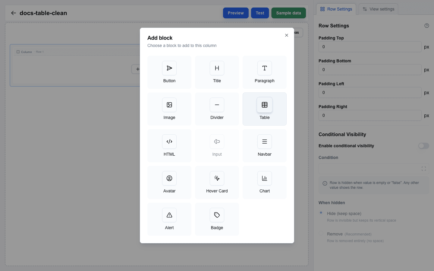
1. Hover the canvas (or the gap between rows) to reveal the `+` button. Click it and pick **Full** in the **Add row** dialog — full-width works best for tables.
2. Click the empty column inside the new row to open **Add block**, then pick **Table**.
3. Click the Table block to open its settings in the sidebar.
 ## Setting the Data Source
The table needs an array data source to iterate over.
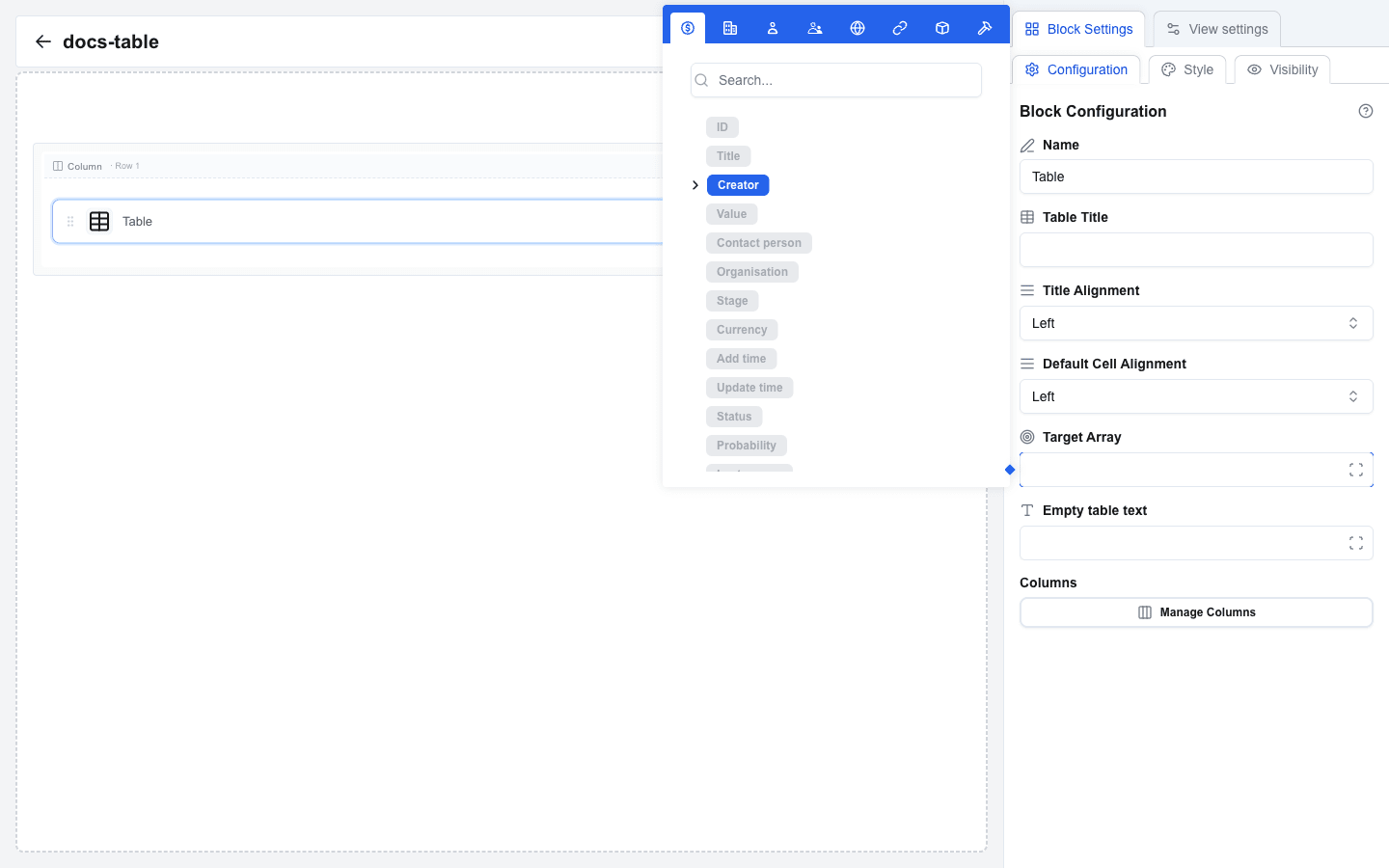
1. In Table settings, find the **Target Array** field. This is a Data Picker input that specifies which array to display.
2. Click the Target Array field to open the Data Picker.
3. Navigate to an array field. For example, under the **Deal** tab, find a field that contains array data (such as deal products or a custom field that returns a list).
4. You can also use the **Custom** tab if your data comes from a custom JSON source.
5. Select the array field. The placeholder is inserted into the Target Array field.
The table renders one row per item in the array.
 ## Table Header (Optional)
Above the data source, the sidebar exposes:
- **Table Title** — optional text rendered above the table, for example `Deal Products`. It is plain text: the Data Picker is not available here.
- **Title Alignment** — Left, Center, or Right alignment for the title text.
- **Default Cell Alignment** — fallback alignment applied to every column that does not set its own alignment. Choose Left, Center, or Right.
- **Empty table text** — text shown when the Target Array resolves to an empty list. This is a Data Picker input and supports dynamic values.
## Configuring Columns
Columns define what data appears in each table column. Use the **Manage Columns** dialog to add and configure them.
1. Click the **Manage Columns** button in Table settings.
2. The dialog opens with a column list on the left and a settings panel on the right.
3. Click the **Add** dropdown to add a new column. You can choose between:
- **Add value column** — displays data from each array item.
- **Add action column** — displays clickable action icons.
- **Add subrow** — displays an extra row of text rendered below each row (useful for descriptions or secondary info).
4. Select a column on the left to edit its settings on the right.
Columns can be reordered by dragging the grip handle, duplicated with the copy icon, or deleted with the trash icon. Subrow columns cannot be reordered — they always render below the main row.
Each column has its settings split across four tabs in the right panel:
- **General** — the data fields that drive the column.
- **Styling** — width, cell alignment, and cell padding.
- **Sorting** — whether the column is sortable and how.
- **Conditional** — when the column is visible.
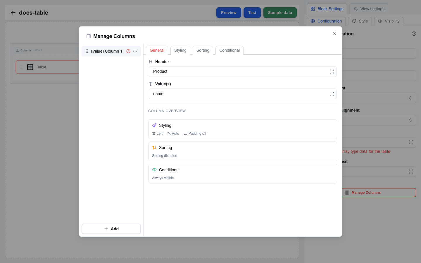
### Value Columns: General Tab
For each value column, fill in:
- **Header** — the column header text. This is a Data Picker input, so you can use static text or dynamic values.
- **Value(s)** — the data field to display for each row. This is a Data Picker input that resolves relative to each array item. For example, if your array contains objects with a `name` property, enter `name` or use the Data Picker to select the field.
 ### Value Columns: Styling Tab
- **Cell Alignment** — Left, Center, or Right for the cell content.
- **Column Width** — pick **Auto**, or set a fixed width in `%` or `px`.
- **Cell padding** — toggle to override the table default. When enabled, you can set Top, Right, Bottom, and Left padding individually.
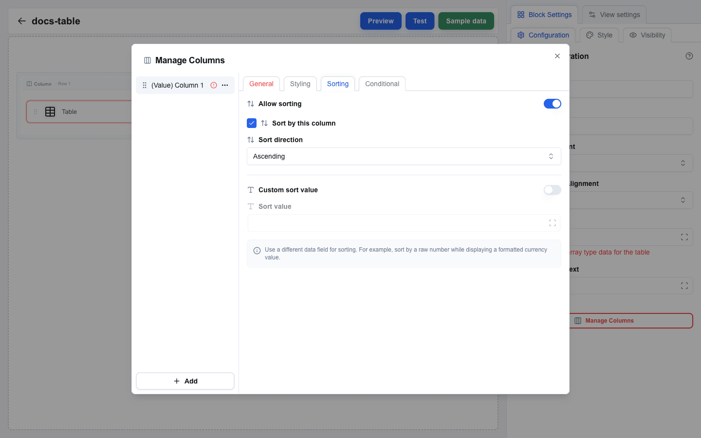
### Value Columns: Sorting Tab
- **Allow sorting** — toggle to let end-users click the column header to reorder rows.
- **Sort by this column** — when enabled, this column is the table's default sort. Only one column can hold this flag.
- **Sort direction** — **Ascending** or **Descending** for the default sort.
- **Custom sort value** — when enabled, sort rows by a different value than the displayed one. Provide a Data Picker path for **Sort value**.
 ### Value Columns: Conditional Tab
- **Enable conditional visibility** — toggle to hide the column based on a condition.
- **Condition** — Data Picker expression. The column is hidden when the value resolves to empty or `"false"`. Any other value shows the column.
## Action Columns
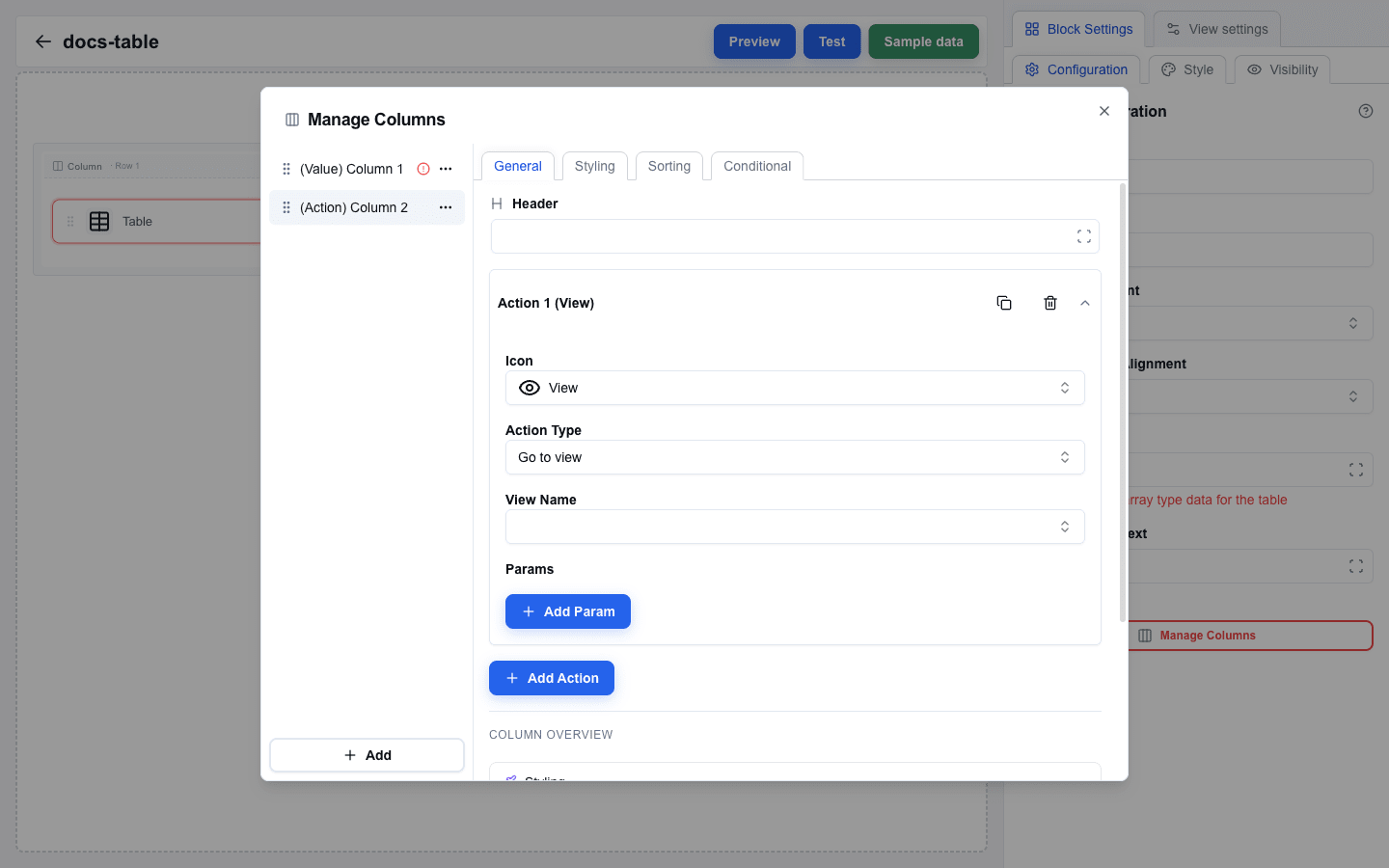
Action columns add clickable buttons to each row, allowing users to perform operations on individual items. A button can show an icon, a text label, or both.
1. In the Manage Columns dialog, click **Add** and select **Add action column**.
2. The General tab shows the column's **Header** plus an accordion of **actions**. Each action has:
- **Icon** — choose from grouped **Actions**, **Communication**, **Files**, and **Status** icons. The set includes View, Edit, Delete, Add, Copy, Play, Refresh, External link, Mail, Send, Phone, Message, Bell, User, File, Folder, Download, Upload, Image, Attachment, Print, Archive, Check, Close, Warning, Info, Clock, Star, Heart, Lock, and Unlock. Select **Custom** to fill **Custom Icon** with an image URL through the Data Picker.
- **Action Type** — pick **Go to view** to navigate within the interface, **Go to URL** to open a URL, or **Send request** to send a POST without leaving the table.
- **Label** — optional button text, shown after you pick an Action Type. It supports the Data Picker and resolves per row. With a Label set, **Icon position** chooses which side the icon sits on, and the Icon picker offers **No icon** for a text-only button.
- **View Name** — when Action Type is **Go to view**, pick the destination from the dropdown. Optionally configure **Parameters** (key-value pairs passed to the target view; values reference fields from the current row).
- **URL** — when Action Type is **Go to URL**, fill the address. The URL field supports Data Picker expressions, so you can construct URLs with row data.
- **Request URL** — when Action Type is **Send request**, enter an absolute HTTP or HTTPS endpoint. Use the Data Picker to include row values.
- **Body Data** — optionally configure a JSON payload as JSON or key-value pairs. Include the row's identifier because OneClick metadata identifies the view resource, not the row. Leave it empty for no configured body.
- **Omit OneClick metadata envelope** — leave off to send Body Data alongside OneClick metadata; turn on to send only Body Data. Test requests in the Test view; Preview shows them disabled.
- **Require confirmation** — when Action Type is **Send request**, turn this on to ask before the request is sent. The **Title** and **Description** support the Data Picker, so the dialog can name the row it acts on.
3. Click **Add Action** to add more actions to the same column.
4. Each action can be duplicated or deleted from the action's accordion menu.
The Styling, Sorting, and Conditional tabs apply to action columns in the same way as value columns.
 ### Passing Row Data to Another View
When an action navigates to a view, you can pass data from the current table row:
1. Set the action's **Action Type** to **Go to view**.
2. Choose the target view from **View Name**.
3. Expand the **Parameters** section.
4. Add key-value pairs where the values reference fields from the current array item. The Data Picker context is scoped to the current row, so you can directly select fields from the row item.
## Subrow Columns
A **subrow** column adds a second line of text below each main row — useful for descriptions, hints, or secondary details that do not need their own column.
- **Path** — the data field rendered as the subrow's text (Data Picker).
- The Styling tab supports **Cell Alignment** and **Cell padding** for the subrow text. Conditional visibility is not available for subrow columns.
## Customizing Appearance
In addition to per-column styling, the Table block uses the standard block style settings:
- **Background color**
- **Font size and color**
- **Borders** — top, right, bottom, and left borders with width, style, and color
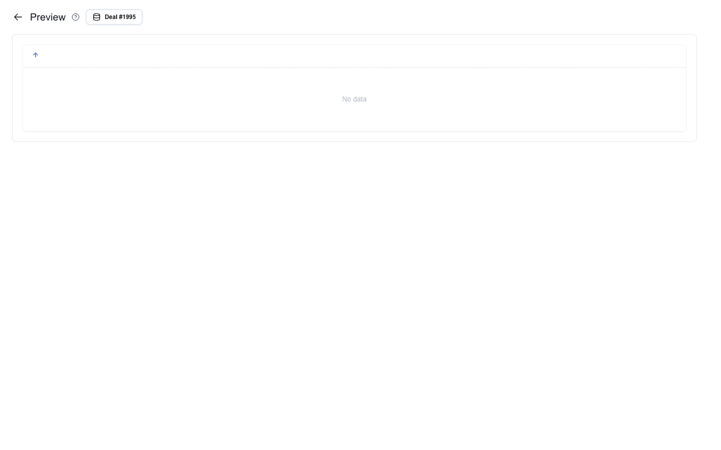
The table renders with structured headers and data rows. When the array is empty, the **Empty table text** (if configured) is shown.
 ## Summary
In this tutorial you learned to:
- Add a Table block and set its data source via the **Target Array** field
- Configure the **Table Title**, **Title Alignment**, **Default Cell Alignment**, and **Empty table text** at the table level
- Add **value**, **action**, and **subrow** columns from the **Manage Columns** dialog
- Configure each column across the **General**, **Styling**, **Sorting**, and **Conditional** tabs
- Add **Go to view**, **Go to URL**, and **Send request** actions with per-row data
- Toggle **Allow sorting**, set a default sort column and direction, and use a custom sort value
- Hide columns conditionally using the **Conditional** tab
---
# Creating a New View
Source: https://help.theoneclick.io/docs/buttons/interface-button/interface-builder/how-to/views/creating-a-view.md
## Interface Views Page
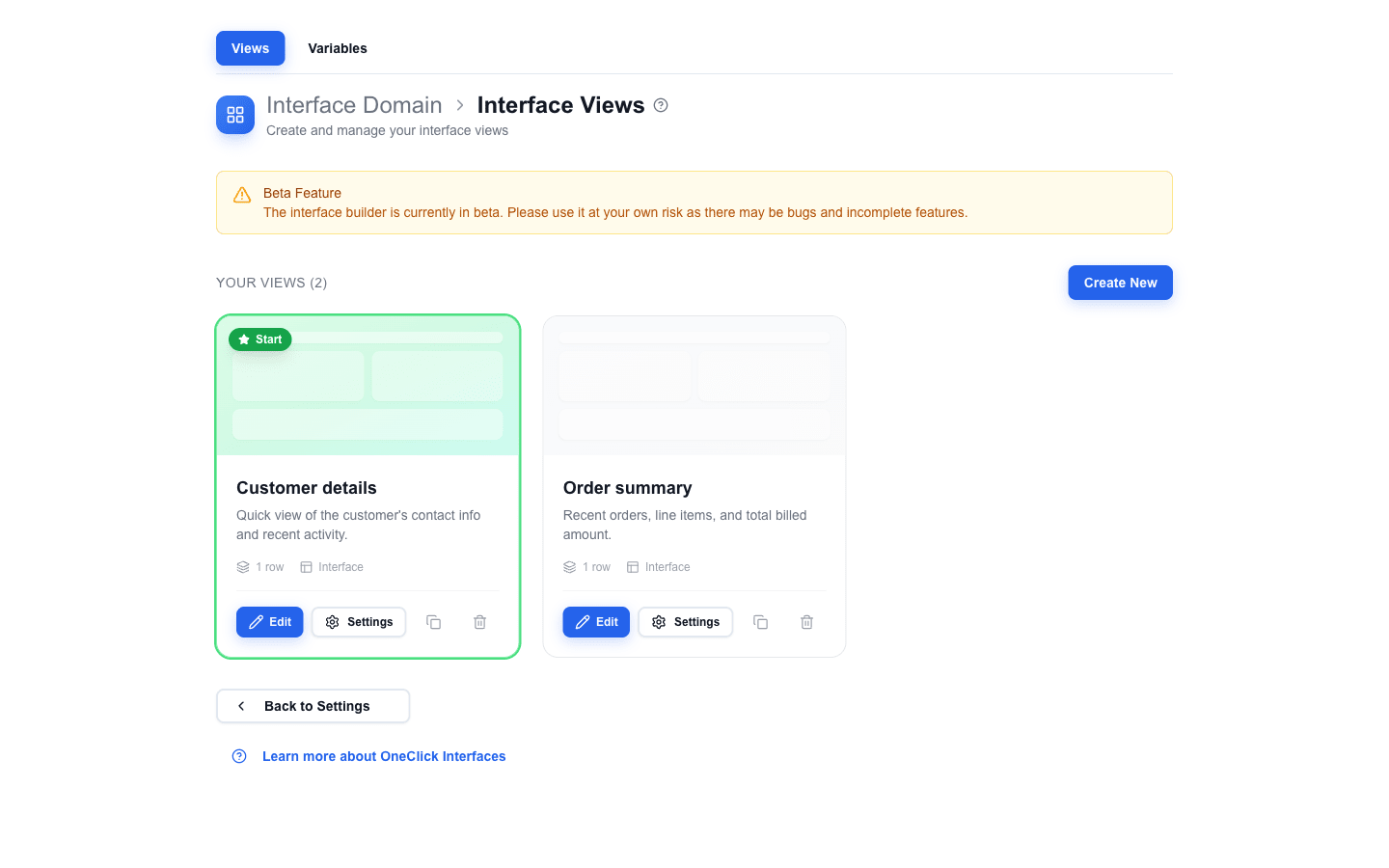
Open the views list for an interface from the interface management page (the **Interface Domain > Interface Views** breadcrumb). The page shows every view in the interface as a card with its name, description, row count, and the **Start** badge on whichever card is the main view.
 ## Creating a New View
1. Click **Create New** in the top-right of the **Your Views** section.
2. The **Create new view** dialog opens. Fill in:
- **Name** -- a unique, descriptive name. The name is used in navigation references (action buttons, navbar links, form-after-submit selectors) and in the view-selector dropdowns inside the builder. Choose clear names like `Customer details`, `Order summary`, or `Edit form`.
- **Description** -- optional context shown on the view card.
- **Default view** -- when on, this view becomes the interface's main view (see [Main View](#main-view) below). The first view of an interface is forced to be the default and the toggle is disabled.
3. Click **Create**. The view is created with an empty canvas and the builder opens automatically.
## Editing the View in the Builder
Click **Edit** on a view card (or open a view from the breadcrumbs) to start working on it in the builder. From there you can:
- Add rows and blocks.
- Configure data bindings via the Data Picker.
- Set Global Styles for view-wide font, colour, and gap defaults.
- Configure Areas to group rows for shared visibility or looping.
Each view has its own independent layout, rows, blocks, and settings. Edits auto-save -- there is no separate save or publish step. See [Saving](/docs/buttons/interface-button/interface-builder/how-to/views/publishing) for the auto-save and validation rules that apply.
## Card Actions
Each view card has four action buttons:
| Button | What it does |
|---|---|
| **Edit** | Opens the view in the builder. |
| **Settings** | Opens the **Edit view** dialog. Same fields as **Create new view** plus a read-only **ID** -- use this dialog to rename, edit the description, or change which view is the main view. |
| **Copy** (clipboard icon) | Duplicates the view inside the same interface. The copy is never the main view. |
| **Delete** (trash icon) | Removes the view after a confirmation prompt. |
## Main View
The main view is the one that opens when a user clicks the OneClick button in Pipedrive. In the views list it is highlighted with a green border and a **Start** badge (star icon) on the card preview.
To change which view is the main view:
1. Click **Settings** on the view card you want to promote.
2. In the **Edit view** dialog, turn on the **Default view** switch.
3. Save.
Only one view can be the main view at a time -- enabling **Default view** on a different card automatically clears it on the previous main view. Other views are reached through navigation actions: Action Buttons, Navbar links, Table action columns, and form submissions. See [Navigating Between Views](/docs/buttons/interface-button/interface-builder/how-to/views/navigation) for setup details.
---
# Managing Interface Views
Source: https://help.theoneclick.io/docs/buttons/interface-button/interface-builder/how-to/views/managing-interface-views.md
Interface Views is the top-level list of all views under a single interface (for example, a deal-details panel, a product form, a summary page). This page covers the tools for managing that list from the home screen.
## The Interface Views list
Open the Interface Views page from the home screen. The list shows one card per view. Each card contains:
- A **preview area** with an abstract miniature of the view's layout. Hovering reveals an **Open Editor** overlay you can click to jump straight into the builder.
- A **Start** badge in the top-left of the preview when the view is the interface's default view.
- An **Error** badge instead, if the view's saved data fails to parse.
- The view **name** and **description**.
- Stats: the **row count** and an **Interface** label.
- Action buttons:
- **Edit** -- the primary call-to-action; opens the view in the builder.
- **Settings** -- opens the view's settings dialog (rename, edit description, mark as default, etc.).
- **Copy view** -- icon button with a tooltip; duplicates the view.
- **Delete view** -- icon button with a tooltip; removes the view.
 ---
# Navigating Between Views
Source: https://help.theoneclick.io/docs/buttons/interface-button/interface-builder/how-to/views/navigation.md
## Action Button
The Action Button is the primary way to navigate between views.
1. Add a **Button** block to your view.
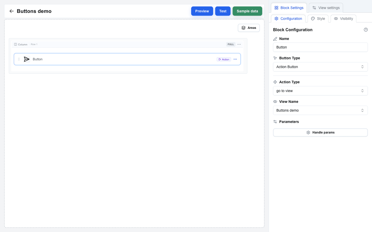
2. Set **Button Type** to **Action Button**.
3. Choose an **Action Type**:
- **go to view** -- navigates to a selected view. A **View Name** dropdown lists every view in the interface.
- **back** -- returns to the previous view.
4. Optionally click **Handle params** under **Parameters** to add key/value pairs that get forwarded to the target view. Values support the Data Picker.
 ## Navbar Links
The **Navbar** block supports interface-type links for view navigation:
1. Add a **Navbar** block to your view.
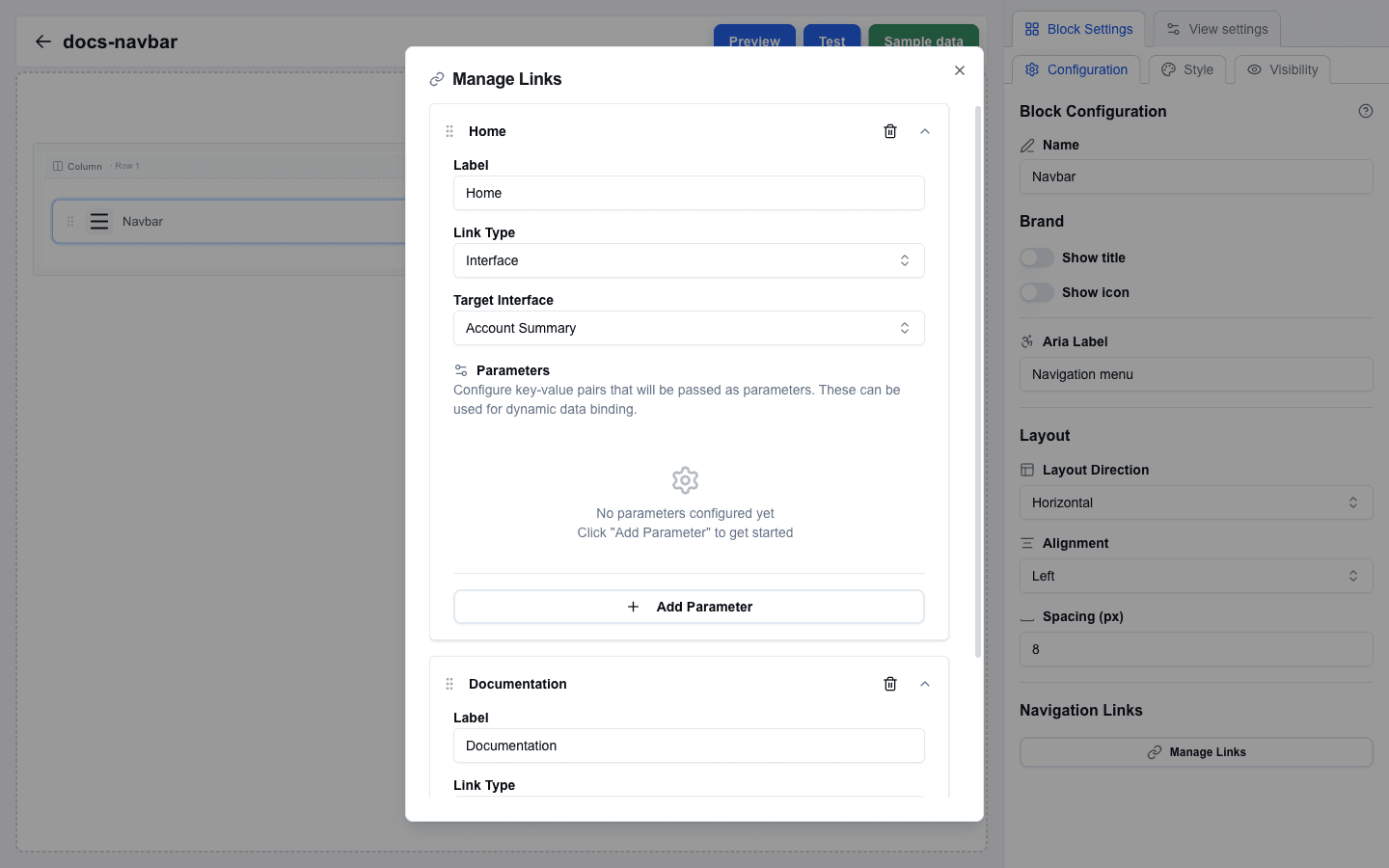
2. Click **Manage Links** in Block Settings to open the link manager dialog.
3. Click **Add** and configure the new link:
- **Label** -- the clickable text shown on the navbar.
- **Link Type** -- pick **Interface** for in-interface navigation (or **External URL** for an outside link).
- **Target Interface** -- the destination view dropdown. Shown when **Link Type** is **Interface**.
- **Parameters** -- key/value pairs passed to the target view. Click **Add Parameter** to add rows.
 ## Table Actions
Table blocks can include row action columns that navigate to views. Configure a column as an action column, add an action with **Action Type = Go to view**, pick a **View Name**, and optionally add **Params** -- the action will navigate to the chosen view with those params, alongside the row's data, when a user clicks the icon.
## Form After Submit
When a form is submitted, you can navigate to a different view:
1. Set the submit button's **After submission** to **Select view**.
2. Pick the target view from the **View ID** dropdown.
3. Optionally add **Parameters** -- key/value pairs passed alongside the navigation.
4. Turn on **Use input values as search params** to automatically forward every form field value as a URL search parameter on the navigation.
Alternatively, set **Form Type** to **Open view with form data** to skip the HTTP submission entirely. The submit button hides its Submit URL and After submission settings, forwards every form input value as a search parameter to the chosen view, and navigates immediately when the user clicks submit.
## Passing Parameters
All navigation methods support passing parameters:
- **Action Button** -- click **Handle params** under **Parameters** and add key / value entries.
- **Table action column** -- each action has its own **Params** key / value editor.
- **Navbar links** -- each link has its own **Parameters** section inside the Manage Links dialog.
- **Form Submit Button** (After submission = **Select view**) -- use **Parameters** for explicit pairs and / or **Use input values as search params** to forward every form field.
The target view receives these as URL search parameters, accessible from the Data Picker's `searchparams` tab (icon-only) and compiled to `{{searchparams.key}}` placeholders at render time.
---
# Saving
Source: https://help.theoneclick.io/docs/buttons/interface-button/interface-builder/how-to/views/publishing.md
## Auto-Save
Interface Builder saves automatically. After you stop editing for a brief moment, the change is written to the server -- there is no save button and no publish step. You do not push a view live; it **is** live. The moment a save completes, anyone opening the view in Pipedrive sees your latest edits.
:::caution[Every save is immediately live]
Preview and Test modes inside the builder render against the same saved data — they do **not** isolate changes from end users. Anyone opening the OneClick button while you're editing sees your in-progress edits. See [External Data Flow](/docs/buttons/interface-button/interface-builder/explanation/external-data-flow) for what each mode does and does not call.
For risk-free experimentation, copy the OneClick button in Pipedrive and edit the copy's interface, then point users at the new button when the changes are ready.
:::
## Validation
Before each save the builder runs a validation pass over the whole view -- rows, blocks, forms, and every setting. If something is wrong, an **Action required** card appears on the canvas with a quick-fix button, and the save is blocked until you resolve the issue. This means a broken view never reaches end users.
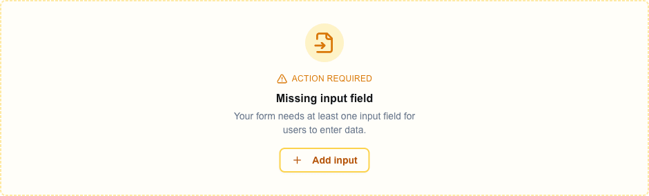
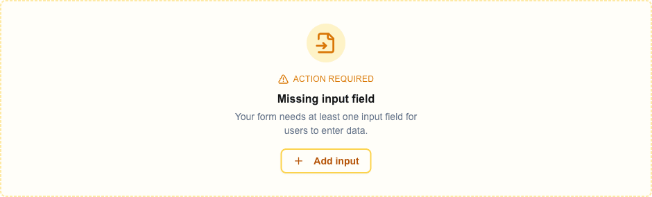 The card icon, title, description, and quick-fix button vary by issue. For incomplete forms the card title is **Missing input field** (with an **Add input** button) or **Missing submit button** (with an **Add submit button** button); other issues surface as inline errors next to the affected field in Block Settings.
## Common Validation Errors
These messages come straight from the validation layer. Each one blocks save until fixed.
| Error | Cause | Fix |
|---|---|---|
| **Form requires at least one submit button** | A form has no submit button. | Add a Button block with **Button Type = Form Submit Button** and pick this form in the **Form** dropdown. |
| **Form requires at least one input field** | A form has no Input blocks. | Add at least one Input block between Form Start and Form End. |
| **Form start requires a corresponding form end** | A `Form Start` row exists without a matching `Form End`. | Add the `Form End` row, or delete the orphan `Form Start`. |
| **Input field must be inside a form** | An Input block sits outside any form. | Move it between a `Form Start` and `Form End` row. |
| **Input name must be unique** | Two Input blocks share the same internal name (usually from copy-paste). | Delete one and re-add it so the builder generates a unique name. |
| **Submit button requires a form to exist** / **Reset button requires a form to exist** | A Form Submit or Form Reset Button points at a Form Identifier that does not exist. | Create a form with that identifier or pick an existing form. |
| **URL is required** | A URL Button or external Navbar link, or a Submit URL on a JSON / Multipart form, has no URL set. | Fill the missing URL field. |
| **You can't use the file input type because the form doesn't submit anything -- it opens a new view with the input values as search parameters.** | A form with file inputs uses **Open view with form data** as its Form Type. | Remove the file input or change **Form Type** to **JSON** or **Multipart/Form-Data**. |
## Testing a Live View
Once a save completes, the view is live. To test it the way users see it:
- Use **Test mode** inside the builder (the **Test** button in the top bar) to run the view with real records.
- Or open the OneClick button in Pipedrive to see exactly what users see.
Either way verifies:
- Layout and styling.
- Data Picker placeholders resolve correctly.
- Form submissions work.
- View navigation behaves as expected.
- Conditional visibility rules behave as expected.
## Main View
An interface can contain more than one view. The **main view** is the one that opens when a user clicks the OneClick button in Pipedrive. It is highlighted in the views list with a green border and a **Start** badge (star icon) on the card preview.
To change which view is the main view, click the **Settings** button on a view card to open the **Interface Settings** dialog, then turn on the **Default view** switch. Only one view can be the main view at a time -- enabling **Default view** on a different card automatically clears it on the previous main view. Users reach the other views through navigation (Action Buttons, Navbar links, or form submissions).
---
# Snapshots
Source: https://help.theoneclick.io/docs/buttons/interface-button/interface-builder/how-to/views/snapshots.md
A snapshot is a copy of all the views and all the variables of one interface. Take a snapshot before a big change. If the change breaks something, restore the snapshot and the interface is back in the state of the snapshot. A snapshot does not hold the OneClick settings of the interface (URL, token, headers, fields, visibility).
Open the **Snapshots** tab on the home screen, next to **Views** and **Variables**.
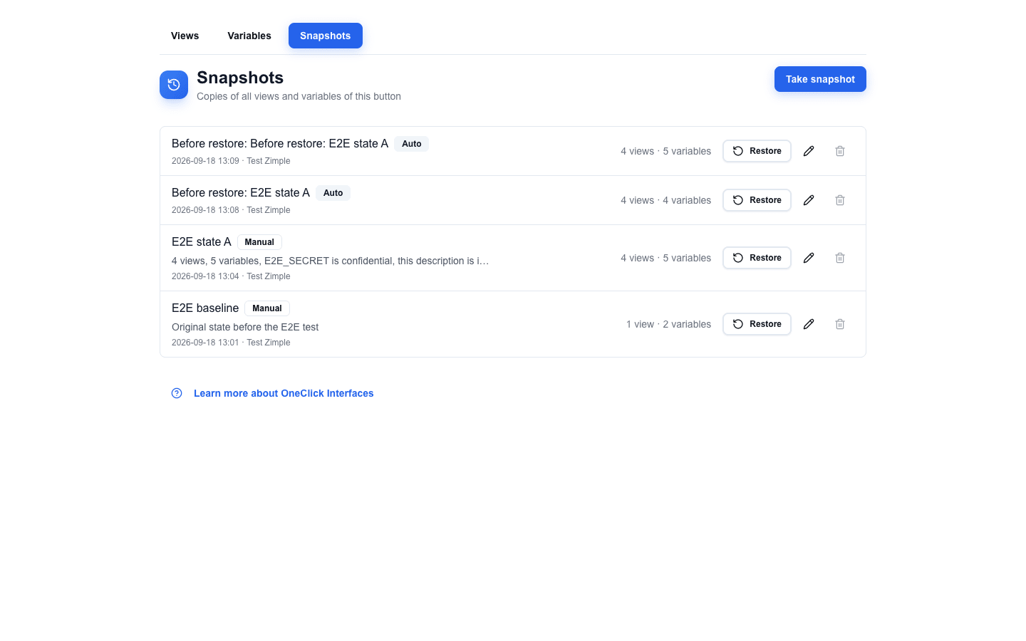 ## Taking a snapshot
1. Click **Take snapshot**.
2. Optionally type a **Name** and a **Description**. An empty name saves the snapshot as `Snapshot
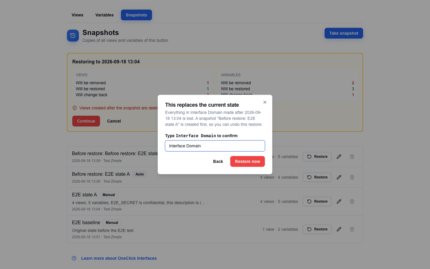
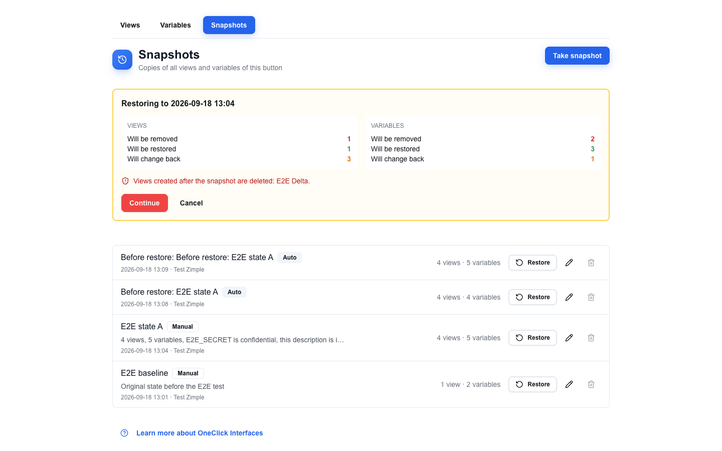 4. The dialog **This replaces the current state** opens. Type the name of the interface exactly as shown, with the same upper and lower case letters.
5. Click **Restore now**. **Restore now** stays disabled until the name matches. Click **Back** to return to the summary card.
 After the restore, a toast confirms it and the **Views** and **Variables** tabs show the restored data.
A restore is all or nothing. If it fails, nothing changes and one of these toasts appears:
| Toast | Cause |
|---|---|
| **Restore failed. No changes were made.** | The restore failed. The summary card stays open, so you can try again. |
| **Snapshot no longer exists. No changes were made.** | Somebody deleted the snapshot in another session. The list refreshes. |
| **Button no longer exists.** | The interface was deleted. The app returns to the OneClick settings. |
## Undoing a restore
Before every restore, a snapshot named `Before restore:
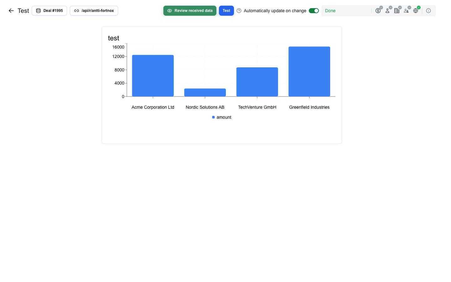 The back arrow on the left returns to the builder.
## Picking a Pipedrive Record
The toolbar shows the active resource as a button labelled `
 The dialog closes and two new marker rows appear on the canvas:
- **Form Start** — marks the beginning of the form (shown with a left-edge accent and a row label).
- **Form End** — marks the end of the form (shown with a left-edge accent and a row label).
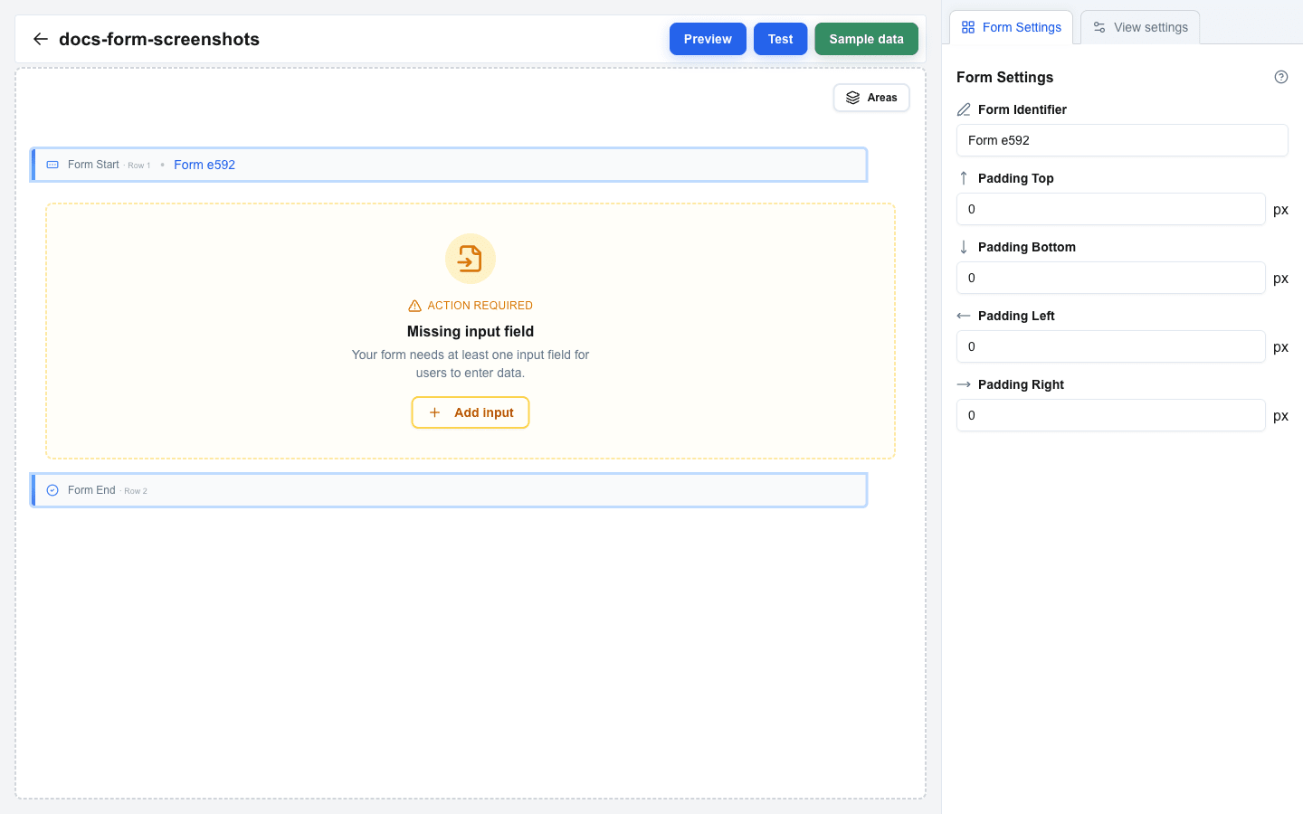 The **Form** option is hidden in the **Add row** dialog when you are already inside a form — forms cannot be nested.
## Set the Form Identifier
1. Click either the **Form Start** or **Form End** row to open the **Form Settings** tab in the sidebar.
2. Enter a unique name in the **Form Identifier** field — for example, `contact-form`.
3. The identifier appears as a badge next to **Form Start** on the canvas and is used by Submit and Reset buttons to target this form.
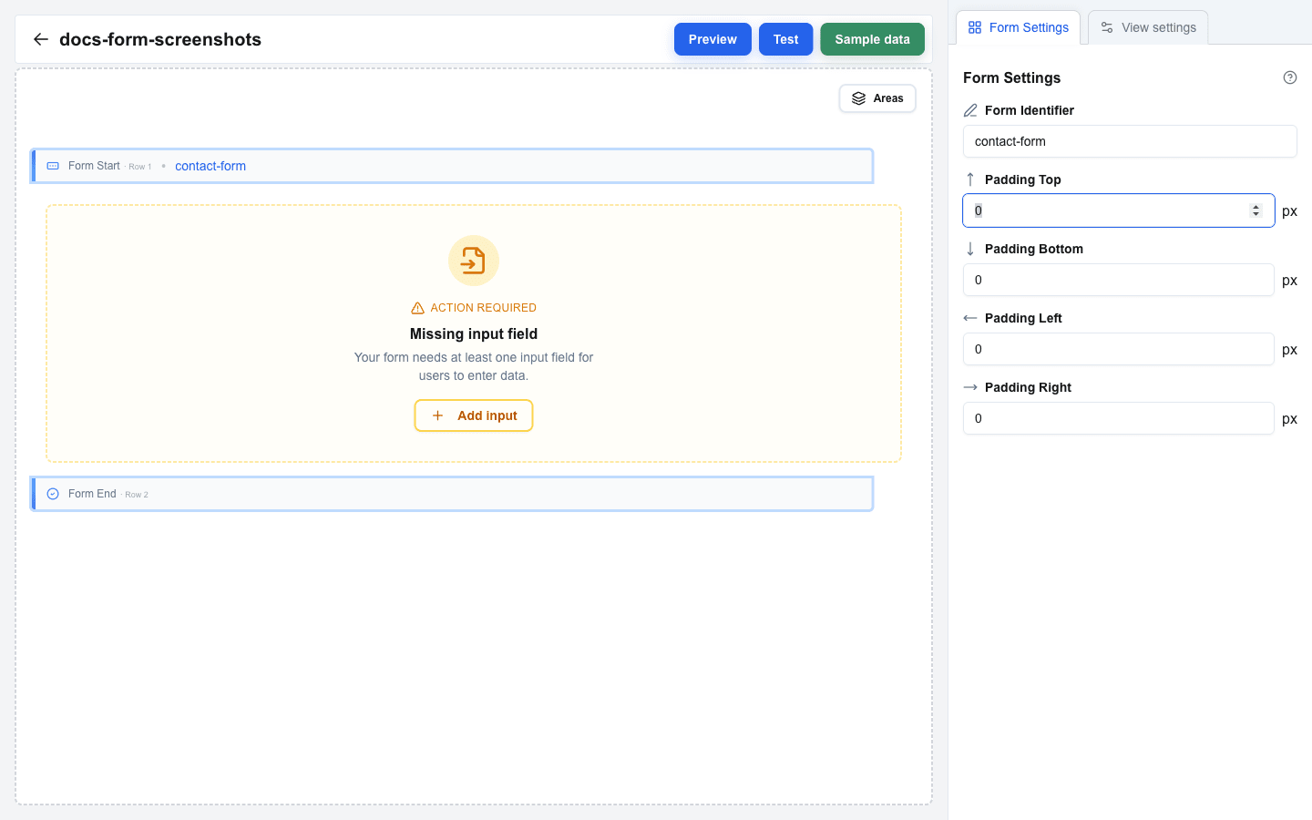 ## Adjust Form Padding (Optional)
In the **Form Settings** tab you can set inner padding for the rendered form:
- **Padding Top** (px)
- **Padding Bottom** (px)
- **Padding Left** (px)
- **Padding Right** (px)
## Add Rows Inside the Form
Hover the area between the Form Start and Form End markers, then click the `+` button that appears to open **Add row**. Pick any layout (Full, Two Column, etc.) — note that the **Form** option is hidden inside an existing form. Rows added in this area become part of the form.
## Place Input Fields
Click an empty column inside the form to open **Add block**, then pick **Input**. The dialog only allows the **Input** block when the surrounding row is inside a form. For details on input types and settings, see [Input Field Types](/docs/buttons/interface-button/interface-builder/how-to/forms/input-field-types).
## Validation Warnings
While you build, the canvas highlights warnings when the form is incomplete. Each warning includes a quick action button to fix the problem:
- **Missing input field** — the form has no input blocks between Form Start and Form End. Add at least one Input block.
- **Missing submit button** — no button anywhere in the view targets this form's Form Identifier. Add a Button block, set its **Button Type** to **Form Submit Button**, and pick this form from the **Form** dropdown.
 ---
# Configuring Form Submission
Source: https://help.theoneclick.io/docs/buttons/interface-button/interface-builder/how-to/forms/form-submission.md
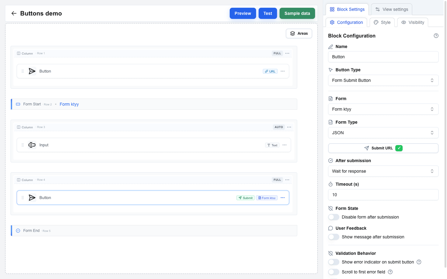
A submit button's settings live in the **Configuration** sub-tab of the Block Settings sidebar. Open them by selecting a **Form Submit Button** on the canvas.
 ## Pointing the Button at a Form
The **Form** dropdown lists every form on the view (each `Form Start` row). Pick the one this submit button should send.
## Form Type
Set **Form Type** to control how data is sent:
- **JSON** (default) -- sends form data as a JSON payload. Requires a Submit URL.
- **Multipart/Form-Data** -- sends as multipart form data. Use this when the form includes file uploads. Requires a Submit URL.
- **Open view with form data** -- passes form data to another view as URL search parameters without making any HTTP request. The Submit URL and After submission settings are hidden in this mode; submission always opens a target view.
Full request shapes for each type: [Form Submission Types reference](/docs/buttons/interface-button/interface-builder/reference/data-binding/form-submission-types).
## Submit URL
For **JSON** and **Multipart/Form-Data**, click the **Submit URL** button to open the **URL Configuration** dialog. The dialog has three cards:
- **Button end-point configuration** -- the End-point URL the form posts to (supports the Data Picker), a **URL Active** toggle, and an **Omit oneclick metadata** switch (turn this on for APIs that reject extra fields like `event_id` or `resource_id`, e.g. Pipedrive API v2).
- **Query Parameters** -- key/value pairs appended to the Submit URL. Click **Add Parameter** to add a row; values support the Data Picker.
- **Manage Headers** -- custom HTTP headers sent with the request. Click **Add Header** to add a row. Header keys must contain only letters, numbers, and hyphens, cannot start or end with a hyphen, and cannot start with `x-oc-` (reserved for system headers). Header values support the Data Picker, so you can use dynamic values like `{{variable.api_key}}`.
:::note[OneClick-level headers are merged in automatically]
If the OneClick button this interface is attached to has its **Headers** toggle enabled (configured outside the builder, on Pipedrive's **Edit a Button** page), every header listed there is sent with the form submit request. Use the per-call headers here only for values that differ between forms. See [OneClick-Level Headers](/docs/buttons/interface-button/interface-builder/explanation/architecture#oneclick-level-headers) for the merge order and the reserved `x-oc-*` keys.
:::
The Submit URL button shows a method badge (always `POST` for submit buttons) and a green ✓ when a URL is set; it turns red if the Submit URL is missing.
## After Submission
For **JSON** and **Multipart/Form-Data**, the **After submission** dropdown picks what happens once the request is sent:
### Select view
Navigates the user to another view as soon as the request finishes.
- **View ID** -- the target view dropdown.
- **Parameters** -- key/value pairs passed to the target view.
- **Use input values as search params** -- a design-time hint. When on, the form's inputs are listed under **Expected Parameters from Views** in the target view's URL Configuration dialog. Form input values are forwarded on the navigation regardless of this switch — toggling it off does not remove them from the URL.
### Wait for response
Waits for the server to respond, then reacts to what came back.
- **Timeout (s)** -- how long to wait, between **10** and **60** seconds (default 10). The fetch is aborted if the response does not arrive in time.
- **Form State** > **Disable form after submission** -- when on, the submit button stays disabled after the response returns. Useful when the submit is final and you do not want the user to try again.
- **User Feedback** > **Show message after submission** -- when on and the response contains a message, replaces the whole form with an inline alert instead of showing a toast. See the [Post-submit message](#post-submit-message) section below.
What you return from the server decides what the user sees next. See [HTTP Response Format](/docs/buttons/interface-button/interface-builder/reference/data-binding/http-response-format) for the response shapes.
## Validation Behavior
The **Validation Behavior** group controls how validation errors and submission errors are surfaced before the request is even attempted. Each toggle has a tooltip explaining what it does.
| Switch | Effect |
|---|---|
| **Show error indicator on submit button** | Adds a red border and a tooltip with the error count to the submit button while there are validation errors on the form. A passive hint before the user clicks. |
| **Scroll to first error field** | When the user clicks submit on an invalid form, smoothly scrolls and focuses the first invalid field. The strongest way to draw attention to a long form's validation issue. |
| **Show error toast on submit** | Pops a toast with the number of invalid fields (for example `3 fields have errors`). The toast does not say *which* fields -- combine it with **Scroll to first error field** to make that obvious. |
Combine **Scroll to first error field** with **Show error toast on submit** for the strongest feedback: the toast tells the user there *are* errors, the scroll-plus-focus shows *which* one to fix first.
## Submission Feedback
### While the submit is in flight
Once the user clicks submit on a **Wait for response** form, the submit button shows a spinner in place of its label (the label's width is preserved so the layout does not jump) and the whole form switches to a `progress` cursor so the user cannot mistake the state for idle. The submit button and every descendant input stay in that state until the response returns -- on success or error -- or the submission throws. A thrown network or JSON-parse error resets the state so the button never gets stuck.
**Select view** forms behave the same way up to the point of navigation; the spinner is visible until the browser leaves the page.
### Backend error response feedback
When the backend returns `oneclick_data.error_message` or `oneclick_data.message_view` (see [HTTP Response Format](/docs/buttons/interface-button/interface-builder/reference/data-binding/http-response-format#error-responses)), two things happen:
1. A full-page message view replaces the rendered content with the message's `title` and `message`, plus **Go Back** and **Retry** buttons. `message` can be an array, shown as a bullet list, and `variant` sets the colours and the icon. You can suppress either button by returning `hideRetry: true` or `hideBack: true` on the object.
2. On error responses, an additional toast also appears with the response's top-level `message` (or `Something went wrong` when none was supplied).
### Post-submit message
When **After submission** is set to **Wait for response** and the backend returns a message, how it is shown depends on **Show message after submission**:
| Show message after submission | Response has `title`? | User sees |
|--|--|--|
| Off | No | Toast with `message` |
| Off | Yes | Toast with `title` as primary text, `message` as description |
| On | No | Inline alert replacing the form, `message` only |
| On | Yes | Inline alert replacing the form, `title` + `message` |
When the inline alert appears, the view smoothly scrolls to it so the user does not miss the new content even if they were at the bottom of a long form.
The message and title can include a small amount of inline HTML -- bold, italic, line breaks, links, and inline code. See [Messages & Toasts](/docs/buttons/interface-button/interface-builder/how-to/data/messages-and-toasts) for how to format messages your backend returns.
---
# Form Validation
Source: https://help.theoneclick.io/docs/buttons/interface-button/interface-builder/how-to/forms/form-validation.md
## Required Fields
1. Select an input field inside your form.
2. Toggle **Required** on in the input settings.
3. When enabled, the form cannot be submitted until the user fills in this field.
:::caution[Hidden inputs ignore Required]
The Required toggle is forced off when the input type is Hidden — there is no way to require a hidden field.
:::
### Required from data
Use data when some records need the field and others do not.
1. Click the ⇄ button beside the **Required** label. A Data Picker field replaces the switch.
2. Bind the field to a value, for example {{deal.must_fill}}.
3. The field is required when the value is `true`, `yes` or `1`. Case and surrounding spaces do not matter.
Any other value leaves the field optional. This includes an empty value, `no`, `0`, `false` and a value that does not resolve, so an empty Data Picker field shows no warning. The value comes from the view data (Sample data, Received data, variables, System context). It does not read other inputs in the same form.
Click ⇄ again to go back to the switch. The switch keeps its earlier position, and the Data Picker value is kept too.
**Disabled** has the same choice and follows the same rule. A disabled field sends its **Default Value** when the form is submitted, and its validation (Required, Pattern, bounds) does not run.
## Pattern Validation
Use regex patterns to enforce custom input formats:
1. Select a text-based input field (**Text**, **Textarea**, **Email**, **Number**, **URL**, or **Date** type).
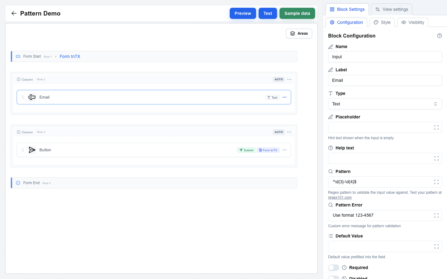
2. Enter a regex expression in the **Pattern** field (e.g., `^\d{3}-\d{4}$` for a phone format like `123-4567`). The field accepts a literal regex, or a Data Picker placeholder (e.g. `{{validation_rules.email_pattern}}`) that resolves to one at submit time.
3. Once Pattern has a value, a **Pattern Error** field appears underneath. Set it to override the default error message shown when the input does not match. Pattern Error also supports the Data Picker, so the message can be localised or context-dependent.
If no custom error message is set, a default validation error is shown.
When the **value** a user submits is itself a Data Picker placeholder (e.g. a prefilled field bound to a template variable), the regex check is skipped -- the resolved value is trusted to be validated by the backend.
 ## Number Min/Max Validation
For **Number** type inputs, bound the accepted range:
1. Select a **Number** input field.
2. Set **Min** and/or **Max** to the desired bounds. Both accept either a literal number or a Data Picker placeholder that resolves to one (e.g. `{{user.min_age}}`).
3. Once Min has a value, a **Min Error** field appears; once Max has a value, a **Max Error** field appears. Use these to customise the messages shown when the submitted value falls outside the bounds.
Bounds are enforced at submit. If the value is below **Min** or above **Max**, the form does not submit and the error message appears next to the field. Changing the input **Type** away from **Number** clears all four fields (Min, Max, Min Error, Max Error) automatically.
## Built-in Type Validation
Certain input types have automatic validation:
- **Email** -- validates email address format.
- **URL** -- validates URL format.
- **Number** -- only accepts numeric input.
No extra configuration is needed -- these validate automatically on form submission.
## File Type Limits
Set **Accepted file types** on a File input to take only some kinds of file. Write one comma-separated list of extensions and MIME types:
```
.pdf, .docx, image/*
```
- A bare word such as `pdf` reads as `.pdf`. Case does not matter, and extra commas are ignored.
- An entry that is neither an extension nor a MIME type, such as `*.pdf` or `image/`, shows an error under the field.
- An empty list accepts every file.
The file dialog offers only the listed types. The drop zone hint starts with the list, such as `.pdf, .png, image/* · One file · max 10 MB`; after three types it shows `+N more`. While a user drags a file of another type over the drop zone, the zone turns red and reads `File type not accepted (.pdf, .png)`. During a drag the browser shows only the file's MIME type, so the warning needs a MIME type for every entry: it never comes while the list holds an extension whose MIME type the field does not know.
A file of another type can still arrive, for example by a drop. It joins the selection, its row turns red, and the form does not submit until the user removes it. The message names the file and the list:
```
File "setup.exe" is not an accepted type (.pdf, .png)
```
This is a check in the browser only. The server does not read the list, so do not rely on it to keep a file type out of your endpoint.
## File Size Limits
A file input is guarded in two places -- your own limits in the browser, and the server's budget -- and they fail with different messages.
### 1. Your own limits, in the browser
You set up to three limits on the field. Each one has its own message, so the user is told which limit they passed and by how much. The form does not submit until the selection clears all three.
**Max File Size (MB)** applies to **each file on its own**, never to the selection added up -- three 5 MB files pass a 10 MB limit. An oversized file also turns its own row in the field red as soon as it is picked, and the message names the file:
```
File "contract.pdf" is 12.4 MB, which exceeds the 10 MB limit
```
**Max Total Size (MB)** applies to the selection added up. Only a field with **Allow multiple files** on has it:
```
The selected files total 12.4 MB, which exceeds the 10 MB limit
```
**Max Number of Files** caps how many files the field takes. It too belongs to a multi-file field alone, and it is the only limit that stops a user attaching hundreds of tiny files:
```
14 files selected, which exceeds the limit of 10 files
```
The range you may set for the two size limits depends on the surrounding form's **Form Type**: **JSON** forms allow up to **10 MB**, **Multipart/Form-Data** forms allow up to **100 MB**. The count may go up to **25** on JSON forms and **50** on Multipart/Form-Data, and arrives pre-filled with **10**. The label inside Block Settings shows the active ceiling for each, and the size fields arrive pre-filled with it -- lower a number yourself if you want a tighter check.
When a selection breaks more than one limit at once, the user reads the file type message first, then the per-file size message, then the count, then the total size. A file of the wrong type must go whatever its size, and the two per-file messages are the ones that name a file, so they say what to drop.
### 2. The submission budget, on the server
Setting your own limits low enough does *not* guarantee the submission goes through. The server never sees them; it weighs every file field of the submission together against one budget of its own, so files that each passed check 1 can still be refused as a group. The user gets an error toast naming both numbers, and the form is never sent:
```
The submission carries 12.6 MB of files, more than the 10 MB this form accepts. Send fewer or smaller files.
```
To stay clear of it, keep the whole form's uploads under the budget for its **Form Type**, and move a form that needs more than 10 MB onto **Multipart/Form-Data**. The numbers, the reason they differ, and the one case that fails without this message are in [File Size Limits](/docs/buttons/interface-button/interface-builder/reference/data-binding/form-submission-types#file-size-limits).
:::caution[No file inputs in "Open view with form data"]
A form whose **Form Type** is **Open view with form data** *cannot* contain a file input -- the builder shows a clear validation error if you try.
:::
## Builder Validation Warnings
The builder itself validates form structure and shows **Action required** cards directly on the canvas inside an empty form:
- **Missing input field** -- with an **Add input** quick-fix button. Add an input block between the `Form Start` and `Form End` rows.
- **Missing submit button** -- with an **Add submit button** quick-fix button. Add a button anywhere in the view, set **Button Type** to **Form Submit Button**, and select this form in the **Form** dropdown.
Each card includes a one-click action button that drops the missing block in the right place.
Other validation rules block save until they are resolved -- see [Saving](/docs/buttons/interface-button/interface-builder/how-to/views/publishing) for the full list (duplicate input names, submit/reset buttons that point at a non-existent form, file inputs in `Open view with form data` forms, missing URLs).
## Unique Input Names
Each input has a **Name** field (the first row in Block Settings) that becomes the field key when the form is submitted. The builder generates an initial name like `Input` and appends a numeric suffix on duplicates -- a second input becomes `Input_2`, a third becomes `Input_3`, and so on.
You can rename inputs from the **Name** field whenever you want to make the submitted JSON more readable.
:::caution[Input names must be unique]
If two inputs end up sharing a name (typically by manual editing), the builder flags an `Input name must be unique` validation error and blocks save until you change one.
:::
---
# Input Field Types and Configuration
Source: https://help.theoneclick.io/docs/buttons/interface-button/interface-builder/how-to/forms/input-field-types.md
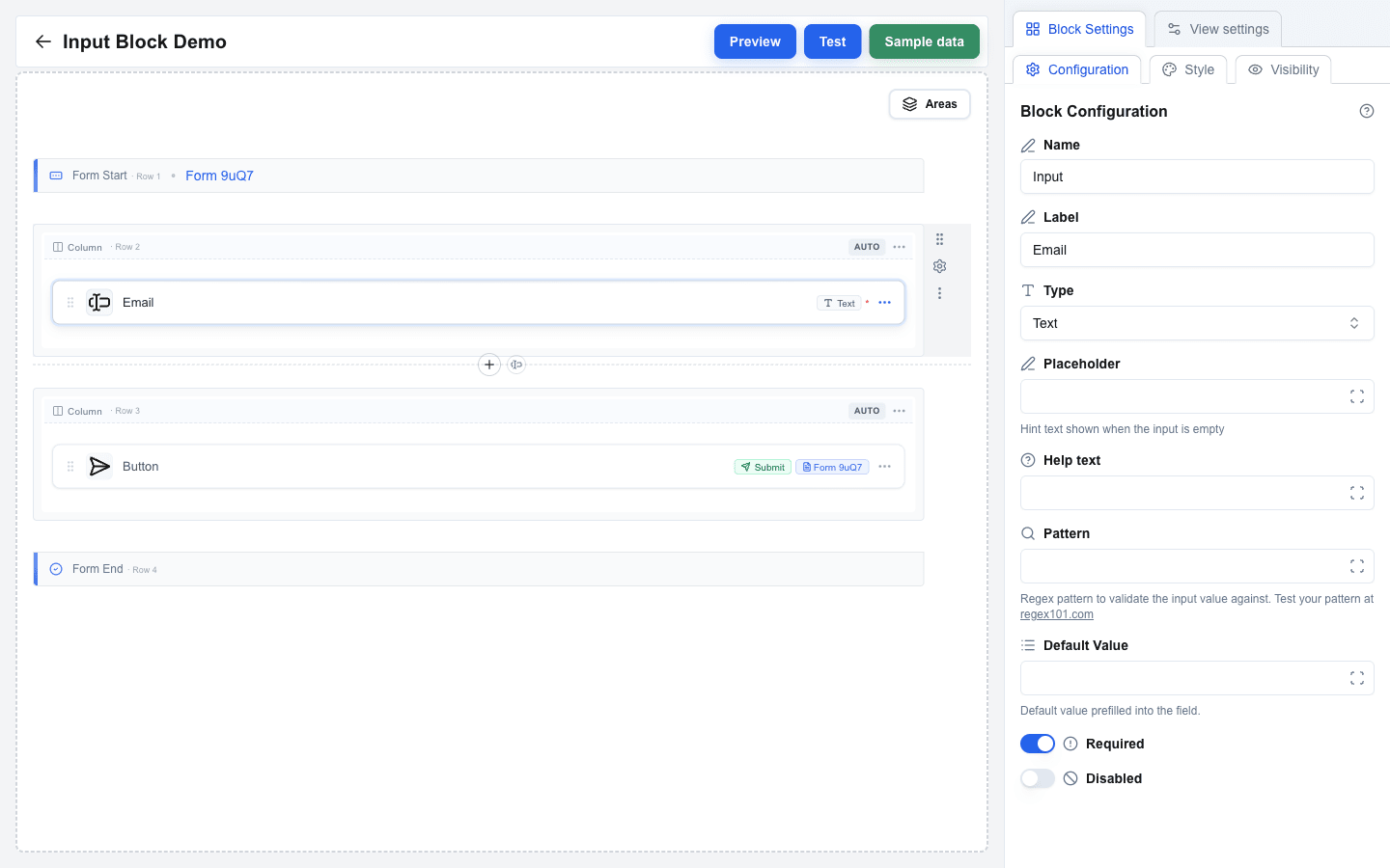
## Adding an Input Field
1. Make sure you have a row inside a form. If you do not, see [Creating a Form](/docs/buttons/interface-button/interface-builder/how-to/forms/creating-a-form) first.
2. Click an empty column inside that row to open the **Add block** dialog.
3. Pick **Input** from the list. (The **Input** entry is only enabled when the row sits between a `Form Start` and a `Form End`.)
4. Click the new block to open its settings in the sidebar.
5. Choose the input **Type** from the dropdown.
 ---
## Basic Types
- **Text** -- standard single-line text input.
- **Textarea** -- multi-line text input.
- **Email** -- text input with email format validation.
- **Number** -- numeric-only input.
- **URL** -- text input with URL format validation.
- **Date** -- date picker.
- **Hidden** -- invisible field, useful for passing data without user interaction. Hidden inputs can never be **Required** or **Disabled**: a change to Hidden turns both switches off and sets both settings back to a switch.
- **File** -- file upload field. See [File Input](#file-input) below for the form-type rules.
### Textarea Input
For **Textarea** type inputs, configure:
- **Rows** -- the number of visible text rows (1--20, default 3).
- **Max Length** -- the maximum number of characters the user can enter. Leave blank for no limit.
### File Input
The rendered field is a row that reads **Drop a file here** (or **Drop files here**), with a **Browse** button on the right. The user either drops files onto the row or clicks anywhere on it to open the file dialog. Under the title, a hint lists the limits you set, such as `One file · max 10 MB` -- a limit you leave empty is left out of the hint. A dropped file goes through the same checks as a picked one.
 A single-file input refuses a drop of several files at once: the row turns red and reads **Only one file allowed. Drop a single file.** as soon as the files are dragged over it, and a drop selects nothing. Once a file is selected, the row is hidden; the user removes the file with **X** to choose another.
For **File** type inputs:
- The maximum upload size is **Max File Size (MB)**. It applies to **one file at a time**, not to the selection as a whole. The allowed range depends on the surrounding form's **Form Type**: **JSON** forms allow up to **10 MB**, **Multipart/Form-Data** forms allow up to **100 MB**. The label inside Block Settings shows the active limit, and the field arrives pre-filled with it -- lower the number yourself if you want a tighter check. Switching the form type lowers a value that is too high for the new type, but never raises one you set yourself.
- **Accepted file types** limits the field to the kinds of file you list, such as `.pdf, .png, image/*`. Leave it empty to accept every file. The file dialog offers only the listed types. A file of another type still joins the selection, but its row turns red and the form does not submit until the user removes it. See [File Type Limits](/docs/buttons/interface-button/interface-builder/how-to/forms/form-validation#file-type-limits).
- A form whose **Form Type** is **Open view with form data** *cannot* contain a file input -- that mode forwards values as URL search parameters and cannot carry files. The builder shows a clear error if you try.
#### Accepting several files
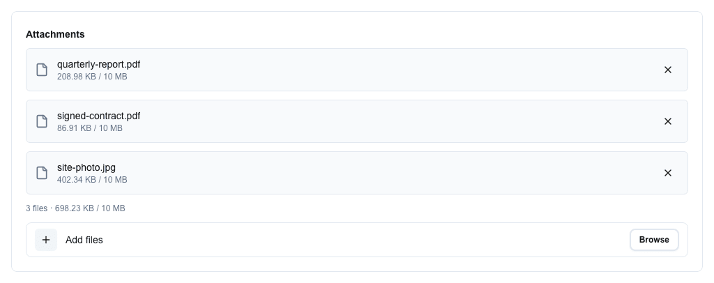
Turn **Allow multiple files** on to let one field carry more than one file. The setting appears on the **File** type only and is off by default.
The field then behaves like this:
1. The row reads **Drop files here**, its hint shows the limits (`Up to 10 files · 100 MB total · 10 MB each`), and the file dialog lets the user select several at once.
2. Each selected file gets a row showing its name and size. When **Max File Size (MB)** is set, the row shows `size / limit`, and a file over the limit turns red. A file that is not one of the **Accepted file types** turns red too.
3. Under the rows, a running summary reads `3 files · 12.4 MB / 100 MB` -- the count, the size of the selection so far, and the total-size limit when one is set. It turns red as soon as the selection breaks **Max Number of Files** or **Max Total Size (MB)**; a file that is too large or of another type turns its own row red instead.
4. The **X** on a row removes that one file; the rest stay selected.
5. Under the summary, a slimmer row reads **Add files** -- dropping or picking again *adds* to the selection instead of replacing it. A file that is already in the list is skipped.
 **Which limits to set.** A multi-file field has three:
| Setting | Set it to |
|---|---|
| **Max File Size (MB)** | The largest single file the endpoint can handle. |
| **Max Total Size (MB)** | What the endpoint can take in one request. Keep it at or under the budget for the form type, or the server refuses the submission even though the field accepted it. |
| **Max Number of Files** | How many attachments the field is for. Pre-filled with 10; the highest you may set is 25 on JSON forms and 50 on Multipart/Form-Data. |
Each limit has its own message, so the user is told which one they passed rather than being left to guess. Put a form meant for several sizeable files on **Multipart/Form-Data**. See [File Size Limits](/docs/buttons/interface-button/interface-builder/reference/data-binding/form-submission-types#file-size-limits).
**Before you turn it on for a live field:** the setting changes what the endpoint receives, so update the integration first. See [File Fields](/docs/buttons/interface-button/interface-builder/reference/data-binding/form-submission-types#file-fields).
---
## Selection Types
Selection inputs let users choose from a list of options:
- **Checkbox** -- multiple selections with checkboxes.
- **Radio** -- single selection with radio buttons.
- **Single Select** -- dropdown for a single selection.
- **Multi Select** -- dropdown for multiple selections.
Each selection type has an **Options Type** dropdown with two values: **Static** or **Dynamic**.
### Static Options
1. Set **Options Type** to **Static**.
2. Click **Manage options** to open the editor and add rows. Each row has:
- **Label** -- text shown to the user. Required.
- **Value** -- value submitted when this option is selected. Required.
3. Use the editor's **Add Option** button to append rows; click **Save Options** to commit.
Both Label and Value must be at least 1 character long.
### Dynamic Options
1. Set **Options Type** to **Dynamic**.
2. Fill the fields:
- **Labels Delimiter** -- character used to split the resolved labels string. Default: `,`.
- **Values Delimiter** -- character used to split the resolved values string. Default: `,`.
- **Labels** -- Data Picker expression that resolves to the option labels.
- **Values** -- Data Picker expression that resolves to the option values.
A warning banner inside Block Settings reminds you that if your data contains the delimiter character, the options may be split incorrectly.
---
## Default Values
Use the **Default Value** field to pre-fill the input. The field supports the Data Picker, so you can bind the default to any resource field or variable. Help text under the field changes per Type to describe what is expected (for example `YYYY-MM-DD format` for Date, `Coerced to a number` for Number).
For selection inputs with **Static** options, the **Default Value** field gains a small swap button next to its label. The button toggles between two modes:
- A **dropdown** of the static options (the selection's stored value is the option's `value`).
- A **plain-text input** that supports template variables -- type the option's `value` directly, optionally as a Data Picker expression. For multi-value selections (Checkbox / Multi Select) separate values with commas.
## Labels and Help Text
- **Label** -- text label displayed above the input field.
- **Help text** -- smaller hint text shown below the input. Supports the Data Picker.
- **Placeholder** -- hint text shown inside the empty input. Available on **Text**, **Textarea**, **Email**, **Number**, **URL**, **Single Select**, and **Multi Select** only -- Checkbox, Radio, Date, File, and Hidden inputs hide the Placeholder field. Supports the Data Picker.
## Validation Settings
- **Required** -- toggle to make the field mandatory. Click the ⇄ button beside the label to take the value from data instead: see [Required from data](/docs/buttons/interface-button/interface-builder/how-to/forms/form-validation#required-from-data). Hidden inputs cannot be Required.
- **Pattern** -- regex pattern for custom validation. Available on Text, Textarea, Email, Number, URL, and Date. Must be a valid regular expression.
- **Pattern Error** -- custom error message shown when pattern validation fails. Only appears once Pattern has a value.
- **Disabled** -- toggle to make the field read-only. A disabled field sends its **Default Value** and skips its validation. Click the ⇄ button beside the label to take the value from data instead; the same `true` / `yes` / `1` rule applies as for Required. Hidden inputs cannot be Disabled.
For numeric bounds (**Min**, **Max**, **Min Error**, **Max Error**) and file size limits, see [Form Validation](/docs/buttons/interface-button/interface-builder/how-to/forms/form-validation).
## Style and Visibility
The Input block uses the standard **Style** sub-tab (background, font, borders, radius) and **Visibility** sub-tab in Block Settings, the same as every other block. See [Block Styles](/docs/buttons/interface-button/interface-builder/how-to/layout/block-styles) and [Conditional Visibility](/docs/buttons/interface-button/interface-builder/how-to/visibility/conditional-visibility).
---
# Using the Data Picker
Source: https://help.theoneclick.io/docs/buttons/interface-button/interface-builder/how-to/data/data-picker.md
This guide covers the everyday picker workflow. For the full breakdown of every tab, type filter, and badge — see the [Data Picker reference](/docs/buttons/interface-button/interface-builder/reference/data-binding/data-picker).
## Inserting Your First Placeholder
1. Click into any block setting that supports the Data Picker — for example a Title block's **Text** field.
2. The picker opens as a tooltip beside the field.
3. Pick the tab whose data you want (Deal, Organization, Person, User, Custom, Search Params, Variable, Functions, Context, or — inside a looping area — Loop item).
4. Click a field in the tree. A blue badge appears in the field as a single unit; the placeholder it represents (for example `{{deal.title}}`) is what gets resolved at render time.
On a [floating window button](/docs/buttons/interface-button/interface-builder/explanation/floating-window-buttons) the **Deal**, **Organization** and **Person** tabs are not in the strip at all, because that button's views get no Pipedrive record.
 ## Combining Static Text and Placeholders
You can mix plain text with badges in the same field. Type freely before, between, and after badges — the picker treats text as text and badges as atomic units.
A typical Paragraph **Value** might read:
```
Deal: {{deal.title}} — {{deal.value}} {{deal.currency}}
```
At render time the three placeholders resolve to live values from the deal record (for example `Deal: Legendary 1995 — 3193 EUR`).
## Removing a Placeholder
Three ways:
- Click the small **×** on the badge.
- Place the cursor after the badge and press **Backspace** — the whole badge disappears in one keystroke.
- Select across the badge and type — the badge is replaced by whatever you type.
## Editing Complex Expressions in the Larger Dialog
Once a field has more than one or two placeholders — or when you start mixing in functions like `if`, `formatCurrency`, or `daysBetween` — the inline picker gets cramped. Click the **expand** icon at the right edge of the Data Picker input to open the same field in a larger dialog. Toggle **Show result** to preview the rendered value (resolved against the active sample data) and **Show whitespace** to make spaces visible. For the **HTML** block specifically, **Show result** renders the compiled output as actual HTML (using the same sanitiser as the live view) so you can see the visual result without switching to Preview mode — see [How to Use the HTML Block](/docs/buttons/interface-button/interface-builder/how-to/blocks/html#previewing-without-leaving-the-dialog).
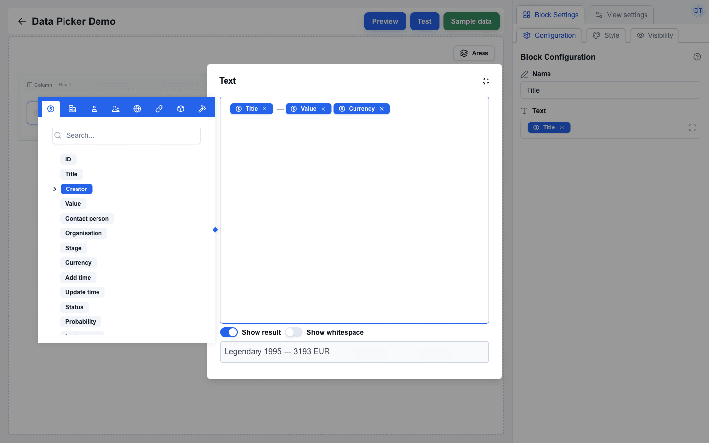 The dialog ignores clicks outside, so you can keep clicking around the canvas without losing your edits — only the minimize icon (top right) closes it.
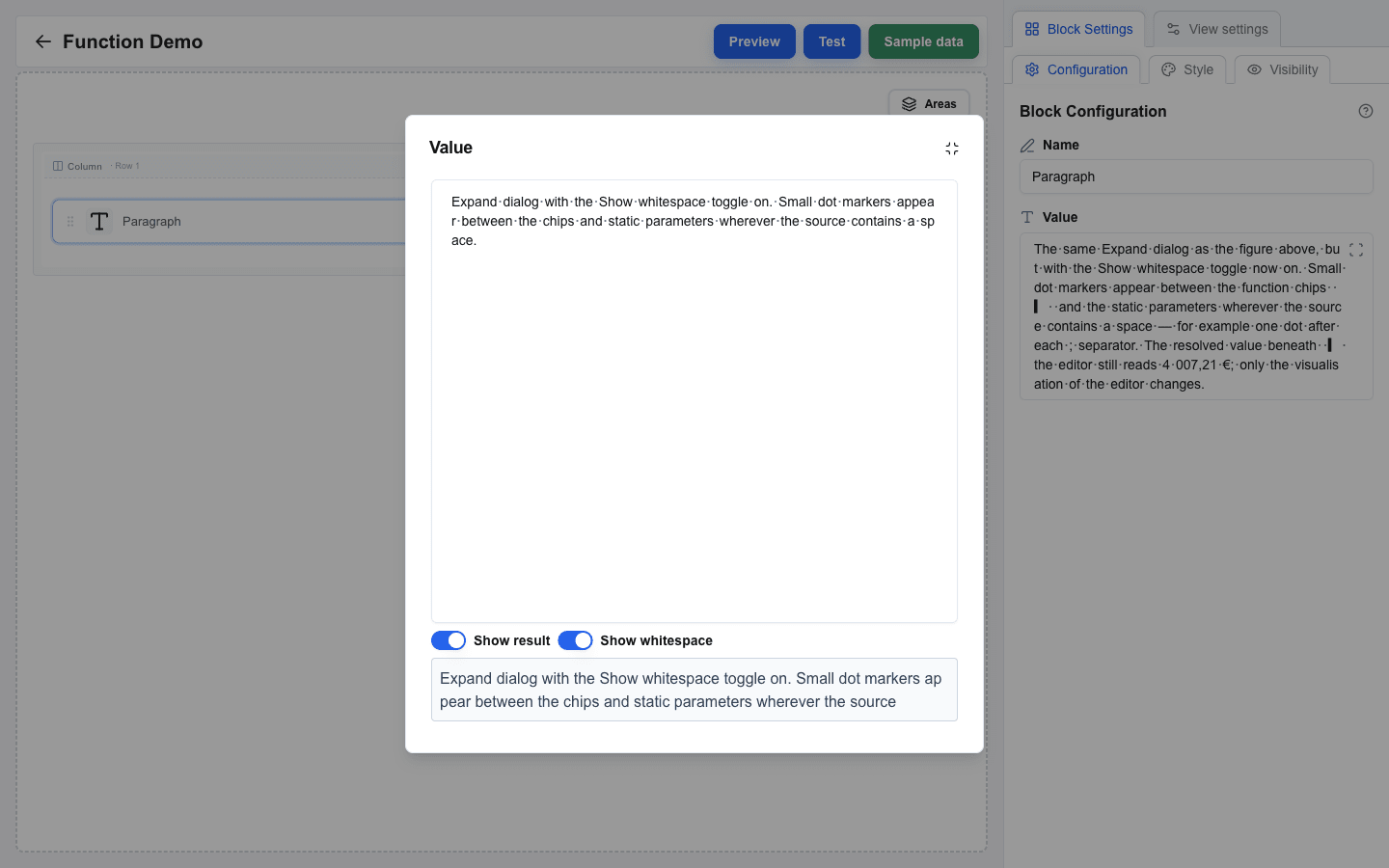
**Show whitespace** is useful when something looks "off" in the rendered output and you suspect a stray or missing space — for example a placeholder that touches the next word, or two spaces between values. Switch the toggle on to see every space in the field as a small dot. The toggle is a **global** preference that applies to every Data Picker field in the builder and is remembered across reloads, unlike **Show result** which is set per field.
 ## Working Inside a Looping Area
When the field is inside an [area with looping enabled](/docs/buttons/interface-button/interface-builder/how-to/layout/areas#looping-an-area), the picker grows an extra **Loop item** tab (a repeat icon). Open it to:
- pick a field of the current iteration's array item (the `index` field is shown last in the list) — placeholders resolve per repetition, so `{{deal.products.name}}` reads a different product on each loop;
- pick `index` — the iteration number, starting at **1**.
If the field is **not** inside a looping area, the Loop item tab does not appear.
## Type-Filtered Contexts
Some block settings only accept a specific data type. The picker greys out fields that do not match:
- **Table > Target Array** and **Area > Loop > Target array** accept only arrays.
- **Visibility > Condition** accepts any value but is most useful with strings or booleans.
- Most text-based settings exclude objects from the clickable set — clicking an object's badge only expands its children.
You do not choose the filter manually — the surrounding setting decides it for you.
## Reusing the Last-Opened Tab
The picker remembers which tab you opened last across fields. If you spend a session inserting Deal fields, the next picker you open also lands on the Deal tab. Switch tabs once and that becomes the new default. Useful when you are building a row of similar inputs.
---
# Configuring an External Data Source
Source: https://help.theoneclick.io/docs/buttons/interface-button/interface-builder/how-to/data/external-data-source.md
## Opening the URL Configuration Dialog
1. Open the **View settings** tab in the right panel.
2. Click the **Configure URL** button (next to **View URL**, with the active method shown as a `POST` / `GET` badge). The **URL Configuration** dialog opens.
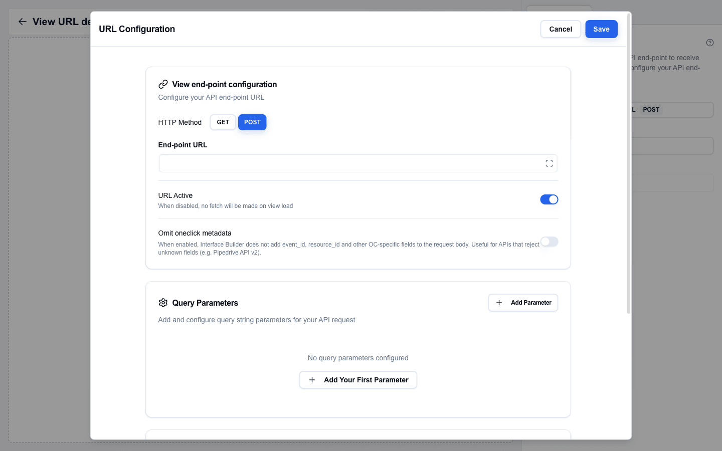 The dialog is divided into cards, in this order: **View end-point configuration**, **Query Parameters**, and **Manage Headers**. Click **Save** in the top-right to apply changes, or **Cancel** to discard them.
## HTTP Method
In the **View end-point configuration** card, pick **GET** or **POST** with the toggle buttons next to **HTTP Method** (default: **GET**).
- **POST** -- sends a request body with deal/person/organization context.
- **GET** -- appends parameters to the URL.
## End-point URL
Enter the full URL of the external API endpoint in the **End-point URL** field. This is the URL the view calls to fetch data when it opens. The field supports the Data Picker, so you can build the URL from variables.
## URL Active
Turn on the **URL Active** switch to enable the external data source. The helper text reads _"When disabled, no fetch will be made on view load."_ When off, no request is made and the **Custom** tab in the Data Picker remains empty.
## Omit oneclick metadata
The **Omit oneclick metadata** switch tells Interface Builder not to add `event_id`, `resource_id`, or other OC-specific fields to the request body. Turn this on for APIs that reject unknown fields, such as the Pipedrive API v2.
## Query Parameters
In the **Query Parameters** card, click **Add Parameter** (or **Add Your First Parameter** when the list is empty) to append a row.
- Each row has a **Key** input and a **Value** input. Values support the Data Picker.
- The **Trash** icon at the end of the row removes that parameter.
- Keys must be 1--255 characters, values 1--512 characters. Duplicate keys are flagged with `Duplicate key not allowed`.
## Manage Headers
In the **Manage Headers** card, click **Add Header** (the empty state shows _"No headers configured yet"_). Each header has:
- **Key** -- the header name. Must contain only letters, numbers, and hyphens, cannot start or end with a hyphen, and cannot start with `x-oc-` (reserved for system headers).
- **Value** -- the header value. Supports the Data Picker, so you can use dynamic values such as `{{variable.api_key}}`.
:::note[OneClick-level headers are merged in automatically]
If the OneClick button this interface is attached to has its **Headers** toggle enabled (configured outside the builder, on Pipedrive's **Edit a Button** page), every header listed there is sent with this request. You only need to set per-call headers here for values that differ between requests. See [OneClick-Level Headers](/docs/buttons/interface-button/interface-builder/explanation/architecture#oneclick-level-headers) for the merge order and the reserved `x-oc-*` keys.
:::
## Using the Data
Once the URL is active, the external API response fields appear in the Data Picker under the **Custom** tab.
1. Open any Data Picker field.
2. Switch to the **Custom** tab.
3. Browse the response fields and click to insert chips that compile to placeholders like `{{custom.field_name}}`.
The data is fetched at render time using the configured method, headers, and parameters. The response is parsed and made available as selectable fields.
## How the Response Reaches the View
When the view opens, the builder calls your data source URL and then waits for your response. The view stays in a loading state until the response arrives, and renders as soon as it does. The total wait is capped at roughly **20 seconds**.
If nothing arrives in that window, the user sees a `Request timed out. No custom data received.` toast. If the data source URL returns an HTTP status outside 2xx, the user sees `Data loading failed (status 500)` (or whichever status came back).
For the exact request shape your endpoint receives — body, headers, system metadata — see the [View Data Source reference](/docs/buttons/interface-button/interface-builder/reference/data-binding/view-data-source). For the parallel-fetch state machine and the differences between Test, Preview, and live render, see [External Data Flow](/docs/buttons/interface-button/interface-builder/explanation/external-data-flow).
## Responding with a Message View
Sometimes the "data" you have for the user is a message, not records -- the record cannot be found, the session expired, or a step is still missing. Return a message-view response instead of real data:
```json
{
"oneclick_data": {
"error_message": {
"title": "Account not found",
"message": "We could not find that account. Choose another."
}
}
}
```
The view shows a full-page message view with your title and message, plus **Go Back** and **Retry** buttons. Use this instead of a toast when the user cannot proceed -- they cannot miss a full-page card. The object form also accepts optional `hideRetry: true` and `hideBack: true` flags to hide the corresponding button.
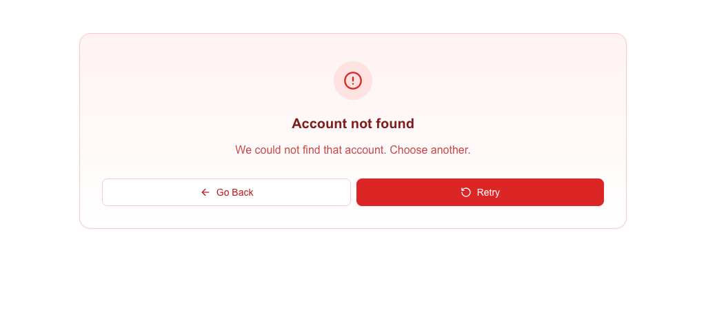 If you only need a single-line message, use the string form. It gets the title "Error":
```json
{
"oneclick_data": {
"error_message": "Something went wrong"
}
}
```
### Lists and variants
To list several items, send `message` as an array of strings. The message view shows them as a bullet list. Add `variant` to change the colours and icon -- `destructive` (default), `warning`, `info`, `success` or `default`:
```json
{
"oneclick_data": {
"error_message": {
"title": "A few things before we continue",
"message": ["Add a delivery address", "Choose payment terms"],
"variant": "info"
}
}
}
```
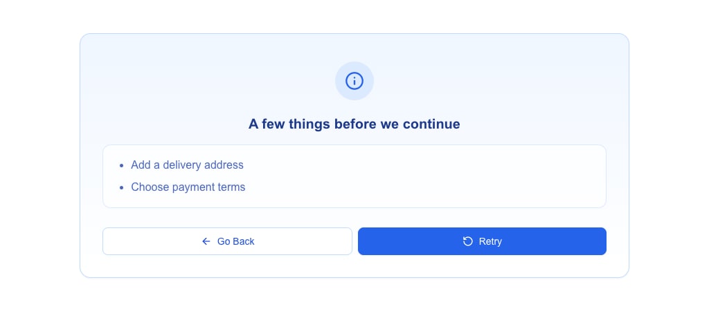 ### `message_view` for messages that are not errors
When the message is not an error -- for example a `success` or `info` note -- send it as `message_view` instead of `error_message`. The fields and the view are the same; only the name is neutral. `message_view` takes the object form only:
```json
{
"oneclick_data": {
"message_view": {
"title": "Almost there",
"message": "Customer created. Add a contact person and press Retry.",
"variant": "success"
}
}
}
```
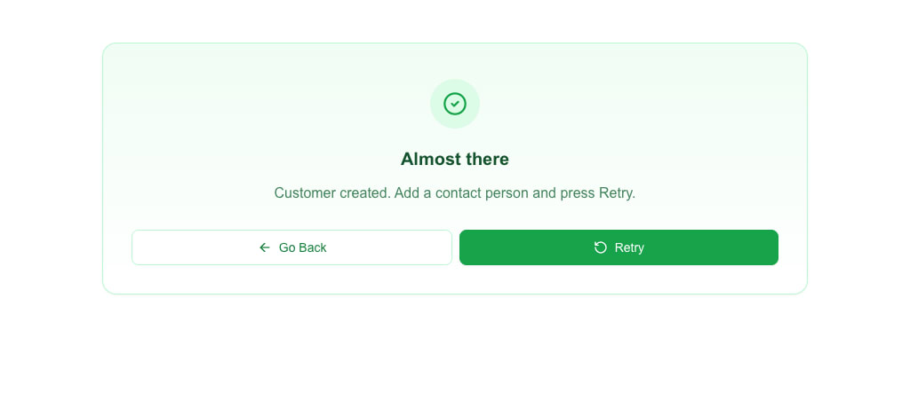 - `variant` changes the look only. The buttons stay **Go Back** and **Retry**, and the response is still not a success response.
- A missing `variant` is `destructive`, as with `error_message`.
- If a response carries both fields, `error_message` wins and `message_view` is ignored.
Both fields support a small HTML subset in the message text. See the [Messages & Toasts reference](/docs/buttons/interface-button/interface-builder/reference/data-binding/messaging) for the allowed tags and link behaviour, and [HTTP Response Format → `message_view`](/docs/buttons/interface-button/interface-builder/reference/data-binding/http-response-format#message_view) for all rules.
## Responding with a Redirect
If the data source should divert the user to another view instead of rendering, return a redirect:
```json
{
"oneclick_data": {
"redirect_view": {
"id": "target-view-id",
"params": { "deal_id": "123" }
}
}
}
```
The view shows a "Redirecting..." toast and navigates to the target view. If the target ID does not exist, the view falls back to a full-page message view with the message _"View with ID ... was not found"_.
See [HTTP Response Format](/docs/buttons/interface-button/interface-builder/reference/data-binding/http-response-format) for the full list of accepted shapes.
---
# Sending Messages and Toasts from Your Backend
Source: https://help.theoneclick.io/docs/buttons/interface-button/interface-builder/how-to/data/messages-and-toasts.md
Interface Builder shows user-visible messages in three places:
1. **Toast** — a short notification that pops up in a corner of the view.
2. **Inline alert** — a coloured box that replaces the form after submission.
3. **Full-page message view** — takes over the view and offers Retry / Go Back buttons.
You decide which one appears by combining the button's settings with the shape of the response your API returns.
## Do I need `oneclick_data`?
No — not for a plain toast. **A toast can come from several simpler shapes**; the `oneclick_data` envelope is only required when you want:
- a **redirect** (navigate the user to another view) on a URL button or a form submit, or
- a **full-page message view** (on a view data source or on a form submission error).
For a plain toast — success or error — a top-level response with a `message` is enough. For URL buttons, even a plain text body (not JSON) works.
## Two-minute recipes
Pick the row that matches your situation.
| I want… | Button setup | Return from API |
|---|---|---|
| A success toast after form submit | Form Submit, **After submission = Wait for response** | `{ "message": "Saved." }` |
| A coloured toast with a title | same | `{ "message": "Profile is up to date.", "title": "Saved", "variant": "success" }` |
| Replace the form with a "thank you" screen | same + **Show message after submission** ON | same shape as above |
| Navigate to another view after submit | Form Submit, **After submission = Wait for response** | `{ "view_id": "receipt-view" }` |
| Show a toast, then navigate | same | `{ "oneclick_data": { "message": "Done.", "redirect_view": { "id": "receipt-view" } } }` |
| Error toast on failed submit | same + **non-2xx** HTTP status | `{ "message": "Email already in use." }` |
| Full-page error after failed submit (view with a data source) | same + **non-2xx** HTTP status | `{ "oneclick_data": { "error_message": { "title": "Blocked", "message": "…" } } }` |
| Quick toast after URL button click | URL Button | plain string body: `"Added to cart"` — **or** `{ "message": "Added to cart" }` |
| Redirect after URL button click | URL Button | `{ "oneclick_data": { "redirect_view": { "id": "next" } } }` |
| Toast then redirect after URL button click | URL Button + **Wait page transition** ON | Stream interim toasts via the polling endpoint, then return `{ "oneclick_data": { "redirect_view": { "id": "next" } } }`. URL buttons drop a sibling `message` next to `redirect_view`. |
| Full-page error on view data source | View with a data source | `{ "oneclick_data": { "error_message": { "title": "…", "message": "…" } } }` |
The rest of the page explains each case in detail.
---
## Form submit responses
For form submits the submit button's **After submission** setting decides what the builder does with your response.
### After submission = Wait for response
All the shapes below are accepted. Return the simplest one that fits.
**Just a toast** — return a JSON body:
```json
{ "message": "Profile saved" }
```
**Coloured toast** — add a variant:
```json
{ "message": "Profile saved", "variant": "success" }
```
`variant` can be `default`, `destructive`, `info`, `success`, or `warning`.
**Toast with a title** — add a title:
```json
{ "message": "Profile is up to date.", "title": "Saved", "variant": "success" }
```
- With **Show message after submission** off → shown as a toast where `title` is the bold first line and `message` is the description.
- With **Show message after submission** on → the form is replaced by an inline alert containing the title and message. The view scrolls to it automatically.
**Just a navigation** — no message, just send the user to another view:
```json
{ "view_id": "target-view" }
```
**Toast plus navigation** — return the `oneclick_data` envelope. This is the only shape that carries both:
```json
{
"oneclick_data": {
"message": "Saved.",
"redirect_view": { "id": "receipt", "params": { "order_id": "4321" } }
}
}
```
### After submission = Select view
The button navigates on its own once the server replies. You usually need no body at all — HTTP 2xx is enough. If you want a toast to flash just before the navigation, return one of these:
```json
{ "message": "Saved." }
```
```json
{ "success": "Saved." }
```
```json
{ "oneclick_data": { "message": "Saved." } }
```
All three produce a success toast and then the navigation.
### Submit errors
Return any non-2xx HTTP status. The accepted bodies are:
| Body | What the user sees |
|---|---|
| `{ "message": "…" }` | Error toast with the message |
| `{ "oneclick_data": { "message": "…" } }` | Error toast with the message, plus a trailing "Something went wrong" toast (the body has no top-level `message`, so the unconditional fallback toast also fires) |
| `{ "oneclick_data": { "message": "…", "redirect_view": {…} } }` | Error toast, then navigation |
| `{ "oneclick_data": { "error_message": "…" } }` | Full-page message view replaces the view, plus a trailing "Something went wrong" toast in the corner |
| `{ "oneclick_data": { "error_message": { "title": "…", "message": "…", "hideRetry": false, "hideBack": false } } }` | Full-page message view with your title and message, plus a trailing "Something went wrong" toast in the corner |
| Anything else | Generic "Something went wrong" toast |
The submit button re-enables on error unless you turned on **Disable form after submission**.
---
## URL button responses
URL buttons accept any of these. Two of the shapes only render their toast when **Wait page transition** is enabled on the button — see [URL button quirks](#url-button-quirks) below.
**A plain text body** (not JSON) — shortest path:
```
"Added to cart"
```
Shown as a success toast. You may include inline HTML inside the string (see [HTML support](#html-support)).
**JSON with a top-level `message`** — still no envelope needed:
```json
{ "message": "Added to cart" }
```
Also shown as a success toast.
**Envelope with a message**:
```json
{ "oneclick_data": { "message": "Added to cart" } }
```
Renders a success toast **only when Wait page transition is on**. If the button does not use Wait page transition (the default), this body is silently dropped — the user sees no toast. Prefer the top-level `{ "message": "…" }` shape for plain toasts and reach for the envelope only when you also need a redirect or are already streaming interim updates through the polling endpoint.
**Envelope with a redirect** — the envelope is *required* for this:
```json
{
"oneclick_data": {
"redirect_view": { "id": "receipt-view", "params": { "order_id": "4321" } }
}
}
```
Silent navigation.
**Envelope with both** — only the redirect runs:
```json
{
"oneclick_data": {
"message": "Payment successful",
"redirect_view": { "id": "receipt-view" }
}
}
```
URL buttons navigate as soon as a `redirect_view` is present and **silently drop** the sibling `message`. To show a message and then navigate, enable **Wait page transition** on the button and stream the toast through the polling endpoint before returning the final response with `redirect_view`. (Form submits behave differently — they show both the toast and then navigate; see [Form submit responses](#form-submit-responses).)
**Errors**: any non-2xx status becomes an error toast. The message comes from the body if it is a plain string or a `{ "message": "…" }` object; otherwise the generic failure message is shown. The button re-enables so the user can try again.
### URL button quirks
URL buttons handle the response in two stages: an immediate handler for the very first response, plus an optional polling loop that runs only when **Wait page transition** is on. Because of that split, the envelope `{ "oneclick_data": { "message": "…" } }` only surfaces in the polling-aware path:
- **Wait page transition off** (the default): only the immediate handler runs. Plain string bodies and top-level `{ "message": "…" }` produce a toast; envelope-only `oneclick_data.message` is silently dropped.
- **Wait page transition on**: the button polls for interim updates (each one becomes a `toast.info`) and at the end shows the final response's `oneclick_data.message` as a `toast.success`. If your final (immediate) response carries both a `message` and a `redirect_view`, the message is dropped — only the redirect runs. Polled responses can carry both, in which case the polled message still shows as `toast.info` just before the redirect.
URL buttons never render `title` or `variant` — the toast is always a success toast (or, on errors, an error toast). Those fields only take effect on form submits.
---
## View data source error
When a view has a data source URL, the response fills the Data Picker's Custom tab. If you need to show an error instead of data — for example "Account not found" — return this shape (and the envelope **is** required):
```json
{
"oneclick_data": {
"error_message": {
"title": "Account not found",
"message": "We could not find that account. Choose another."
}
}
}
```
The view shows a full-page message view with your title and message plus **Retry** and **Go Back** buttons. Add `"hideRetry": true` or `"hideBack": true` to hide either button.
To list several things the user must fix, send `message` as an array of strings. The message view shows them as a bullet list. Add `variant` to change the colours and icon of the message view — `destructive` (default), `warning`, `info`, `success` or `default`:
```json
{
"oneclick_data": {
"error_message": {
"title": "A few things before we continue",
"message": ["Add a delivery address", "Choose payment terms"],
"variant": "info"
}
}
}
```
`variant` changes the look only. The buttons stay **Go Back** and **Retry**, and the response still counts as an error.
When the message view is not an error, send it as `message_view` instead of `error_message`. The fields and the view are the same; the name just reads better for a `success` or `info` note. `message_view` takes the object form only:
```json
{
"oneclick_data": {
"message_view": {
"title": "Almost there",
"message": "Customer created. Add a contact person and press Retry.",
"variant": "success"
}
}
}
```
If you only need a single-line message, the string form also works:
```json
{ "oneclick_data": { "error_message": "Something went wrong" } }
```
The same message view also appears when a form submit on this view returns `oneclick_data.error_message` or `oneclick_data.message_view`.
---
## title and variant belong at the top level
:::caution[Common mistake]
The `oneclick_data` envelope **does not carry `title` or `variant`** — its allowed fields are only `message`, `redirect_view`, `error_message`, `message_view`, and `event_id`. Putting `title` or `variant` inside `oneclick_data` is silently ignored. (The `variant` inside the `error_message` or `message_view` object is a different field: it sets the look of the full-page message view.)
:::
If you write:
```json
{ "oneclick_data": { "message": "Done", "title": "Saved", "variant": "success" } }
```
the `title` and `variant` are silently ignored.
Put them at the top level instead:
```json
{ "message": "Done", "title": "Saved", "variant": "success" }
```
:::caution[URL-button toasts ignore title and variant]
This top-level shape is only read on form submits with **Wait for response**. URL buttons do not support titles or variants — the toast always renders as a success toast regardless.
:::
---
## HTML support
Every `message` and `title` — whether at the top level or inside `oneclick_data` — passes through a narrow HTML allowlist before rendering. You can use a small subset:
```
/ bold
/ italic
underline
line break
inline monospace
link (opens in a new tab)
paragraph
generic wrapper
/ / - lists
```
Anything else is stripped. Links are sanitised: only `https:`, `http:`, `mailto:`, and `tel:` URLs survive; `javascript:` and other schemes are removed. A link left with no URL, an empty one, or a bare `#` shows as plain text. Event-handler attributes (`onclick`, `onerror`, …) are stripped from every tag.
Full rules are in the [Messages & Toasts reference](/docs/buttons/interface-button/interface-builder/reference/data-binding/messaging).
---
## Picking a variant
Set `variant` to match the nature of the message. Variants only take effect in form-submit responses — URL buttons and `oneclick_data.message` always render as success toasts.
| Variant | Use when |
|---|---|
| `success` | Operation completed normally |
| `info` | Neutral informational message |
| `warning` | Non-fatal problem the user should know about |
| `destructive` | Error the user needs to fix |
| `default` | Same as `success` — use when the colour does not matter |
---
## Quick reference
| Situation | Minimal response | Optional/fancier response |
|---|---|---|
| Form submit (Wait for response), plain toast | `{ "message": "…" }` | `{ "message": "…", "variant": "…" }` |
| Form submit (Wait for response), toast with title | `{ "message": "…", "title": "…" }` | add `"variant"` |
| Form submit (Wait for response), replace form | same as above + **Show message after submission** on | |
| Form submit (Wait for response), navigate | `{ "view_id": "…" }` | `{ "oneclick_data": { "redirect_view": {…} } }` |
| Form submit (Wait for response), toast + navigate | `{ "oneclick_data": { "message": "…", "redirect_view": {…} } }` | — |
| Form submit (Select view), toast before navigation | `{ "message": "…" }` or `{ "success": "…" }` | `{ "oneclick_data": { "message": "…" } }` |
| Form submit error | non-2xx + `{ "message": "…" }` | non-2xx + `{ "oneclick_data": { "error_message": {…} } }` for a full-page message view |
| URL button, plain toast | `"…"` (plain string body) or `{ "message": "…" }` | `{ "oneclick_data": { "message": "…" } }` only with **Wait page transition** on |
| URL button, redirect only | `{ "oneclick_data": { "redirect_view": {…} } }` | — |
| URL button, toast then redirect | **Wait page transition** on; stream toasts via the polling endpoint, then return `{ "oneclick_data": { "redirect_view": {…} } }` | — (a sibling `message` next to `redirect_view` is dropped) |
| View data source error (full-page message view) | `{ "oneclick_data": { "error_message": "…" } }` | `{ "oneclick_data": { "error_message": { "title": "…", "message": "…" } } }` |
---
## See also
- [HTTP Response Format](/docs/buttons/interface-button/interface-builder/reference/data-binding/http-response-format) — every response shape the builder accepts.
- [Messages & Toasts reference](/docs/buttons/interface-button/interface-builder/reference/data-binding/messaging) — exact HTML allowlist and link sanitisation rules.
- [Configuring Form Submission](/docs/buttons/interface-button/interface-builder/how-to/forms/form-submission) — the submit button settings that pair with these responses.
---
# Using Search Parameters
Source: https://help.theoneclick.io/docs/buttons/interface-button/interface-builder/how-to/data/search-params.md
## What are Search Params?
Search params are URL query parameters available inside the interface at render time. Use them to pass data between views, between buttons, or from external sources via the URL.
## Passing Params
### Via Action Button
1. Add a **Button** block and set **Button Type** to **Action Button**.
2. Set **Action Type** to **go to view** and pick the target view from the **View Name** dropdown.
3. Click **Handle params** under **Parameters** and add key / value pairs.
4. Values support the Data Picker, so you can pass dynamic data like `{{deal.id}}`.
### Via Navbar Link
1. Add a **Navbar** block, click **Manage Links**, and add or edit a link.
2. Set **Link Type** to **Interface** and pick the target view from **Target Interface**.
3. In the link's **Parameters** section, click **Add Parameter** to append key / value rows. Values support the Data Picker.
### Via Table Action Column
A Table action column's per-action settings include a **Params** key / value editor. Each row's data plus those params are forwarded as search parameters when the action is clicked.
### Via Form Submission
There are two ways a form can pass values as search params on the navigation that follows submission.
**Wait for response or JSON / Multipart-Form-Data with Select view**
1. Configure a **Form Submit Button** with **After submission** set to **Select view** (and Form Type **JSON** or **Multipart/Form-Data**).
2. Optionally add explicit **Parameters** rows -- key / value pairs sent alongside.
3. Turn on **Use input values as search params** to also forward every form input value as a search parameter on the navigation. Each input's internal `name` becomes the parameter key, and the user-entered value becomes the value.
**Open view with form data**
1. Set **Form Type** to **Open view with form data** on the submit button.
2. The Submit URL and After submission settings hide; submission no longer makes an HTTP request.
3. On submit, every form input value is forwarded to the chosen view as a URL search parameter and the navigation runs immediately. Useful for multi-step wizards or filter views.
### Via URL Button
URL Buttons that open a custom URL or another OneClick interface let you append query parameters to the request:
1. Click the **Button URL** button on the URL Button settings to open the **URL Configuration** dialog.
2. In the **Query Parameters** card click **Add Parameter** and fill in key / value pairs. Values support the Data Picker.
3. The pairs are appended to the target URL when the button is clicked.
## Accessing in Data Picker
1. Open any Data Picker field.
2. Switch to the **searchparams** tab (icon-only -- the link icon, with tooltip `searchparams`).
3. Click a parameter to insert it. The chip compiles to a `{{searchparams.
}}` placeholder at render time.
The list inside the tab shows every search parameter currently present on the URL plus any that have been declared as expected by buttons elsewhere in the interface (so you can bind to them before they actually arrive).
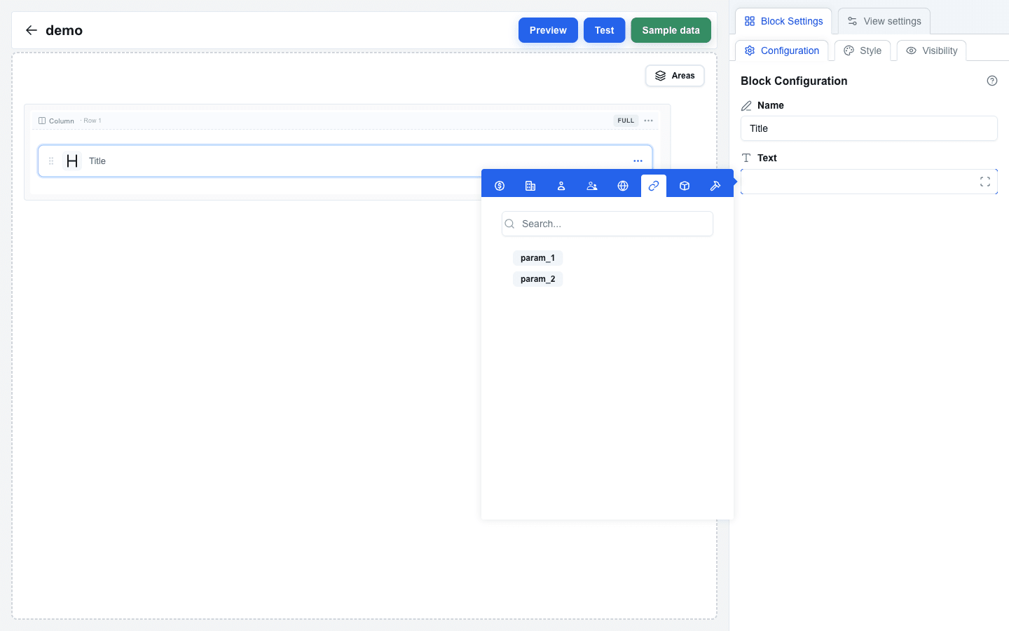 ---
# Managing Interface Variables
Source: https://help.theoneclick.io/docs/buttons/interface-button/interface-builder/how-to/data/variables.md
## Variables Page
Open the **Variables** tab from the home screen. The page header reads **Environment Variables** and lists every variable defined for the current interface, with a stats line showing how many are confidential and how many are Pipedrive fields.
 ## Creating a Variable
The **Add Variable** button in the top-right is a dropdown with two options:
- **Normal** -- a key-value pair you fill in yourself (e.g. an API base URL or token).
- **Pipedrive Field** -- a variable that resolves to the value of a chosen Pipedrive field on the current resource.
### Normal variable
Pick **Normal** to open the **Add New Variable** dialog and fill in:
- **Key** -- a unique identifier (referenced in the Data Picker as `{{variable.key}}`). Required.
- **Value** -- the variable's content. Required. The field uses a password-style input with a show/hide toggle.
- **Confidential** -- toggle on to mask the value in the builder UI and restrict editing/deletion to its creator. (All variable values are encrypted at rest, regardless of this toggle.)
Click **Create Variable** to save.
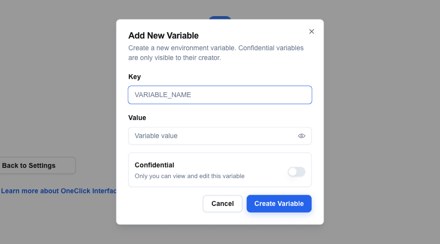 ### Pipedrive Field variable
Pick **Pipedrive Field** to open the **Add Pipedrive Field Variable** dialog and fill in:
1. **Resource Type** -- choose **Deal**, **Person**, or **Organization**.
2. **Pipedrive Field** -- pick a field from the searchable list.
3. **Variable Name** -- defaults to the field's display name. Edit if you want a shorter key.
The dialog also shows the resolved **Field code** as a preview. Click **Create Variable** to save. The variable's value is resolved at render time from the current deal/person/organization context.
## Confidential Variables
All variable values are encrypted at rest in the database. The **Confidential** toggle adds two extra protections on top of that:
- The value is masked (`••••••••••••`) in the variables list. Only the creator can reveal it with the eye icon. Other users see the mask with no eye icon, and the copy button is not shown for confidential variables.
- Only the creator can edit or delete the variable. Other users see the row but the action icons are disabled.
The variable still works the same way at render time: the encrypted value is decrypted server-side and used in placeholders. Use confidential variables for API keys, tokens, and other sensitive data.
## Using in Data Picker
1. Open any Data Picker field in the builder.
2. Switch to the **Variable** tab (the icon-only tab in the picker's top bar).
3. Click a variable to insert it as a tag. The compiled syntax is `{{variable.your_key}}`.
Variables are resolved server-side at render time, so confidential values are never exposed in the client.
## Editing and Deleting
Hover a variable card to reveal the action icons on the right:
- **Edit (pencil)** -- modify the key, value, or confidential flag.
- **Delete (trash)** -- removes the variable after a confirmation dialog.
**Permissions:** only the user who created a confidential variable can edit or delete it. Non-confidential variables can be modified by any user with access to the interface.
## Variables and snapshot restore
A [snapshot](/docs/buttons/interface-button/interface-builder/how-to/views/snapshots) holds every variable of the interface, confidential values included. The values stay encrypted in the snapshot. A restore returns the variables to the state of the snapshot, with the same creator rule as editing:
- **Your own confidential variables** are restored like all other variables.
- **Confidential variables of other admins** stay as they are. The restore does not change their value and does not delete them, also when the snapshot does not have them. The restore preview lists their keys in a separate line (for example *"2 confidential variables of other admins stay as they are: api_token, slack_webhook_token."*) and does not count them in the **Variables** totals.
- If the snapshot has a variable with the same id or the same key as such a kept variable (the key match ignores case), the restore skips the snapshot variable. So each key is on one variable after the restore.
---
# How to Use Alert and Badge Blocks
Source: https://help.theoneclick.io/docs/buttons/interface-button/interface-builder/how-to/blocks/alert-and-badge.md
## Alert Block
1. Hover the gap between two rows and click the `+` button to add a row, then click an empty column and pick **Alert** in the **Add block** dialog.
2. Click the new block to open its settings in the sidebar.
### Setting the Variant
The variant controls the alert's visual style. The Variant card has two tabs:
**Select tab** (default): Pick a variant from the dropdown:
- **Default** -- neutral style
- **Destructive** -- red, for errors
- **Info** -- blue, for informational messages
- **Success** -- green, for confirmations
- **Warning** -- yellow/amber, for caution
**Data tab**: Use the Data Picker to bind the variant to a data field. The field value must be one of: `default`, `destructive`, `info`, `success`, `warning`.
 ### Title and Description
- **Title (Optional)**: Use the Data Picker to set the alert title. You can type static text or pick a dynamic value from your data source using `{{resource.field}}` syntax.
- **Description**: Use the Data Picker to set the alert body text. Same static/dynamic options as title.
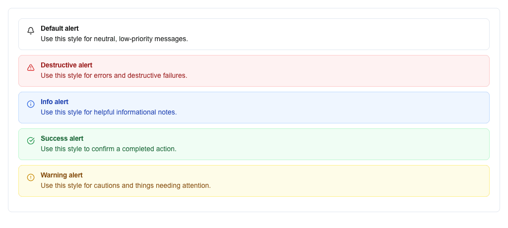 ---
## Badge Block
1. Hover the gap between two rows and click the `+` button to add a row, then click an empty column and pick **Badge** in the **Add block** dialog.
2. Click the new block to open its settings in the sidebar.
### Setting the Variant
Like Alerts, Badges have **Select** and **Data** tabs in the Variant card.
Static variants available:
- Default, Destructive, Info, Success, Warning, Secondary, Outline, Pink, Violet, Light Blue, Disabled
In the Data tab, use the Data Picker to bind the variant to a data field. Valid values: `default`, `destructive`, `info`, `success`, `warning`, `secondary`, `outline`, `pink`, `violet`, `lightBlue`, `disabled`.
### Setting the Value
Use the **Text** field to set the badge text. You can type static text or use the Data Picker with `{{resource.field}}` to pull values dynamically from your data source.
 ---
# How to Add Avatars
Source: https://help.theoneclick.io/docs/buttons/interface-button/interface-builder/how-to/blocks/avatar.md
## Adding an Avatar Block
1. Hover the gap between two rows and click the `+` button to add a row (pick any layout in the **Add row** dialog).
2. Click an empty column inside the row, then pick **Avatar** in the **Add block** dialog.
3. Click the new block to open its settings in the sidebar.
## Image Source
Use the **Image URL** field to set the avatar image URL. Typically you bind this to a dynamic data field such as a Pipedrive user photo or person photo URL using `{{resource.field}}` syntax.
If the URL resolves to a valid image, the avatar displays that image.
## Fallback Text
Use the **Fallback Name** field to define fallback text shown when no image is available. This is typically a person's name -- the avatar automatically extracts initials from the first two words (e.g., "John Doe" becomes "JD").
You can use static text or bind it dynamically via the Data Picker.
## Size Selection
Choose the avatar size from the dropdown:
- **Small (32px)**
- **Medium (40px)** — default
- **Large (56px)**
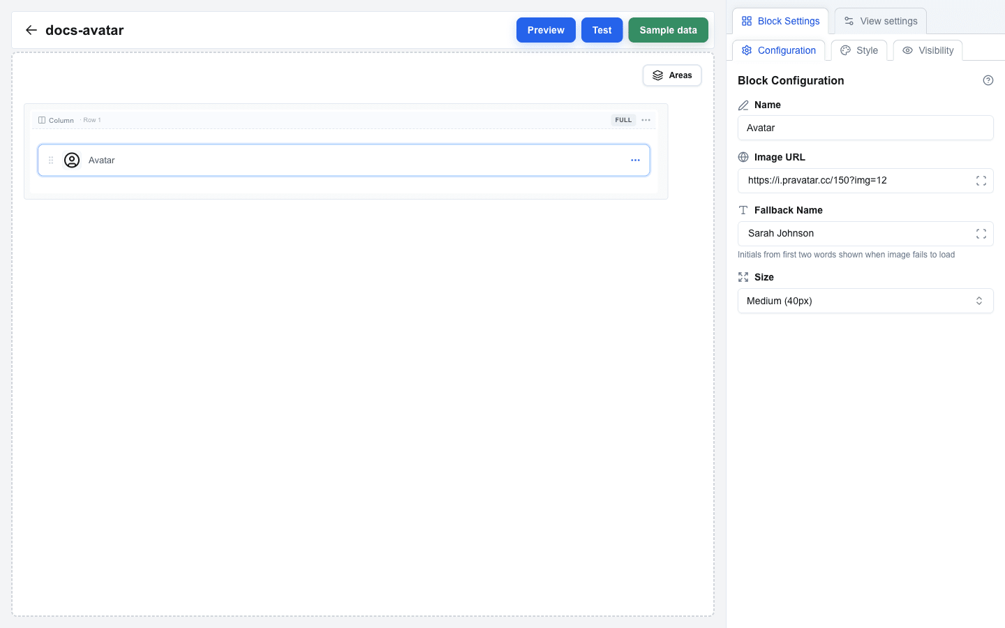 ---
# How to Add and Configure Buttons
Source: https://help.theoneclick.io/docs/buttons/interface-button/interface-builder/how-to/blocks/button.md
## Adding a Button Block
1. Add a row if you do not have one yet — hover the gap between two rows to reveal the `+` button, click it, and pick a layout.
2. Click an empty column inside the row to open the **Add block** dialog.
3. Pick **Button** from the list.
4. Click the new block to open its settings in the sidebar.
5. Choose a **Button Type**: **URL Button**, **Action Button**, **Form Submit Button**, or **Form Reset Button**.
---
## URL Button
Opens a URL or makes an API call when clicked.
1. Set **Button Type** to **URL Button**.
2. Optionally fill **Button Identifier** -- a unique identifier for tracking this button.
3. Choose the **Button URL** mode:
- **Use view base url** -- appends a path to your view's base URL.
- **Use custom url** -- a fully custom URL.
4. For **Use view base url**, set **Path**. For **Use custom url**, set **Custom URL**. Both support the Data Picker for dynamic values.
5. Optionally configure:
- **Button Body Data** -- JSON or form-encoded body sent with the request.
- **Headers** -- custom HTTP headers (key/value pairs). If the OneClick button this interface is attached to has its **Headers** toggle enabled, those headers are merged into the URL button's request automatically — see [OneClick-Level Headers](/docs/buttons/interface-button/interface-builder/explanation/architecture#oneclick-level-headers).
- **Query parameters** -- URL query parameters (key/value pairs).
- **Wait page transition** -- enable to wait for interstitial messages and redirects from your backend (see below).
- **Page Transition Timeout** -- how long to wait for the backend (in seconds).
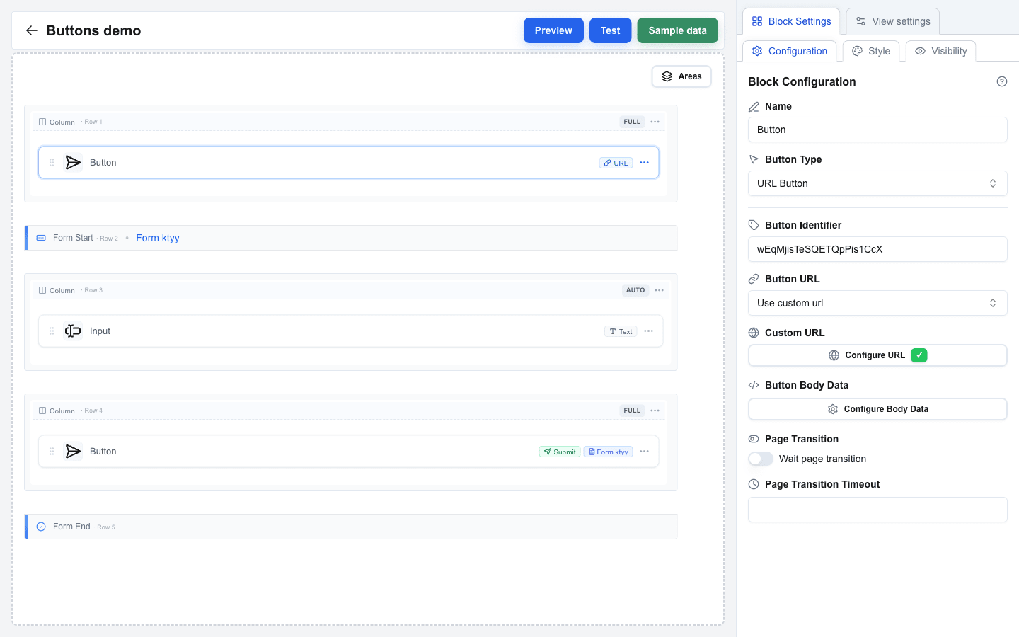 ### How a URL button handles the response
For the request shape your endpoint receives and the polling loop that runs while **Wait page transition** is on, see [URL Button Flow](/docs/buttons/interface-button/interface-builder/explanation/url-button-flow).
When the user clicks a URL button, Interface Builder calls your backend and then:
- **If Wait page transition is off**, the response is used once: a string body becomes a success toast, an `oneclick_data` response can show a toast and/or navigate the user. Nothing else happens.
- **If Wait page transition is on**, Interface Builder keeps polling for updates from your backend for up to **Page Transition Timeout** seconds. Every time your backend writes a new message, the user sees it as a toast. If your backend eventually returns a redirect, the user is navigated there.
Use **Wait page transition** when the action behind the button takes time to complete and you want to show progress (for example, "Validating…", "Charging card…", "Creating invoice…") and then jump the user to a result page when done.
**Response shapes:**
```json
{ "oneclick_data": { "message": "Item added to cart" } }
```
Shown as a success toast.
```json
{
"oneclick_data": {
"message": "Payment successful",
"redirect_view": { "id": "receipt-view", "params": { "order_id": "4321" } }
}
}
```
Shown as a toast, then user is navigated to `receipt-view`.
```json
"Thanks!"
```
A plain string response is shown as a success toast.
See [HTTP Response Format](/docs/buttons/interface-button/interface-builder/reference/data-binding/http-response-format) for every shape the button accepts, and [Messages & Toasts](/docs/buttons/interface-button/interface-builder/how-to/data/messages-and-toasts) for how to format the message text.
If the backend times out or returns an error, the user sees an error toast. No navigation happens.
---
## Action Button
Navigates between views in your interface.
1. Set **Button Type** to **Action Button**.
2. Choose the **Action Type**:
- **go to view** -- navigate to a specific view.
- **back** -- go to the previous view.
3. For **go to view**, select the target view from the **View Name** dropdown.
4. Optionally add **Parameters** -- key-value pairs passed to the target view.
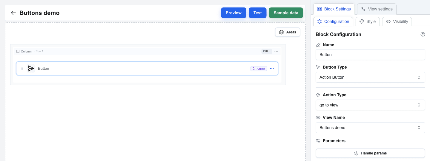 ---
## Form Submit Button
Submits a form's data.
1. Set **Button Type** to **Form Submit Button**.
2. Select the target form from the **Form** dropdown. This links to the **Form Identifier** set on the form.
3. Choose the **Form Type**:
- **JSON** (default) -- sends form data as JSON. Requires a Submit URL.
- **Multipart/Form-Data** -- sends as multipart data (use for file uploads). Requires a Submit URL.
- **Open view with form data** -- passes form data to another view without making an HTTP request. Submit URL is not required.
4. For **JSON** and **Multipart/Form-Data**, set the **Submit URL** -- the endpoint that receives the data.
5. Configure **After submission**:
- **Select view** -- navigate to a chosen view after submission. Optionally pass parameters or forward input values as search params.
- **Wait for response** -- wait for the server response (timeout: 10-60 seconds). Optionally enable **Disable form after submission** to prevent double-submits, or **Show message after submission** to display a confirmation.
6. Optionally configure **Headers** and **Query parameters** for the request.
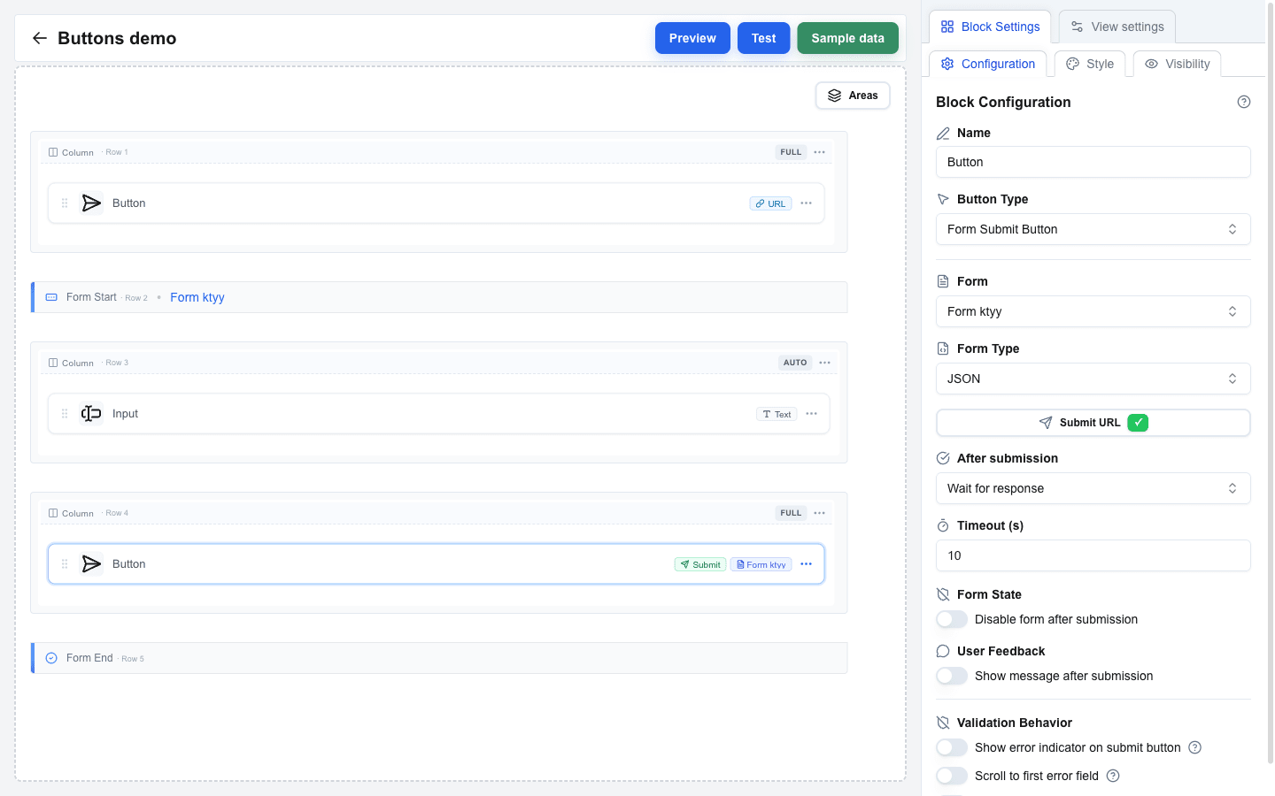 See [Configuring Form Submission](/docs/buttons/interface-button/interface-builder/how-to/forms/form-submission) for full details on submission behavior.
---
## Form Reset Button
Clears all fields in a form back to their default values.
1. Set **Button Type** to **Form Reset Button**.
2. Select the target form from the **Form** dropdown.
---
## Asking for Confirmation
Use a confirmation when a click deletes, sends, approves, or clears something. The button then opens a dialog and runs its action only after the user confirms. It works on all four button types.
1. Select the button and scroll to the **Confirmation** section at the bottom of the **Configuration** tab.
2. Turn on **Require confirmation**. The dialog is filled in for you: "Are you sure?", **Confirm**, and **Cancel**, with the Confirm choice copying the button's own variant.
3. Write the **Title** as the question the user answers, for example `Delete {{deal.title}}?`. It supports the Data Picker, so a button inside an Area loop asks about that iteration's record.
4. Optional: add a **Description** with what will happen. It also supports the Data Picker and keeps its line breaks.
5. Optional: adjust **Confirm Button Label** and **Confirm Button Variant** — pick **Destructive** for a delete — and the matching **Cancel** fields.
6. Test the button in the Test view: the dialog must open, and the action must run only after **Confirm**.
Cancel and Escape close the dialog and change nothing. Turning **Require confirmation** back off keeps the texts you wrote, so removing the gate for a test costs nothing.
### On a Form Submit Button
The dialog opens before the form is validated, so a user can confirm and then meet "field required". This is expected: the submission runs unchanged after the confirmation, validation and all. Keep the Title about the action ("Send the application?") rather than about the data being complete.
Pressing Enter in a text input opens the dialog too — the form clicks the gated button for you, so Enter cannot skip the question.
---
## Button Appearance
Variant and size live on the **Style** tab in Block Settings (next to **Configuration** and **Visibility**).
### Button Variant
Choose a visual style from the **Button Variant** selector:
- **Default** -- primary filled button
- **Destructive** -- red/danger style
- **Outline** -- bordered, no fill
- **Secondary** -- muted/secondary fill
- **Ghost** -- no border or fill, text only
- **Link** -- styled as a hyperlink
- **Custom** -- unlocks the rest of the Block Style panel (font size/weight/colours, etc.) so you can build your own look. The other variants ignore those custom style fields.
### Button Size
Choose from: **Small**, **Default**, or **Large**.
### Icons
Both icon slots sit on the same **Style** tab, between **Button Size** and **Button Variant**.
1. Open **Icon before text** and pick a glyph, or **Icon after text** for a trailing one.
2. Pick from the groups **Actions**, **Navigation**, **Communication**, **Files** and **Status**.
3. Choose **No icon** to clear a slot again.
The glyph takes the button's text colour and is always 16 px, so every Button Variant works.
### Making a button icon-only
Use this for a dense row of controls where the words cost more width than they earn.
1. Pick a glyph in **Icon before text**.
2. Turn **Show text** off.
The button becomes a square of the height its **Button Size** already had, keeping its variant colours.
What to expect:
- **Show text** stays unavailable until you pick an icon, and a note below it tells you so. A button with no text and no glyph would be empty.
- **Icon after text** becomes unavailable while the text is hidden. If your only glyph was in that slot, it moves to **Icon before text** when you hide the text.
- The block name is still the button's name: a screen reader announces it, and it appears as a tooltip on hover.
- Your service still receives the block name as the button name in the URL Button metadata.
- On a **Form Submit Button** with **Show error indicator on submit**, the hover reports the invalid field count while the form has errors; the name tooltip returns once the errors are fixed. The badge and the loading spinner are unaffected.
---
# How to Add Charts
Source: https://help.theoneclick.io/docs/buttons/interface-button/interface-builder/how-to/blocks/chart.md
## Adding a Chart Block
1. Hover the gap between two rows and click the `+` button to add a row (pick any layout in the **Add row** dialog).
2. Click an empty column inside the row, then pick **Chart** in the **Add block** dialog.
3. Click the new block to open its settings in the sidebar.
## Selecting Chart Type
Choose the chart type from the **Chart Type** dropdown:
- **Bar** -- vertical bar chart (default)
- **Line** -- line chart
- **Area** -- filled area chart
- **Pie** -- pie/donut chart
## Configuring Data Source
Use the **Data Source** field to bind the chart to an array data source. The Data Picker only allows array-typed values here; pick the array field that holds your data points (it will appear as a blue tag, for example a custom field that resolves to a list of invoices).
Each item in the array must be an object whose properties supply the values and labels for the chart.
## Setting Keys
- **Data Keys** -- comma-separated list of property names to plot as values. For a single series, enter one key (for example `amount`). For multi-series charts, separate with commas (for example `paid,open,overdue`).
- **Name Key** -- the property used for labels on the X-axis or pie segments. Defaults to `name`.
Example data structure (matching the screenshot):
```json
[
{ "invoice_number": "INV-2026-001", "customer": "Acme Corporation Ltd", "amount": 12500, "status": "Paid" },
{ "invoice_number": "INV-2026-002", "customer": "Nordic Solutions AB", "amount": 2400, "status": "Paid" },
{ "invoice_number": "INV-2026-003", "customer": "TechVenture GmbH", "amount": 8750, "status": "Open" },
{ "invoice_number": "INV-2026-004", "customer": "Greenfield Industries","amount": 15000, "status": "Open" }
]
```
With **Data Keys** = `amount` and **Name Key** = `customer`, each row becomes one bar/segment labelled by customer name.
 ## Visual Options
- **Height** -- chart height in pixels (100--800, default `300`)
- **Show Grid** -- toggle background grid lines on/off (default on)
- **Show Tooltip** -- toggle hover tooltips on/off (default on)
- **Show Legend** -- toggle the chart legend on/off (default off)
 ---
# How to Use Hover Cards
Source: https://help.theoneclick.io/docs/buttons/interface-button/interface-builder/how-to/blocks/hover-card.md
## Adding a Hover Card Block
1. Hover the gap between two rows and click the `+` button to add a row (pick any layout in the **Add row** dialog).
2. Click an empty column inside the row, then pick **Hover Card** in the **Add block** dialog.
3. Click the new block to open its settings in the sidebar.
## Trigger Type
Choose what the user hovers over to reveal the card. Set **Trigger Type** to:
- **Text Only** — displays trigger text only (default)
- **Icon Only** — displays an icon only
- **Text + Icon** — displays both text and an icon
When the trigger includes text, fill the **Trigger Text** field. You can use static text or bind it dynamically with the Data Picker.
## Icon Configuration
When the trigger type includes an icon (**Icon Only** or **Text + Icon**), the sidebar shows two extra fields:
- **Icon Type** — pick the icon style: **Warning (Triangle)**, **Info (Exclamation)**, or **Question (Help)**. Default: **Question (Help)**.
- **Icon Color** — pick the icon color: **Gray**, **Red**, **Yellow**, **Blue**, or **Green**. Default: **Gray**.
## Content, Width, Alignment
- **Content** — the hover card body content. Use static text or the Data Picker for dynamic values.
- **Width** — set the card width in pixels (100–600). Default: 320.
- **Alignment** — set card alignment relative to the trigger: **Start**, **Center**, or **End**. Default: **Center**.
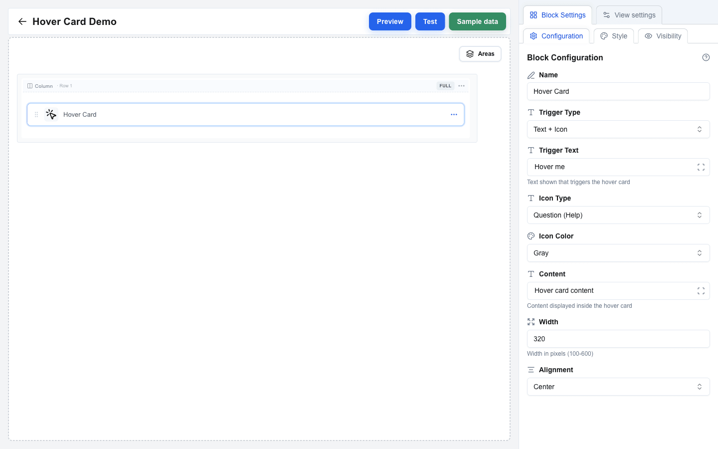
 ---
# How to Use the HTML Block
Source: https://help.theoneclick.io/docs/buttons/interface-button/interface-builder/how-to/blocks/html.md
## Adding an HTML Block
1. Hover the gap between two rows and click the `+` button to add a row (pick any layout in the **Add row** dialog).
2. Click an empty column inside the row, then pick **HTML** in the **Add block** dialog.
3. Click the new block to open its settings in the sidebar.
## Writing HTML Content
Enter your HTML markup in the **HTML** field. The field accepts whatever you paste -- there is no validation in the builder itself.
> **Pasting from ChatGPT or similar tools**
> Pasted content is normalised before it is saved: smart quotes (`"` `"` `'` `'`) become straight quotes, en/em dashes (`–` `—`) become hyphens, non-breaking spaces become regular spaces, and zero-width characters and Windows line endings are stripped. This prevents invisible artefacts from breaking your markup. Valid HTML entities like `&` are left untouched.
When the view renders, the HTML is run through a sanitiser. Only a fixed allowlist of tags survives:
`p`, `span`, `div`, `br`, `hr`, `h1`--`h6`, `ul` / `ol` / `li`, `dl` / `dt` / `dd`, `table` / `thead` / `tbody` / `tfoot` / `tr` / `th` / `td` / `caption` / `colgroup` / `col`, `a`, `img`, `figure`, `figcaption`, `details`, `summary`, plus inline-formatting tags (`strong`, `b`, `em`, `i`, `u`, `s`, `strike`, `del`, `ins`, `sub`, `sup`, `small`, `mark`, `abbr`, `code`, `pre`, `blockquote`).
Allowed attributes: `href`, `src`, `alt`, `title`, `width`, `height`, `colspan`, `rowspan`, and `style` (so inline CSS is supported).
Anything else -- `ok"` → `"ok"`
## Allowed attributes
- `` accepts `href`. All other attributes are dropped.
- Event-handler attributes (`onclick`, `onerror`, and so on) are stripped from every tag.
- `
![]() `, `