The Button block renders a clickable button. What happens on click depends on the **Button Type** you pick: open a URL, navigate to another view, submit a form, or reset a form.
 ## Common Settings
These appear for every button regardless of type.
| Setting | Description |
|---|---|
| **Button Type** | Determines what the button does. Options: URL Button, Action Button, Form Submit Button, Form Reset Button. A brand-new button has no type until you pick one. |
| **Button Variant** | The visual style of the button. See the list below. |
| **Button Size** | Small, Default, or Large. |
| **Icon before text** | Optional glyph shown to the left of the button's text. See Icons below. |
| **Icon after text** | Optional glyph shown to the right of the button's text. Unavailable while **Show text** is off. See Icons below. |
| **Show text** | On by default. Turn it off for an icon-only button. Unavailable until you have picked an icon. See Icons below. |
| **Block name** | The button's visible label. Edit it in the name input at the top of the Block Configuration sidebar; on the canvas it is shown read-only. It is plain text: the Data Picker does not apply to it, and it is not resolved from data at render time. |
| **Require confirmation** | Off by default. Turn it on to ask the user before the button's action runs. See Confirmation below. |
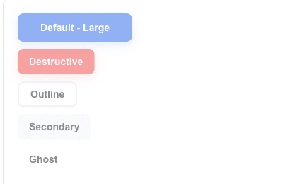
### Button Variant
| Variant | Appearance |
|---|---|
| **Default** | Primary filled button. |
| **Destructive** | Red/danger style. |
| **Outline** | Outlined, no fill. |
| **Secondary** | Muted secondary fill. |
| **Ghost** | Transparent background; visible on hover. |
| **Link** | Styled as a text link. |
| **Custom** | Your own colors (see below). |
When you pick **Custom**, four color fields appear:
- **Background color**
- **Text color**
- **Hover background color**
- **Hover text color**
### Button Size
- **Small**
- **Default**
- **Large**
### Icons
A button has two icon slots, **Icon before text** and **Icon after text**. Both sit with Button Size and Button Variant, and both are available on every Button Type — including a button whose type you have not picked yet.
The slots are independent, and **Show text** can hide the text, so five arrangements are reachable:
| Arrangement | How |
|---|---|
| Text only | Leave both slots on **No icon**. This is how every button behaved before the slots existed. |
| Icon + text | Fill **Icon before text**. |
| Text + icon | Fill **Icon after text**. |
| Icon + text + icon | Fill both. |
| Icon only | Fill **Icon before text**, then turn **Show text** off. |
Pick a glyph from the shared catalogue, grouped by meaning: **Actions**, **Navigation**, **Communication**, **Files** and **Status**. Each glyph is shown next to its name in the list. Choose **No icon** to clear a slot.
Notes:
- The glyph is chosen once, in the builder. It does not come from your data, so it cannot change per row or per Area loop iteration, and it cannot be an image URL.
- There is no size or colour setting. A glyph is always 16 px and always takes the button's text colour, so every Button Variant works — the Custom variant's **Text color** reaches the glyph too.
- Icons look the same in the Preview view, the Test view and the published view, and a copied button keeps them.
### Icon-only buttons
Turn **Show text** off to keep the glyph and drop the text. The button becomes a square: its height is the one **Button Size** already gives it, and its width now matches, so an icon-only button lines up with the text buttons beside it. It keeps its corner radius and its **Button Variant** colours, so a Destructive icon-only button still reads as destructive.
Nothing is lost by hiding the text:
- The block name becomes the button's accessible name, so a screen reader announces it.
- The block name also appears as a tooltip when the user hovers the button.
- The block name still reaches your service as the button name in the URL Button metadata, exactly as it does with the text shown.
Two rules keep an icon-only button usable, and the builder applies both:
- **Show text** is unavailable until you have picked an icon, with a note saying so — a button with neither text nor a glyph would be empty.
- **Icon after text** is unavailable while the text is hidden — an icon-only button carries one glyph. If that glyph was in the **Icon after text** slot when you turned **Show text** off, it moves to **Icon before text** for you.
On a **Form Submit Button** with **Show error indicator on submit** enabled, the error message wins the hover: while the form has validation errors the tooltip reports the number of invalid fields instead of the button's name. The error count badge and the loading spinner appear as they do on a button with text, and the accessible name stays in place the whole time.
---
## Confirmation
A confirmation is an optional gate in front of the button's action: the click opens a modal dialog, and the action runs only after the user confirms it. The **Confirmation** section sits at the bottom of the Block Configuration sidebar and is available on every Button Type, including a button whose type you have not picked yet.
| Setting | Description |
|---|---|
| **Require confirmation** | Off by default. Turn it on to gate the button. Turning it off again keeps the texts you wrote, so you can try the button without the gate and put it back. |
| **Title** | The dialog's question. Required, and prefilled with "Are you sure?" on the first enable. Supports the Data Picker. |
| **Description** | Optional explanation below the question. Supports the Data Picker and keeps its line breaks. An empty description leaves the dialog with the question alone. |
| **Confirm Button Label** | The confirming choice's text. Required, prefilled with "Confirm". |
| **Confirm Button Variant** | The confirming choice's appearance. On the first enable it copies the button's own **Button Variant**, so a Destructive button opens a dialog with a Destructive Confirm. A **Custom** button falls back to **Default**. |
| **Cancel Button Label** | The cancelling choice's text. Required, prefilled with "Cancel". |
| **Cancel Button Variant** | The cancelling choice's appearance. Defaults to **Outline**. |
The two variant dropdowns offer **Default**, **Destructive**, **Outline**, **Secondary**, **Ghost**, and **Link**. **Custom** is not offered: it paints both choices from the block's single style object, which would make them identical.
### Behaviour
The dialog is a gate in front of the action, not a report on it. Confirming closes the dialog and runs the action; whatever the action normally shows — a toast, a redirect, an inline alert — follows as usual.
**Cancel** and **Escape** close the dialog and change nothing. Nothing is sent, no form is submitted or cleared, and no navigation happens.
The **Title** and the **Description** resolve from data like any other Data Picker field, and a button inside an Area loop resolves them once per iteration, so each rendered copy asks about its own record. A Title that resolves empty falls back to "Are you sure?"; a Confirm or Cancel label that resolves empty falls back to "Confirm" and "Cancel". The Confirm and Cancel labels are plain text and have no Data Picker.
### Per Button Type
| Button Type | What the confirmation gates |
|---|---|
| **URL Button** | The POST to the URL. The request is sent once, after Confirm. |
| **Action Button** | The navigation. Cancel leaves the reader on the current view. |
| **Form Submit Button** | The submission. See the ordering note below. |
| **Form Reset Button** | The reset. Cancel leaves the typed values in place. |
On a **Form Submit Button** the dialog opens *before* the form is validated, so a user can confirm and then be shown "field required". Fix the field and confirm again. The submission itself is unchanged: validation, the error toast, the error indicator, and the After submission action all run after the confirmation, exactly as they do without it.
Pressing **Enter** in a text input of a gated form opens the dialog instead of submitting: the form intercepts the key and clicks the Submit Button for you, so the gate cannot be bypassed. Shift+Enter and Enter in a textarea keep their normal meaning.
---
## URL Button
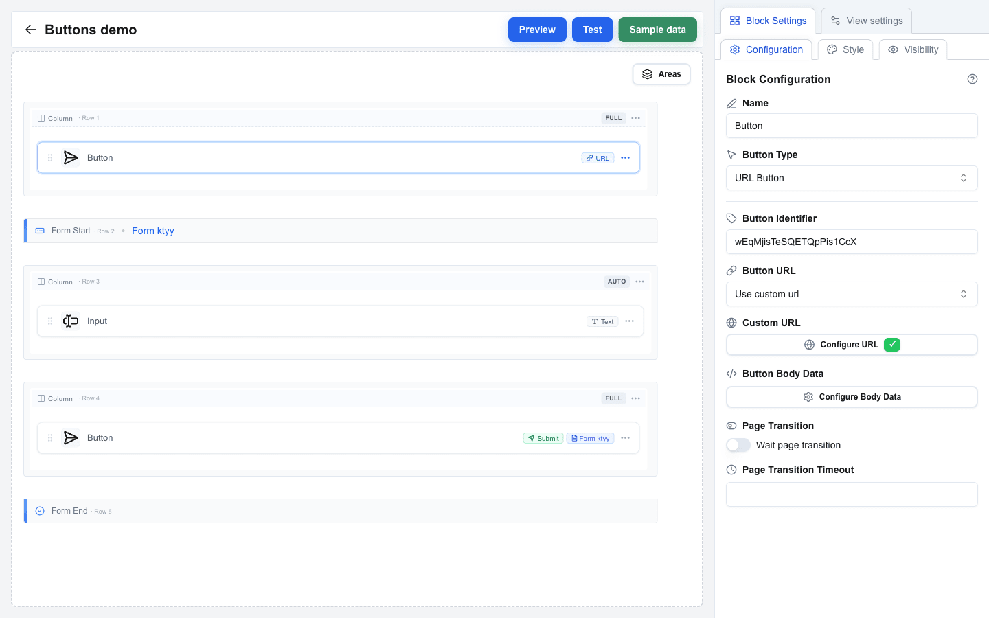
Choose **Button Type = URL Button** when clicking the button should open a URL or call your API.
| Setting | Description |
|---|---|
| **Button Identifier** | Optional free-text identifier used when you want to track or reference this specific button. |
| **Button URL** | Pick **Use view base url** to append a path to the view's base URL, or **Use custom url** to specify a full URL. |
| **Path** | Path appended to the view base URL. Shown when Button URL = Use view base url. |
| **Custom URL** | Full target URL. Shown when Button URL = Use custom url. Supports the Data Picker. |
| **Button Body Data** | Request body sent with the call. Supports the Data Picker. |
| **Headers** | Key/value pairs of custom HTTP headers. Header keys may only contain letters, numbers, and hyphens, and must not start with `x-oc-`. |
| **Query parameters** | Key/value pairs appended to the URL. |
| **Wait page transition** | When on, the builder keeps listening for progress updates from your backend after the click. Use this when the action takes a while. |
| **Page Transition Timeout** | How long to keep listening when Wait page transition is on, in seconds. |
 ---
## Action Button
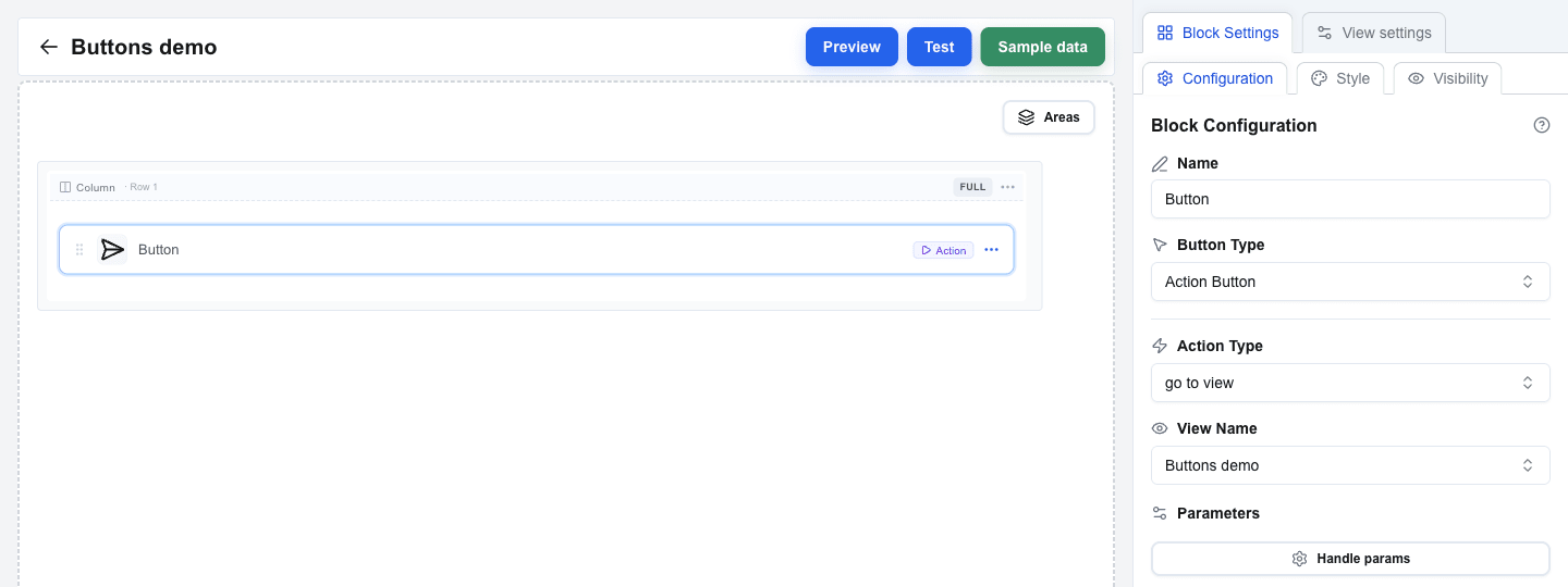
Choose **Button Type = Action Button** for navigation between views inside the same interface.
| Setting | Description |
|---|---|
| **Action Type** | Pick **go to view** to navigate to a specific view, or **back** to return to the previous view. |
| **View Name** | Dropdown of every view in the interface. Shown when Action Type = go to view. |
| **Parameters** | Optional key/value pairs passed to the target view as search parameters. |
 ---
## Form Submit Button
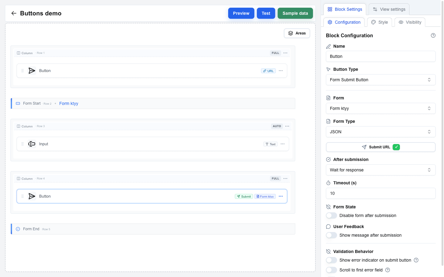
Choose **Button Type = Form Submit Button** to submit a form.
| Setting | Description |
|---|---|
| **Form** | Dropdown listing every form in the view (by its Form Identifier). Pick the one this button should submit. |
| **Form Type** | How the form data is packaged and sent. See the three options below. |
| **Submit URL** | The endpoint that receives the submission. Required for **JSON** and **Multipart/Form-Data**. |
| **Headers** | Key/value pairs of custom HTTP headers. |
| **Query parameters** | Key/value pairs appended to the Submit URL. |
### Form Type options
| Option | When to use |
|---|---|
| **JSON** *(default)* | Standard API that expects a JSON body. |
| **Multipart/Form-Data** | The form includes file uploads. |
| **Open view with form data** | Do not call an API at all — navigate to another view and pass all input values as URL search parameters. |
### After submission
Right below Submit URL, the **After submission** setting decides what happens once the data is sent.
**Select view** — navigate to a specific view after sending.
| Setting | Description |
|---|---|
| **View ID** | The view to navigate to after submission. |
| **Parameters** | Key/value pairs passed to the target view. |
| **Use input fields as search params** | When on, every input value from the form is automatically forwarded as a URL parameter. |
**Wait for response** — wait for the server to reply, then act on the response.
| Setting | Description |
|---|---|
| **Timeout (s)** | How long to wait, 10 to 60 seconds. |
| **Disable form after submission** | When on, the submit button stays disabled after a successful response so the user cannot re-submit. |
| **Show message after submission** | When on, a server-provided message replaces the form with an inline alert instead of showing as a toast. |
### Validation feedback
Three toggles control how validation errors on the form are surfaced when the user clicks submit:
| Toggle | What it does |
|---|---|
| **Show error toast on submit** | Shows a toast with the number of invalid fields. |
| **Scroll to first error field** | Smoothly scrolls and focuses the first invalid field. |
| **Show error indicator on submit button** | Shows a small error badge on the button while there are validation errors. |
 ---
## Form Reset Button
Choose **Button Type = Form Reset Button** when the button should clear the form's fields back to their default values.
| Setting | Description |
|---|---|
| **Form** | Dropdown listing every form in the view. Pick the one to reset. |
---
## Style and Visibility
The Button block also has the standard **Block Style** section (background, text, borders, size) and **Conditional Visibility** section available to every block.