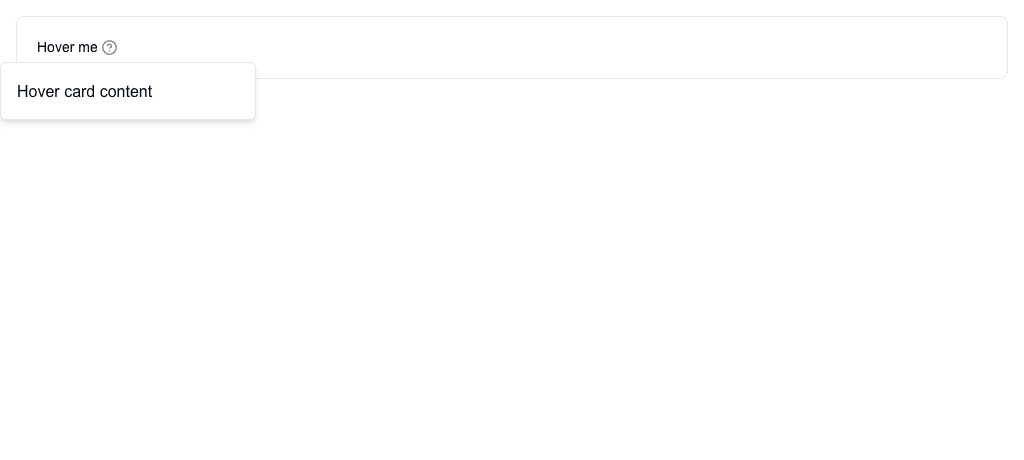
The Hover Card block shows a popup card when the user hovers over a trigger. The trigger can be text, an icon, or both.
 ## Settings
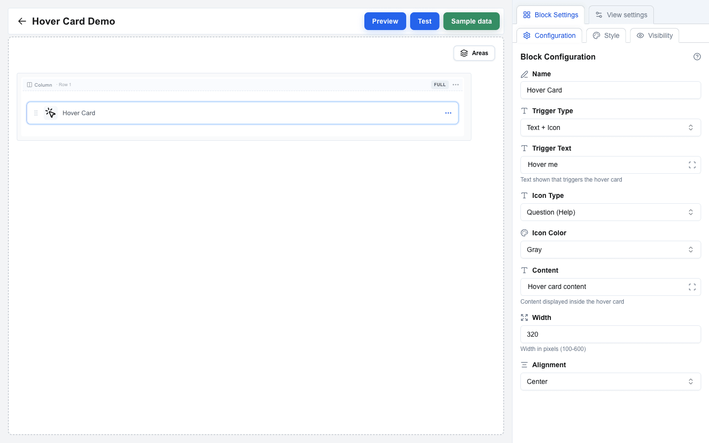
| Setting | Description |
|---|---|
| **Trigger Type** | Pick **Text Only**, **Icon Only**, or **Text + Icon** -- what the user hovers over (default: Text Only). |
| **Trigger Text** | The trigger's visible text. Shown when Trigger Type is **Text Only** or **Text + Icon**. Supports the Data Picker. |
| **Icon Type** | Pick **Warning (Triangle)**, **Info (Exclamation)**, or **Question (Help)** (default: Question (Help)). Shown when Trigger Type is **Icon Only** or **Text + Icon**. |
| **Icon Color** | Pick **Gray** (default), **Red**, **Yellow**, **Blue**, or **Green**. |
| **Content** | The body of the popup card. Supports the Data Picker. |
| **Width** | Popup width in pixels, between 100 and 600 (default: 320). |
| **Alignment** | **Start**, **Center** (default), or **End** -- horizontal alignment of the popup relative to the trigger. |
 ## Style and Visibility
The Hover Card block uses the standard **Style** sub-tab (background, borders, radius) and **Visibility** sub-tab in Block Settings, the same as every other block. See [Block Styles](/docs/buttons/interface-button/interface-builder/reference/styles/block-styles) and [Conditional Visibility](/docs/buttons/interface-button/interface-builder/how-to/visibility/conditional-visibility).