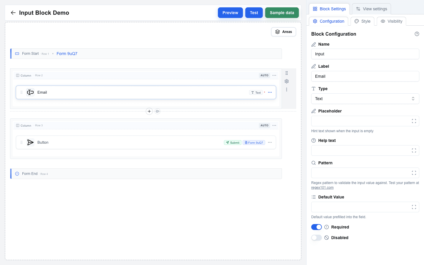
The Input block renders a form field. It must be placed inside a form -- between a **Form Start** and **Form End** row on the canvas. Every input has a **Label**, a **Type**, and whatever extra settings its Type requires.
 ## Common Settings
These appear for every input regardless of Type, in this order in the Block Settings sidebar:
| Setting | Description |
|---|---|
| **Label** | The visible text shown above the field. |
| **Type** | Picks the kind of input -- Text, Email, Number, etc. See the list below. |
| **Placeholder** | Hint text shown inside the empty field. Available on **Text**, **Textarea**, **Email**, **Number**, **URL**, **Single Select**, and **Multi Select** only. Supports the Data Picker. |
| **Help text** | Smaller hint text shown below the field (max 128 characters). Supports the Data Picker. |
| **Default Value** | A pre-filled value shown to the user. Supports the Data Picker. The help text under the field changes per Type to describe what's expected (for example `YYYY-MM-DD format` for Date, `Coerced to a number` for Number). |
| **Required** | When on, the form cannot be submitted until this field is filled. The ⇄ button beside the label swaps the switch for a Data Picker field: the field is required when the value is `true`, `yes` or `1` (trimmed, case-insensitive), and optional for any other value, including empty. Hidden fields cannot be Required. |
| **Disabled** | When on, the field is read-only. It sends its **Default Value** on submit and skips its validation. The ⇄ button offers the same Data Picker choice and rule as Required. Hidden fields cannot be Disabled; a change to Hidden turns both settings off and back to a switch. |
## Input Types
### Basic Types
| Type | What the user sees |
|---|---|
| **Text** | Single-line text box. |
| **Textarea** | Multi-line text box. |
| **Email** | Text box with built-in email validation. |
| **Number** | Numeric-only text box. |
| **URL** | Text box with built-in URL validation. |
| **Date** | Date picker. |
| **File** | File upload row: the user drops files onto it or clicks it to open the file dialog. A single-file input refuses a drop of several files. |
| **Hidden** | No UI -- the value is included in the submission but never shown to the user. Useful for pre-filling context data. |
#### Extra settings on basic types
| Setting | Applies to | Description |
|---|---|---|
| **Pattern** | Text, Textarea, Email, Number, URL, Date | Regex pattern that the value must match. Supports the Data Picker. |
| **Pattern Error** | Same as above (only shown after Pattern has a value) | Custom error message shown when the pattern fails. Supports the Data Picker. |
| **Min** | Number | Minimum accepted value. Supports the Data Picker. |
| **Max** | Number | Maximum accepted value. Supports the Data Picker. |
| **Min Error** | Number (only shown after Min has a value) | Custom error message when the value is below Min. |
| **Max Error** | Number (only shown after Max has a value) | Custom error message when the value is above Max. |
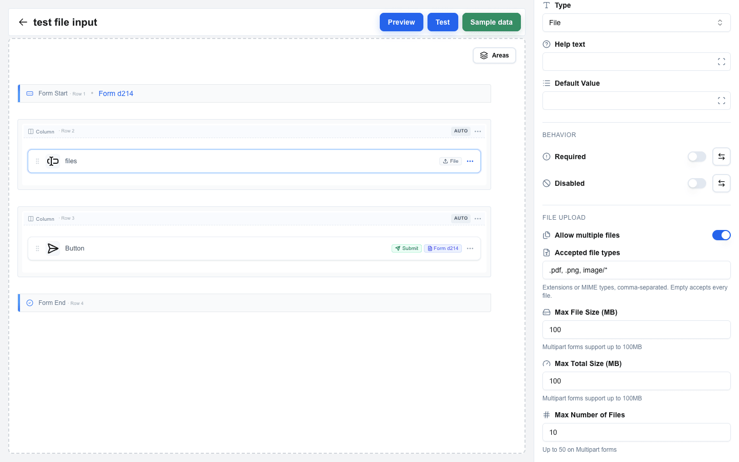
| **Allow multiple files** | File | Off by default. On, the input takes several files in one field: the user picks many at once, sees them listed, removes one, and adds more without losing the rest. It also fixes the field's payload shape -- a multi-file input always sends an array, a single-file input always sends an object. See [File Fields](/docs/buttons/interface-button/interface-builder/reference/data-binding/form-submission-types#file-fields). |
| **Accepted file types** | File | Empty by default, which accepts every file. One comma-separated list of file extensions (`.pdf`) and MIME types (`application/pdf`, `image/*`); a bare word such as `pdf` reads as `.pdf`, case does not matter, and extra commas are ignored. An entry that is neither form, such as `*.pdf` or `image/`, shows an error under the field. The file dialog offers only these types, and the drop zone hint lists the first three. The drop zone turns red while a file of another MIME type is dragged over it, but never while the list holds an extension whose MIME type the field does not know. A file of another type, such as a dropped one, still joins the selection, but its row turns red and the form does not submit until the user removes it. The list is static: a Data Picker value cannot set it, and the server does not check it. |
| **Max File Size (MB)** | File | Upper size limit for **one file**, weighed against each selected file on its own -- three 5 MB files pass a 10 MB limit. The maximum you can set depends on the surrounding form's Form Type: **JSON** forms allow up to 10 MB, **Multipart/Form-Data** forms allow up to 100 MB, and the label inside Block Settings shows the active one. The builder pre-fills the field with that ceiling, and lowers a value that is too high for the form type when the form type changes -- it never raises one you set yourself. |
| **Max Total Size (MB)** | File, with Allow multiple files on | Upper size limit for **the whole selection added up**. Same ceilings as Max File Size -- 10 MB on JSON forms, 100 MB on Multipart/Form-Data -- and the field arrives pre-filled with the ceiling. |
| **Max Number of Files** | File, with Allow multiple files on | How many files the field accepts at once. Pre-filled with **10** on both form types; the highest you may set is **25** on JSON forms and **50** on Multipart/Form-Data. This is the only setting that stops a user attaching hundreds of tiny files, which a size limit alone lets through. |
| **Rows** | Textarea | Visible rows (1 to 20, default 3). |
| **Max Length** | Textarea | Maximum character count. Leave empty for no limit. |
A **Default Value** of `0` works for Number inputs (it renders as zero, not as an empty field). If you switch a field's Type away from Number, the four numeric settings (Min, Max, Min Error, Max Error) clear automatically. Switching Type away from File clears **Allow multiple files** and **Accepted file types** the same way, and turning **Allow multiple files** off clears **Max Total Size (MB)** and **Max Number of Files** -- they belong to a multi-file field alone.
Switching the surrounding form's Form Type lowers any of the three limits that the new type cannot afford, down to that type's ceiling. It never raises a number you set yourself.
 All three limits are browser-side conveniences, not enforced ceilings. The server never reads an input's settings: it weighs every file field of a submission together against one budget of its own and refuses an over-budget submission with `413`. It puts no cap on the file count at all, so **Max Number of Files** narrows what a person can pick through the form and nothing more. See [File Size Limits](/docs/buttons/interface-button/interface-builder/reference/data-binding/form-submission-types#file-size-limits) for the numbers the server does enforce.
### Selection Types
| Type | What the user sees |
|---|---|
| **Checkbox** | Multiple-choice checkboxes. |
| **Radio** | Single-choice radio buttons. |
| **Single Select** | Dropdown for a single choice. |
| **Multi Select** | Dropdown for multiple choices. |
Each selection input has:
| Setting | Description |
|---|---|
| **Options Type** | Pick **Static** (you type the options in the builder) or **Dynamic** (options come from data at render time). |
For selection inputs with **Static** options, the **Default Value** field also gains a small swap button next to its label. The button toggles between two modes:
- A **dropdown** of the static options (the selection's stored value is the option's `value`).
- A **plain-text input** that supports template variables -- type the option's `value` directly, optionally as a Data Picker expression. For multi-value selections (Checkbox / Multi Select) separate values with commas.
#### Static options
Click the **Manage options** button and add rows. Each row has:
| Column | Description |
|---|---|
| **Label** | The text shown to the user. |
| **Value** | The value submitted when this option is selected. |
Both columns are required and must be at least 1 character long.
#### Dynamic options
| Setting | Description |
|---|---|
| **Labels Delimiter** | Separator used to split the resolved labels string. Default: `,`. |
| **Values Delimiter** | Separator used to split the resolved values string. Default: `,`. |
| **Labels** | Data Picker expression that resolves to the option labels. |
| **Values** | Data Picker expression that resolves to the option values. |
A warning banner inside Block Settings reminds you that if your data contains the delimiter character, the options may be split incorrectly.
## Form Requirement
An input always needs a surrounding form:
- Place the input between a **Form Start** and **Form End** row.
- The form needs at least one input and at least one **Form Submit Button** pointing at it.
- The **File** type cannot be used in a form whose **Form Type** is **Open view with form data**, because that mode passes values as URL parameters and cannot carry files. The builder shows a clear error if you try.
## Style and Visibility
The Input block uses the standard **Style** sub-tab (background, font, borders, radius) and **Visibility** sub-tab in Block Settings, the same as every other block. See [Block Styles](/docs/buttons/interface-button/interface-builder/reference/styles/block-styles) and [Conditional Visibility](/docs/buttons/interface-button/interface-builder/how-to/visibility/conditional-visibility).