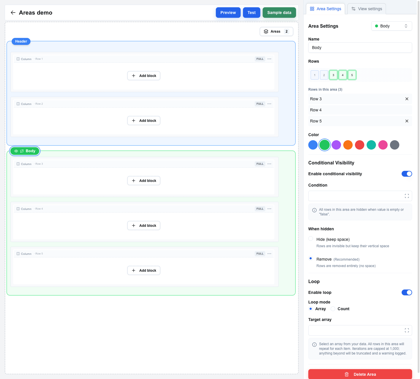
The settings panel is the sidebar on the right side of the builder. Its contents change based on what you have selected on the canvas -- a block, a row, a column, a form boundary, or an area badge. This page lists every tab the sidebar can show and every setting inside.
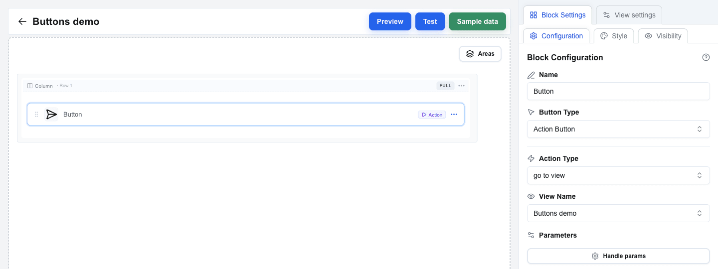 ## Tabs
The panel always shows **View settings** as one tab. A second tab appears when you click something on the canvas:
| Second tab shown | When it appears |
|---|---|
| **Block Settings** | A block is selected. |
| **Row Settings** | You clicked a row's column-header on the canvas, or picked **Settings** from the row's "..." menu. |
| **Column Settings** | You clicked a column-indicator label (the small "Col 1", "Col 2", "Full", etc. label above each column). |
| **Form Settings** | You selected a Form Start or Form End row. |
| **Area Settings** | You clicked an area's coloured **badge** (the floating chip with the area name above the area's first row). |
## View settings
Open any time by clicking the **View settings** tab. Contains view-wide configuration.
### View URL
Configure an API endpoint that the view calls when it opens. The response is available inside the view via the Data Picker's **Custom** tab.
Click **Configure URL** to open the URL Configuration dialog and fill in:
| Field | Description |
|---|---|
| **End-point URL** | The endpoint URL. Supports the Data Picker for dynamic values. |
| **HTTP Method** | **POST** or **GET** (default: GET). |
| **URL Active** | Toggle the call on or off. When off, no fetch runs on view load. |
| **Omit oneclick metadata** | When on, Interface Builder skips adding `event_id`, `resource_id`, and other OC-specific fields to the request body. Useful for APIs that reject unknown fields. |
| **Query Parameters** | Key/value pairs appended to the URL. |
| **Manage Headers** | Opens a sub-section to add custom HTTP headers. Header keys may only contain letters, numbers, and hyphens, and must not start with `x-oc-`. |
The End-point URL, its query parameters, and its header values all take the Data Picker, including its [Context tab](/docs/buttons/interface-button/interface-builder/reference/data-binding/data-picker#context-tab) — the four System context values that scope a call to this company, this user, and this record, and a View reference to any other view of the same button. On a [floating window button](/docs/buttons/interface-button/interface-builder/explanation/floating-window-buttons) that call cannot be scoped to a record: `resource_id` and `resource` are not offered.
 ### Global Styles
Click **Global Styles** to open a dialog for view-wide style defaults (background, text, spacing, row gap, column gap). See [Global Styles](/docs/buttons/interface-button/interface-builder/reference/styles/global-styles) for the full list.
### View ID
Read-only display of the view's identifier. Useful when another view needs to navigate here.
## Block Settings
Shown when you select a block on the canvas. The Block Settings tab has its own three sub-tabs:
- **Configuration** -- block-specific settings (Button Type, Variant inputs, Data Picker bindings, etc.). The exact fields depend on the block type -- each block has its own reference page under **Block Types**.
- **Style** -- the block's visual style (background, text, borders, size). For the Button block this is also where Button Variant and Button Size live.
- **Visibility** -- conditional rules to show or hide this block based on data.
## Column Settings
Shown when you click a column-indicator label above a column.
| Setting | Description |
|---|---|
| **Padding Top** | Top padding, in pixels. |
| **Padding Bottom** | Bottom padding, in pixels. |
| **Padding Left** | Left padding, in pixels. |
| **Padding Right** | Right padding, in pixels. |
| **Width** | Pick **Auto**, **%** (a percentage of the row's width), or **px** (a fixed pixel value). |
| **Horizontal Align** | Left, Center, or Right. |
| **Vertical Align** | Top, Middle, or Bottom. |
When the row has multiple columns, an **Apply style to all columns** button copies this column's settings onto the others.
## Row Settings
Shown when you click a row's column-header on the canvas, or pick **Settings** from the row's "..." menu.
| Setting | Description |
|---|---|
| **Padding Top / Bottom / Left / Right** | Row padding, in pixels. |
| **Exclude from global row gap** | Only appears when a global Row Gap is set. Excludes this row from the global gap. |
| **Exclude from global column gap** | Only appears when a global Column Gap is set. Excludes this row's columns from the global gap. |
### Conditional Visibility
| Setting | Description |
|---|---|
| **Enable conditional visibility** (switch) | Turns visibility rules on or off for this row. |
| **Condition** | A Data Picker expression. The row is hidden when this resolves to empty or `"false"`. |
| **Hide (keep space)** | The row disappears but keeps its vertical space. |
| **Remove** *(Recommended)* | The row is removed entirely. |
## Form Settings
Shown when you select a **Form Start** or **Form End** row on the canvas.
| Setting | Description |
|---|---|
| **Form Identifier** | A unique name for the form. Submit and Reset buttons use this to target the form. |
| **Padding Top / Bottom / Left / Right** | Inner padding around the rendered form, in pixels. |
## Area Settings
Shown when you click an area's **badge**. Areas group consecutive rows so they share a visibility rule -- and, optionally, a loop.
| Setting | Description |
|---|---|
| **Name** | Display name for the area, shown on the badge. |
| **Rows** | The rows the area covers. Edit by toggling row numbers in the visual row selector at the top of the panel, or by clicking the **Add Row N (above/below)** buttons that appear for adjacent unowned rows. |
| **Color** | Blue, green, purple, orange, red, teal, pink, or gray -- how the area is highlighted in the builder. Builder-only aid. |
**Conditional Visibility** -- the same Condition and Hide / Remove options as on rows.
**Loop** -- repeat the area's rows per item in an array, or a fixed number of times. See [Areas](/docs/buttons/interface-button/interface-builder/reference/layout/areas) for details.
**Delete Area** -- removes the area and keeps its rows in place.