## How Forms Are Structured
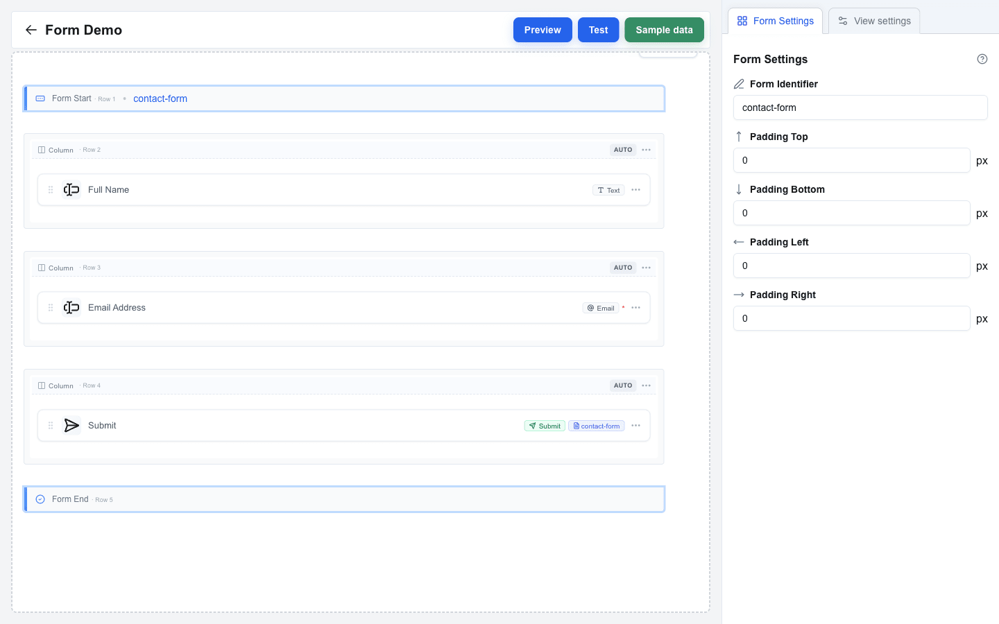
A form in Interface Builder is defined by two marker rows on the canvas -- **Form Start** at the top and **Form End** at the bottom -- with your content rows in between. Every input placed between those markers belongs to the form. A **Submit button** links to the form by its **Form Identifier** and is what users click to send their answers.
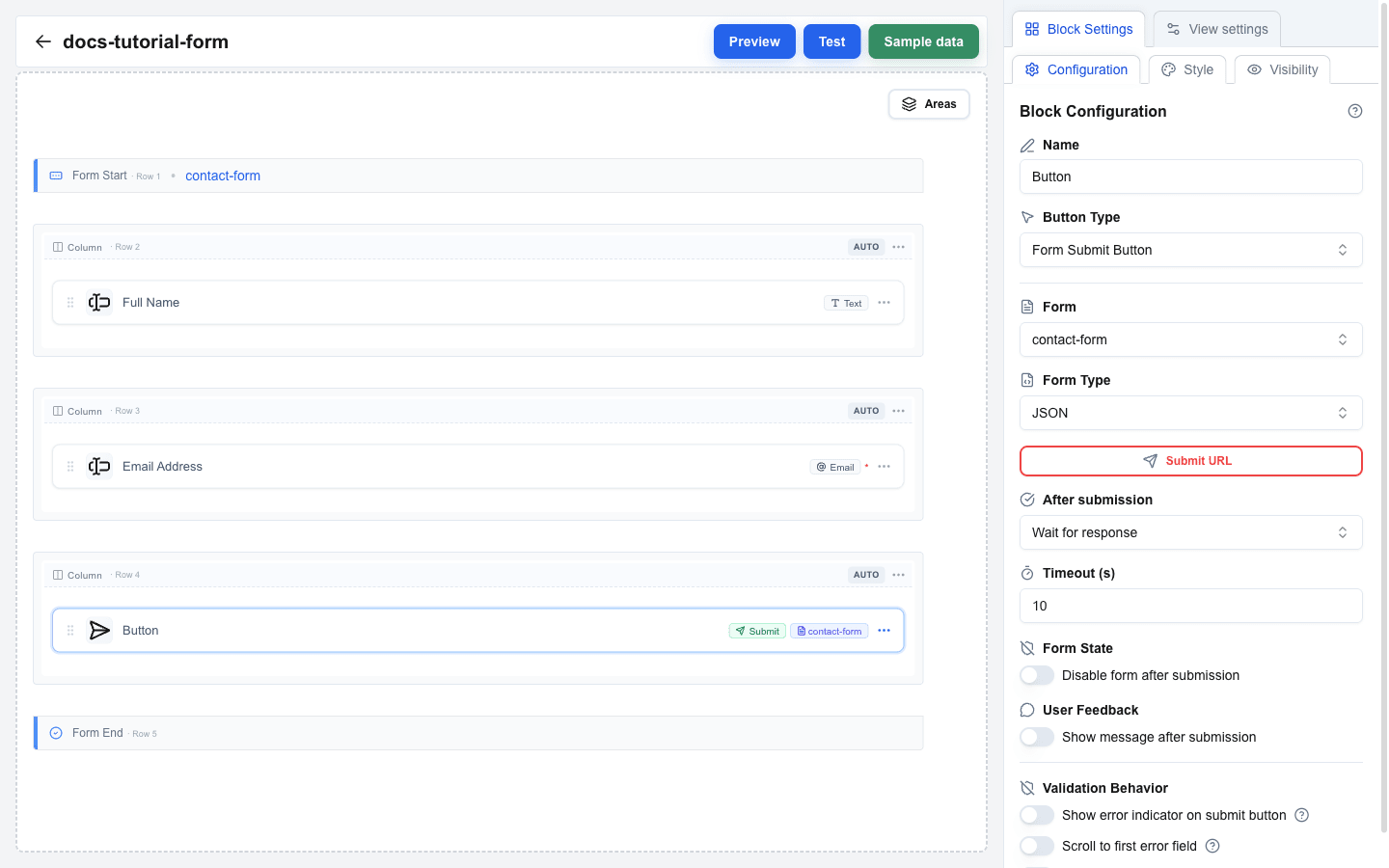
The screenshot below shows the finished tutorial form on the canvas: Form Start carries the `contact-form` identifier badge, and the Submit button shows the same `contact-form` badge — that match is how the button knows which form to send.
 ## Step 1: Add a Form Element
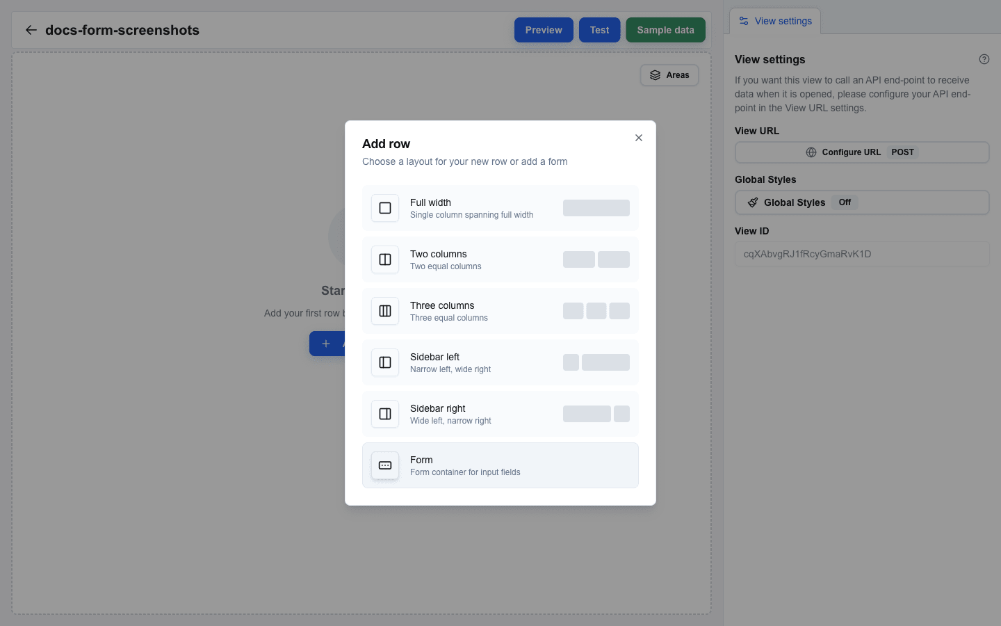
1. Hover the canvas (or the gap between two rows) to reveal a small `+` button.
2. Click `+` to open the **Add row** dialog.
3. Pick **Form** from the layout list.
Two marker rows appear on the canvas: **Form Start** on top and **Form End** at the bottom, with empty space between them.
 ## Step 2: Give the Form an Identifier
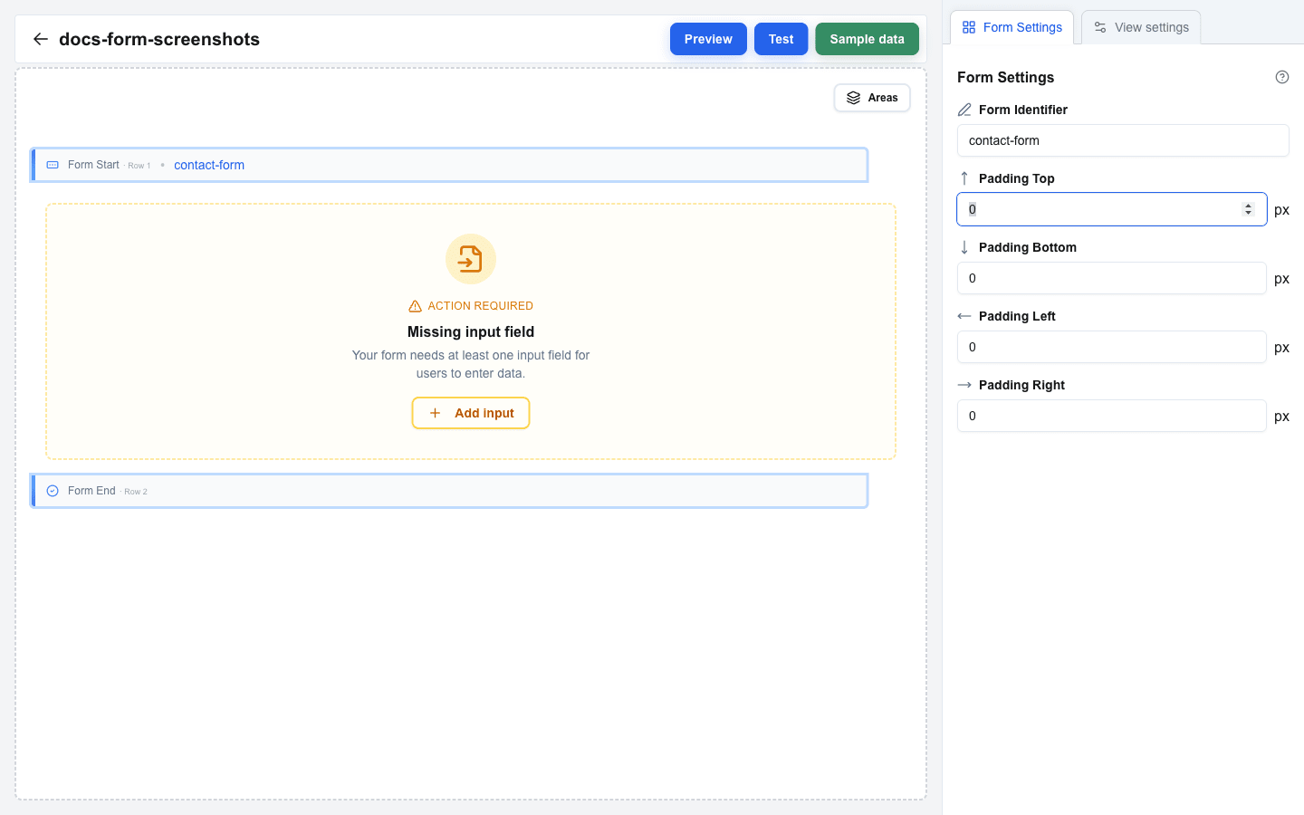
1. Click the **Form Start** row (Form End works too).
2. The sidebar switches to **Form Settings**.
3. In the **Form Identifier** field, enter a descriptive name. For this tutorial, use `contact-form`.
The identifier shows up as a badge on Form Start on the canvas, and it is how the Submit button (added later) will find the correct form.
 ## Step 3: Add a Full-Name Input
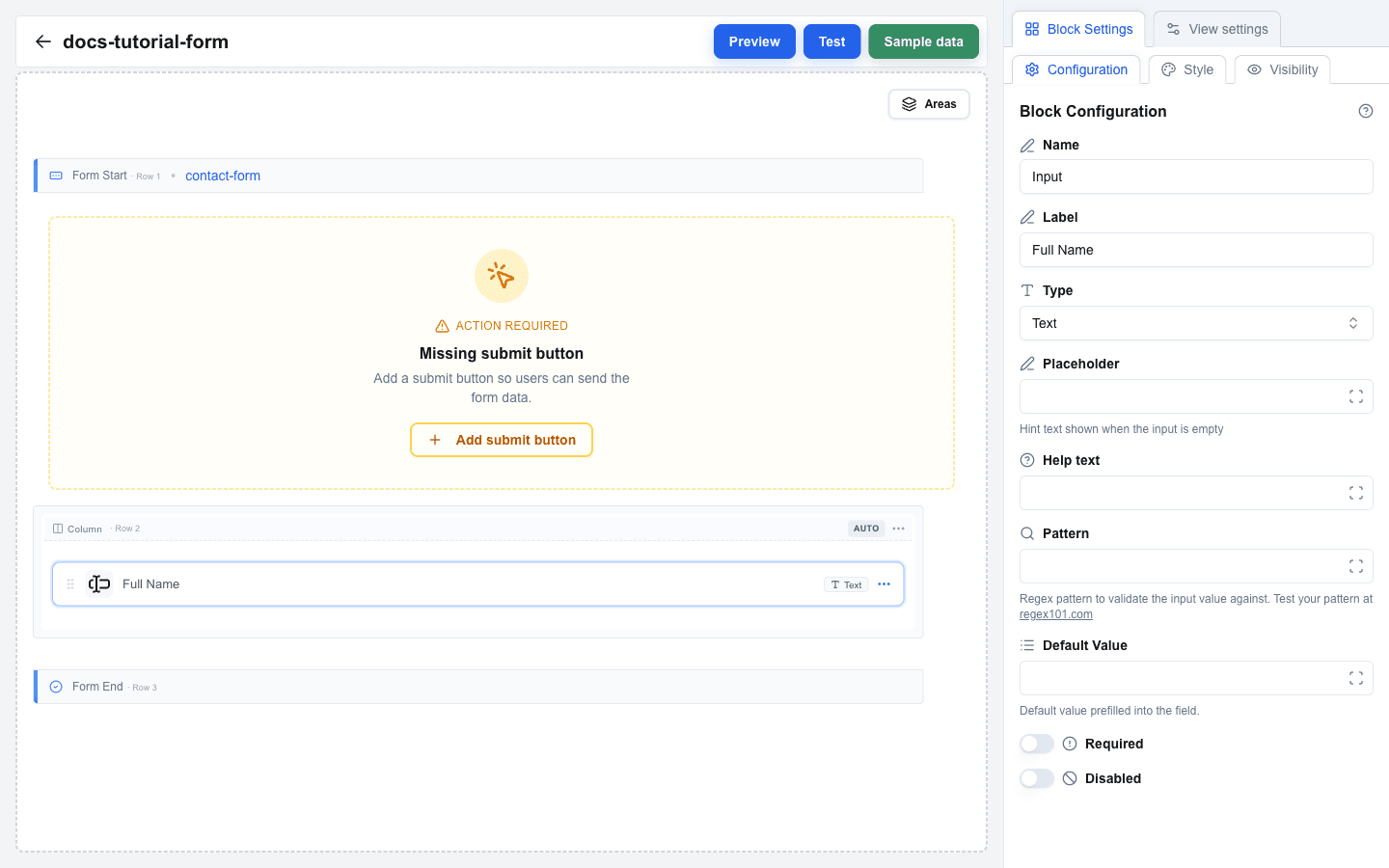
1. Hover the area between Form Start and Form End — a `+` button appears.
2. Click `+`, pick a one-column **Full** layout in the **Add row** dialog.
3. Click the empty column inside that new row to open the **Add block** dialog and pick **Input**.
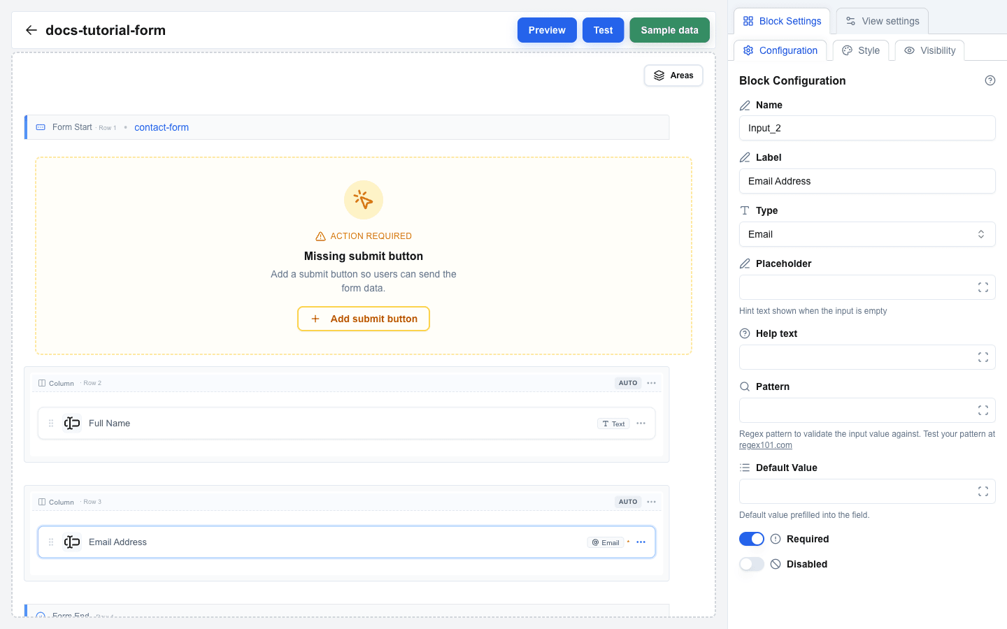
4. Click the new Input block to open its settings. You will see fields for **Label**, **Type**, **Placeholder**, **Help text**, **Default Value**, **Required**, and **Disabled**.
5. Set **Label** to `Full Name`.
6. Leave **Type** as **Text**.
 ## Step 4: Add an Email Input
1. Repeat the same steps to add another row inside the form.
2. Add a second Input block in the new column.
3. Set **Label** to `Email Address`.
4. Change **Type** to **Email**.
5. Turn on the **Required** switch.
 ## Step 5: Add a Selection Input (Optional)
If you want a drop-down or multi-choice field, pick one of these selection types for **Type**: **Single Select**, **Multi Select**, **Checkbox**, or **Radio**. An **Options Type** selector then appears with two choices:
- **Static** -- you define label/value pairs manually. Use the options editor that appears to add each pair.
- **Dynamic** -- options come from data at render time using the Data Picker. Enter Data Picker expressions for **Labels** and **Values**.
## Step 6: Add Pattern Validation (Optional)
For the simple input types (Text, Email, Number, URL, Date) you can add regex validation:
1. In the input settings, scroll to the **Pattern** field and enter a regex (for example, `^[A-Za-z ]+$`).
2. Optionally fill **Pattern Error** with a custom message shown when the pattern fails.
Test your regex at [regex101.com](https://regex101.com/) before pasting it in.
## Step 7: Add a Submit Button
1. Add a new row using the `+` button. It can be inside or outside the form boundaries — both work.
2. Click an empty column in the new row, then pick **Button** in the **Add block** dialog.
3. Click the new Button to open its settings. Set **Button Type** to **Form Submit Button**.
4. A **Form** dropdown appears. Pick `contact-form` from the list.
 ## Step 8: Configure Submission
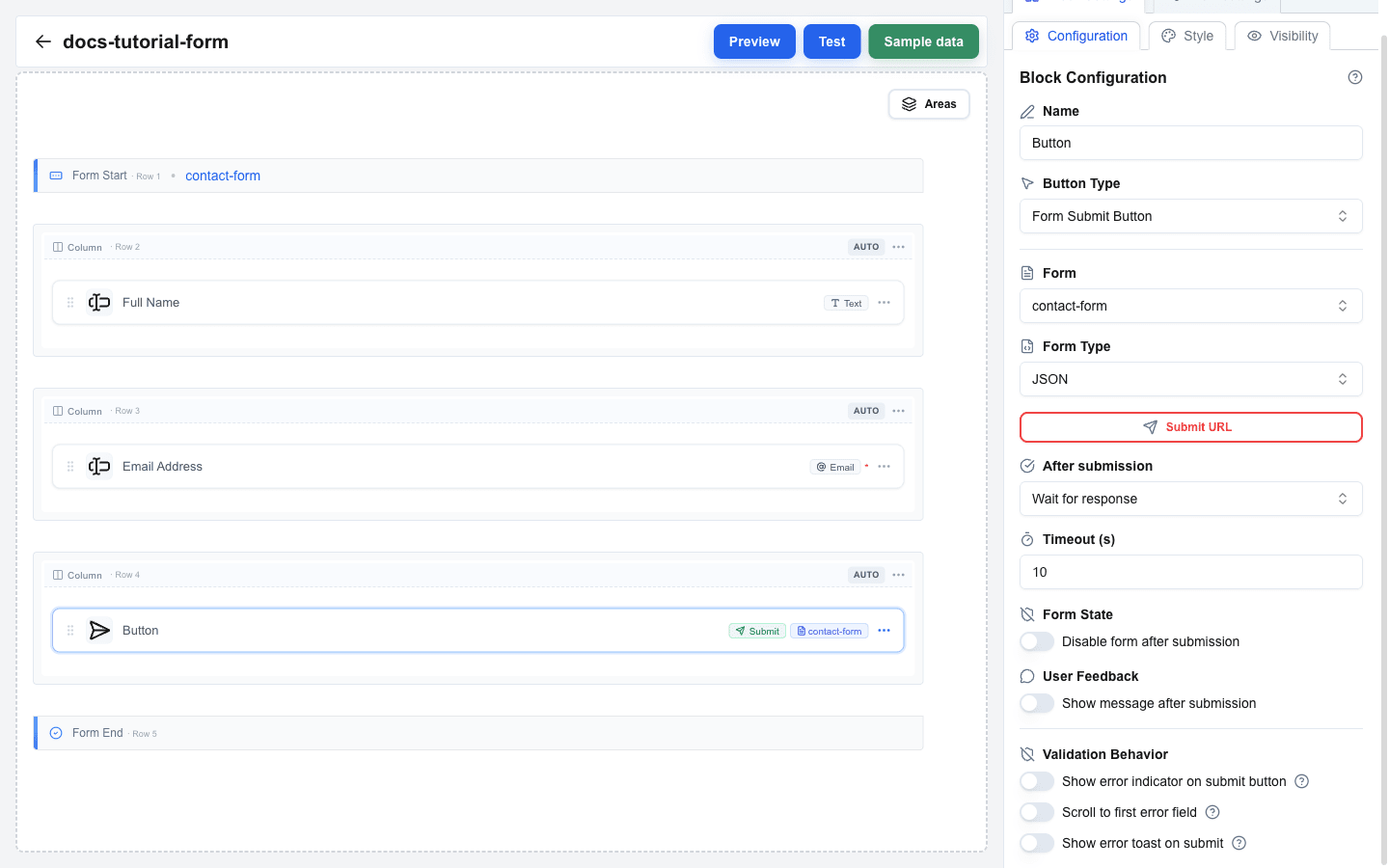
Once Button Type is Form Submit Button, extra settings appear. You will set **Form Type**, **Submit URL**, and an **After submission** behavior.
### Form Type
- **JSON** (default) -- posts form values as a JSON payload to the Submit URL.
- **Multipart/Form-Data** -- use this whenever any input has **Type = File**.
- **Open view with form data** -- instead of posting anywhere, navigates to another view and passes input values as URL search parameters.
### Submit URL
For **JSON** and **Multipart/Form-Data**, enter the endpoint in **Submit URL**. Opening the URL input reveals an advanced dialog where you can also add:
- **Headers** -- custom HTTP headers (key/value pairs; values support the Data Picker).
- **Query parameters** -- additional query string pairs.
### After submission
Pick one of:
- **Wait for response** -- waits up to **Timeout (s)** seconds (10--60) for the server to reply. You can turn on **Disable form after submission** (prevents double-submits) and **Show message after submission** (displays the server's confirmation).
- **Select view** -- immediately navigates to a chosen **View ID** after sending. You can pass static parameters, and optionally forward every input value as search parameters to the target view.
 ## Step 9: Add a Reset Button (Optional)
To let users clear the form:
1. Add another Button block (use the `+` button to add a row, then **Add block** → **Button**).
2. Set **Button Type** to **Form Reset Button**.
3. In the **Form** dropdown, pick `contact-form`.
## Step 10: Test the Form
1. Click **Preview** in the top bar. The form renders with live inputs.
2. Fill in the fields and click the submit button to see the behavior you configured.
3. For an end-to-end test, click **Test** in the top bar -- test mode runs the interface closer to production.
 ## Summary
In this tutorial you learned how to:
- Pick **Form** in the **Add row** dialog and work with the **Form Start** / **Form End** markers on the canvas
- Set a **Form Identifier** to name the form
- Add **Input** blocks with different **Types** (Text, Email, and selection types)
- Configure selection inputs with **Options Type** (Static or Dynamic)
- Add **Pattern** validation with a custom **Pattern Error** message
- Add a **Form Submit Button** and link it to the form
- Configure **Form Type**, **Submit URL**, **Headers**, and **After submission**
- Add a **Form Reset Button** to clear the form
- Test the form in Preview and Test modes