## What are Views?
An interface can contain multiple **views** (pages). Each view is a separate canvas with its own rows and blocks. One view is marked as the **default view** -- it carries a green **Start** badge in the views list and is the view displayed by default when the interface loads.
Users navigate between views using:
- **Action buttons** with the "go to view" action
- **Navbar blocks** with interface-type links
Views are managed from the **Interface Views** page, where every view in the current interface is shown as a card.
## Creating a Second View
1. Go back to the **Interface Views** page by clicking the back arrow in the top bar of the Builder.
2. Click **Create New** to open the **Create new view** dialog.
3. Give it a descriptive name (for example `Order summary`) and click **Create**.
4. Back on the Interface Views list, click the **Edit** button on the new view's card to open it in the Builder.
 ## Building the Second View
1. With the new view open in the Builder, add rows and blocks as needed.
2. For example, add a Title block bound to `{{deal.title}}` and a Paragraph block showing deal details.
3. This view will serve as a detail page that users navigate to from the first view.
## Adding Navigation with an Action Button
On the first view, set up a button that navigates to the second view:
1. Go back to the Interface Views page and open your first view.
2. Add a **Button** block to the canvas.
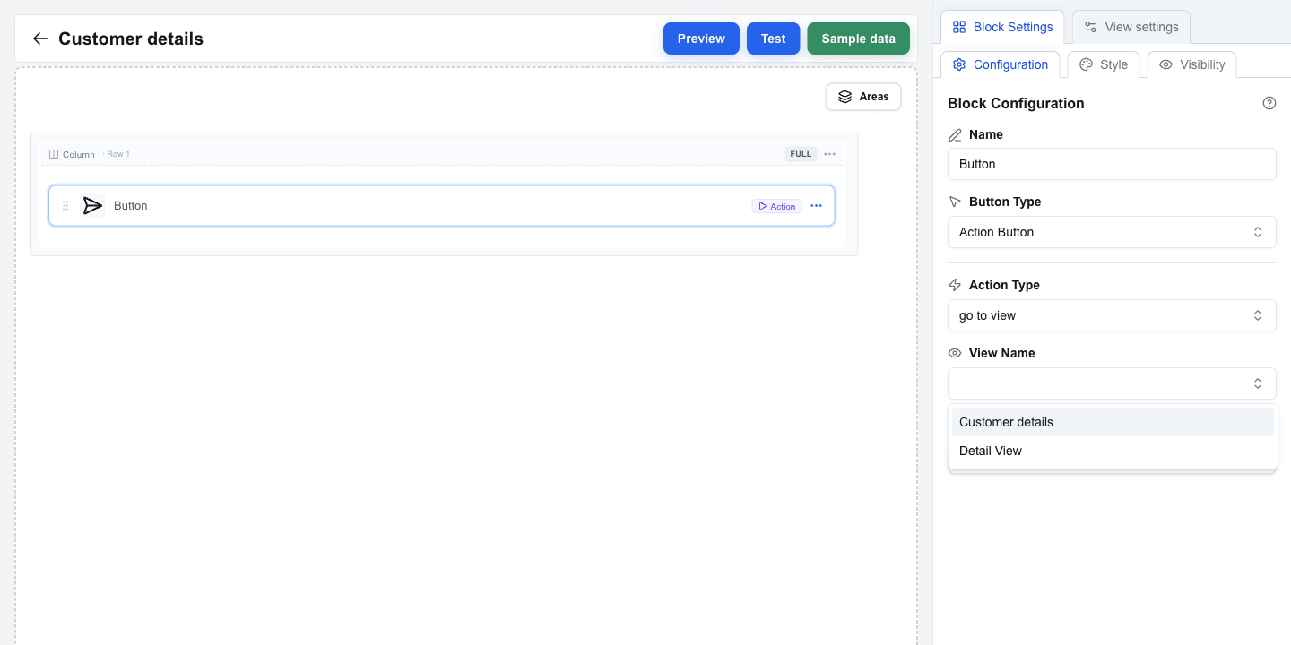
3. In Button settings, set the **Button Type** to `Action Button`.
4. A new **Action Type** dropdown appears with two options:
- **back** -- navigates to the previous view
- **go to view** -- navigates to a specific view
5. Select **go to view**.
6. A **View Name** dropdown appears, listing all views in this interface. Select the second view you just created.
7. The button now navigates users to that view when clicked.
 ## Adding a Back Button
On the second view, add a way to return to the first view:
1. Open the second view in the Builder.
2. Add a **Button** block.
3. Set the **Button Type** to `Action Button`.
4. Set the **Action Type** to **back**.
5. This button returns users to whatever view they came from.
The settings panel looks the same as for "go to view" — just without the **View Name** dropdown.
## Passing Parameters Between Views
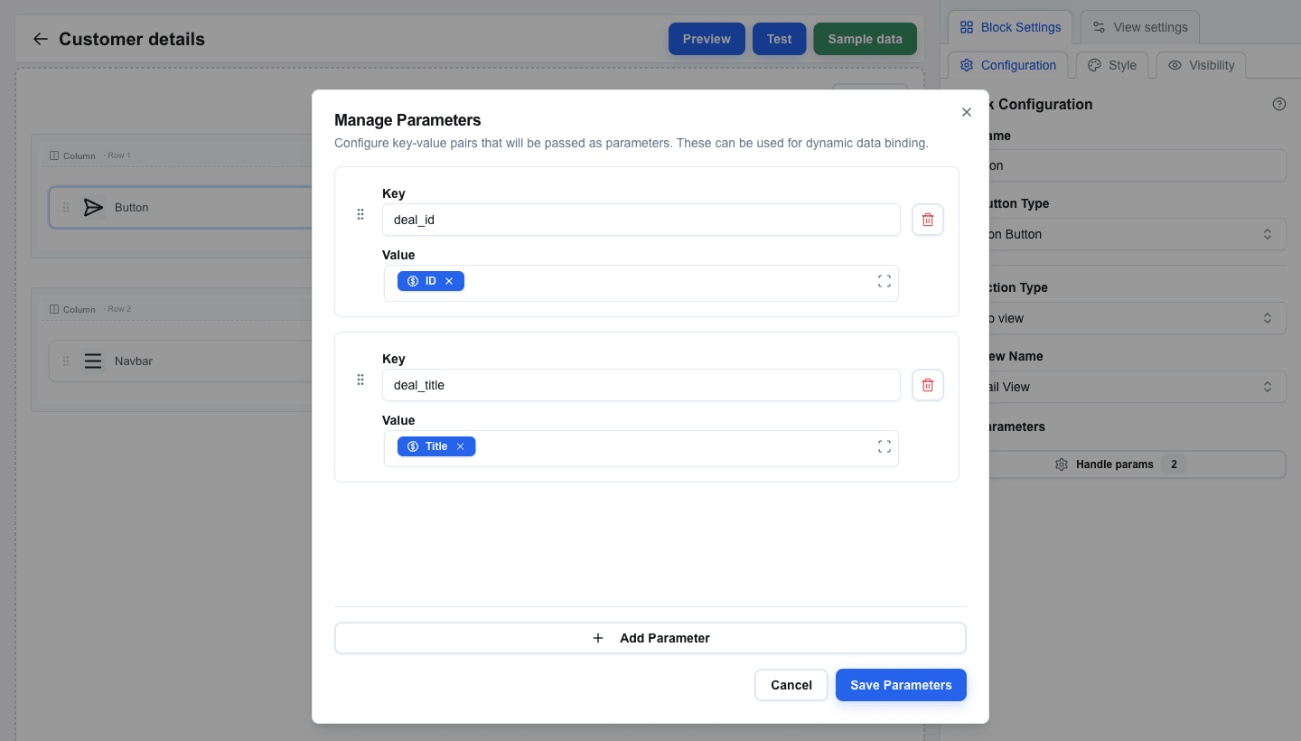
Action buttons can pass data from one view to another using parameters. The receiving view accesses these values via the **Search Params** tab in the Data Picker.
1. On the first view, select your "go to view" Action Button.
2. Below the View Name dropdown, you will see a **Parameters** section.
3. Click to open the parameters dialog.
4. Add key-value pairs. For example:
- Key: `deal_id`, Value: a Data Picker tag pointing to the deal's **ID** field.
- Key: `deal_title`, Value: a Data Picker tag pointing to the deal's **Title** field.
5. Values support Data Picker expressions, so you can pass dynamic data.
On the receiving view:
1. Select a block (for example, a Title block).
2. Open the Data Picker and switch to the **Search Params** tab (the icon-only tab in the picker's top bar).
3. You will see the parameter keys you defined. Selecting one inserts a tag that compiles to `{{searchparams.deal_id}}`.
 ## Using Navbar for Navigation
For persistent navigation across your interface, use a **Navbar** block:
1. Add a **Navbar** block to a row on your view. It typically goes in a full-width row at the top.
2. Click the Navbar block to open its settings. The settings are divided into sections.
### Brand
- Toggle **Show title** to display a text title in the navbar. Configure **Title Text**, **Font Size (px)** (12–48), **Font Weight** (Normal, Medium, Semibold, Bold), and **Title Color**.
- Toggle **Show logo** to display a logo image. Provide the **Image URL**, **Alt Text**, and **Width / Height (px)**.
### Aria Label
Below the Brand section, set the **Aria Label** for the navigation element (defaults to "Navigation menu"). This helps screen readers identify the navigation purpose.
### Layout
- **Layout Direction** — Horizontal or Vertical
- **Alignment** — Left, Center, Right, or Space Between
- **Spacing (px)** — pixel spacing between nav items (0–50)
### Navigation Links
1. Click the **Manage Links** button to open the links dialog.
2. Click **Add** to create a new link. Each link has:
- **Label** — the text displayed in the navbar
- **Link Type** — choose between:
- **Interface** — navigates to another view within this interface. Select the target view from the **Target Interface** dropdown. You can also add **Parameters** (key-value pairs) that are passed to the target view.
- **External URL** — opens an external URL (supports Data Picker expressions)
3. Add links for each view you want in your navigation.
4. Reorder links by dragging the grip handle on each link card.
5. Delete links using the trash icon.

 ## Summary
In this tutorial you learned to:
- Create multiple views from the Interface Views page
- Use Action Buttons with the "go to view" action to navigate between views
- Add "back" buttons for return navigation
- Pass parameters between views using key-value pairs and Data Picker expressions
- Access passed parameters on the receiving view via the Search Params tab
- Set up a Navbar block with interface-type links for persistent navigation
- Configure navbar Brand, Aria Label, Layout, and link settings