Alert Block
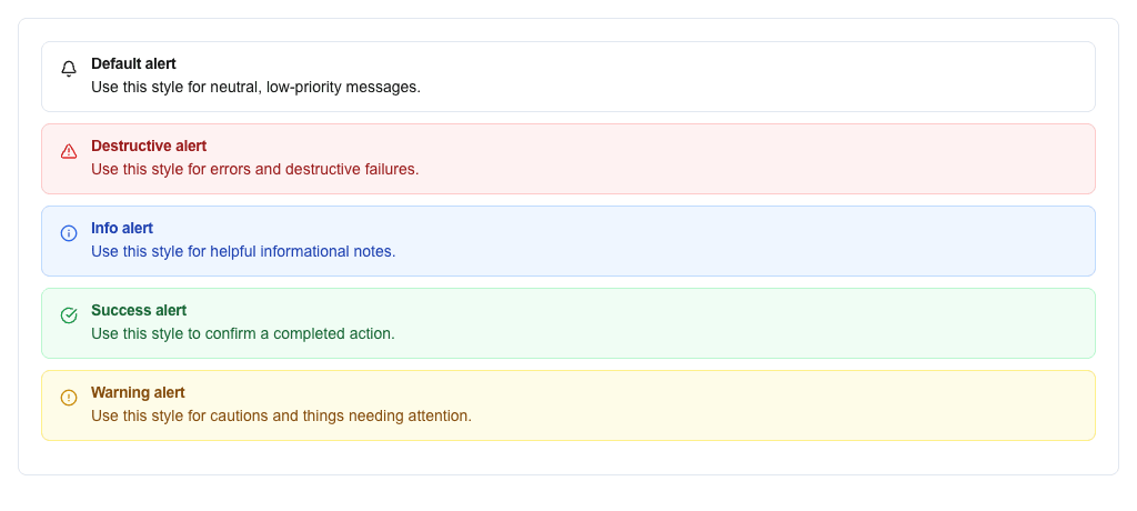
The Alert block shows a colored notification banner with a title and description. Use it to draw attention to messages, warnings, or errors inside a view.
Settings
Section titled “Settings”| Setting | Description |
|---|---|
| Variant | The color and icon style. Pick from Default, Destructive, Info, Success, Warning. In dynamic mode, bind the variant to data instead. |
| Title | The alert’s title text. Supports the Data Picker. |
| Description | The alert’s body text. Supports the Data Picker. |
Variant modes
Section titled “Variant modes”Variant has two modes — switch between them with the mode selector at the top of the Variant section:
- Static — pick a specific variant (Default, Destructive, Info, Success, Warning).
- Dynamic — bind the variant name to data via the Data Picker. The resolved value must match one of the static variant names; anything else falls back to the default style.
Style and Visibility
Section titled “Style and Visibility”The Alert block also has the standard Block Style section (background, text, borders, radius) and Conditional Visibility section available to every block.