Builder View
The builder is where you build a view. You add rows on the canvas, drop blocks into them, and configure whatever is selected from the sidebar on the right. This page names every area of the builder and every menu you can open from it.
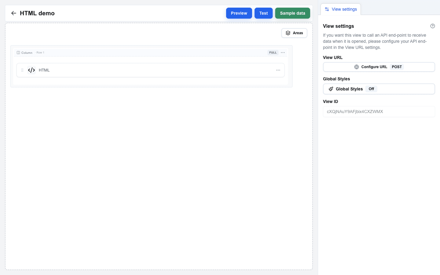
Main Areas
Section titled “Main Areas”| Area | Where it sits | What it does |
|---|---|---|
| Canvas | Centre / left | The working surface where you arrange rows and drop blocks into columns. |
| Sidebar | Right | Shows the settings of whatever you have selected. See Sidebar. |
| Top Bar | Top of the page | View name on the left, action buttons (Preview / Test / Sample data) on the right, and the saving indicator. |
Canvas
Section titled “Canvas”The canvas is the main editing surface. Rows are stacked vertically; inside each row are one or more columns; each column holds at most one block.
Adding things
Section titled “Adding things”- Add a new row – hover the gap between two rows (or the area above the first row); a small
+button appears. Click it to open the Add row dialog and pick a layout (Full width, Two columns, Three columns, Sidebar left, Sidebar right, or Form). - Add a block – click an empty column to open the Add block dialog and pick a block type (Title, Paragraph, Button, Input, Table, etc.).
- Add a column – open a row’s “…” menu and choose Add column, or use Add column left / right from a column-indicator’s “…” menu.
Rearranging
Section titled “Rearranging”- Reorder rows – grab a row and drag it up or down on the canvas.
- Move a block to a different column – drag the block onto another column. The block leaves the original column empty.
Sidebar
Section titled “Sidebar”A panel on the right that always shows View settings plus a context-specific tab whenever you have something selected (Block Settings, Row Settings, Column Settings, Form Settings, or Area Settings). See Sidebar for an overview and Settings Panel for the contents of each tab.
Block Menu
Section titled “Block Menu”Every block has a “…” button that opens its block menu.
| Action | What it does |
|---|---|
| Settings | Opens the block’s settings in the sidebar. |
| Copy block left | Adds a copy of the block in a new column to the left. |
| Copy block right | Adds a copy of the block in a new column to the right. |
| Copy to new row | Adds a copy of the block in a brand-new full-width row below. |
| Delete block | Removes the block (asks you to confirm first). |
Row Dropdown
Section titled “Row Dropdown”Every row has a “…” menu.
| Action | What it does |
|---|---|
| Settings | Opens the row’s settings in the sidebar. |
| Copy row | Duplicates the row inside the current view. |
| Copy to another view | Copies the row into a different view in this interface. |
| Add column | Adds a new column to the row. |
| Delete | Removes the row (asks you to confirm first). |
| Copy (form rows only) | On Form Start / Form End, copies the whole form (start, end, and every row inside). |
| Delete with content (form rows only) | On Form Start / Form End, deletes the form and every row inside it. |
Column Indicator
Section titled “Column Indicator”A bar shown above each column inside a row. It shows:
- A column label such as Col 1, Col 2, or just Column when the row has only one column.
- A width badge with the current column width, like 1/2, 1/3, Full, or 25%.
- A “…” menu with Add column left, Add column right, and Delete column.
Clicking the column label opens Column Settings in the sidebar.
Add Row Dialog
Section titled “Add Row Dialog”Opens when you click the + between rows. Lets you pick the layout for the new row:
- Full width – single full-width column
- Two columns – 50% / 50%
- Three columns – 33% / 33% / 33%
- Sidebar left – 25% / 75%
- Sidebar right – 75% / 25%
- Form – adds a matching Form Start + Form End marker pair (hidden when you are already inside a form)
Add Block Dialog
Section titled “Add Block Dialog”Opens when you click an empty column. Lists every block type you can drop into that column. Input blocks are disabled when the surrounding row is not inside a form.
Top Bar
Section titled “Top Bar”The bar above the canvas. Contains:
- View name on the left, and a back arrow that returns to the Interface Views list.
- Preview – switches to the Preview viewer running against the currently selected Pipedrive resource – or, on a floating window button, against no record at all, because there is none to select. Your view’s external data source URL is not called in Preview; instead, the saved Sample data (if any) is used as the Custom data the view would normally fetch.
- Test – switches to the Test viewer where the view’s API call actually fires so you can debug responses.
- Sample data – opens a dialog where you can paste JSON. The same payload feeds the Data Picker’s Custom tab and is what Preview renders against, so you can iterate on layout and bindings without hitting an external API.
- Saving indicator – a small spinner plus the word Saving… that appears while your latest edit is being saved.