Settings Panel
The settings panel is the sidebar on the right side of the builder. Its contents change based on what you have selected on the canvas – a block, a row, a column, a form boundary, or an area badge. This page lists every tab the sidebar can show and every setting inside.
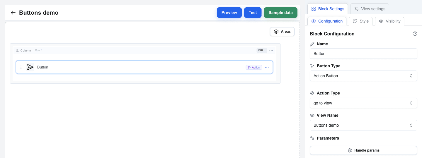
The panel always shows View settings as one tab. A second tab appears when you click something on the canvas:
| Second tab shown | When it appears |
|---|---|
| Block Settings | A block is selected. |
| Row Settings | You clicked a row’s column-header on the canvas, or picked Settings from the row’s “…” menu. |
| Column Settings | You clicked a column-indicator label (the small “Col 1”, “Col 2”, “Full”, etc. label above each column). |
| Form Settings | You selected a Form Start or Form End row. |
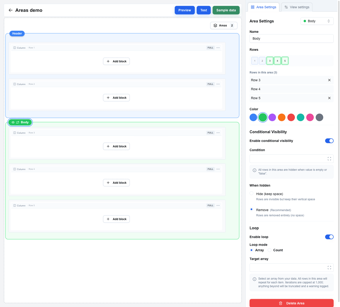
| Area Settings | You clicked an area’s coloured badge (the floating chip with the area name above the area’s first row). |
View settings
Section titled “View settings”Open any time by clicking the View settings tab. Contains view-wide configuration.
View URL
Section titled “View URL”Configure an API endpoint that the view calls when it opens. The response is available inside the view via the Data Picker’s Custom tab.
Click Configure URL to open the URL Configuration dialog and fill in:
| Field | Description |
|---|---|
| End-point URL | The endpoint URL. Supports the Data Picker for dynamic values. |
| HTTP Method | POST or GET (default: GET). |
| URL Active | Toggle the call on or off. When off, no fetch runs on view load. |
| Omit oneclick metadata | When on, Interface Builder skips adding event_id, resource_id, and other OC-specific fields to the request body. Useful for APIs that reject unknown fields. |
| Query Parameters | Key/value pairs appended to the URL. |
| Manage Headers | Opens a sub-section to add custom HTTP headers. Header keys may only contain letters, numbers, and hyphens, and must not start with x-oc-. |
The End-point URL, its query parameters, and its header values all take the Data Picker, including its Context tab — the four System context values that scope a call to this company, this user, and this record, and a View reference to any other view of the same button. On a floating window button that call cannot be scoped to a record: resource_id and resource are not offered.

Global Styles
Section titled “Global Styles”Click Global Styles to open a dialog for view-wide style defaults (background, text, spacing, row gap, column gap). See Global Styles for the full list.
View ID
Section titled “View ID”Read-only display of the view’s identifier. Useful when another view needs to navigate here.
Block Settings
Section titled “Block Settings”Shown when you select a block on the canvas. The Block Settings tab has its own three sub-tabs:
- Configuration – block-specific settings (Button Type, Variant inputs, Data Picker bindings, etc.). The exact fields depend on the block type – each block has its own reference page under Block Types.
- Style – the block’s visual style (background, text, borders, size). For the Button block this is also where Button Variant and Button Size live.
- Visibility – conditional rules to show or hide this block based on data.
Column Settings
Section titled “Column Settings”Shown when you click a column-indicator label above a column.
| Setting | Description |
|---|---|
| Padding Top | Top padding, in pixels. |
| Padding Bottom | Bottom padding, in pixels. |
| Padding Left | Left padding, in pixels. |
| Padding Right | Right padding, in pixels. |
| Width | Pick Auto, % (a percentage of the row’s width), or px (a fixed pixel value). |
| Horizontal Align | Left, Center, or Right. |
| Vertical Align | Top, Middle, or Bottom. |
When the row has multiple columns, an Apply style to all columns button copies this column’s settings onto the others.
Row Settings
Section titled “Row Settings”Shown when you click a row’s column-header on the canvas, or pick Settings from the row’s “…” menu.
| Setting | Description |
|---|---|
| Padding Top / Bottom / Left / Right | Row padding, in pixels. |
| Exclude from global row gap | Only appears when a global Row Gap is set. Excludes this row from the global gap. |
| Exclude from global column gap | Only appears when a global Column Gap is set. Excludes this row’s columns from the global gap. |
Conditional Visibility
Section titled “Conditional Visibility”| Setting | Description |
|---|---|
| Enable conditional visibility (switch) | Turns visibility rules on or off for this row. |
| Condition | A Data Picker expression. The row is hidden when this resolves to empty or "false". |
| Hide (keep space) | The row disappears but keeps its vertical space. |
| Remove (Recommended) | The row is removed entirely. |
Form Settings
Section titled “Form Settings”Shown when you select a Form Start or Form End row on the canvas.
| Setting | Description |
|---|---|
| Form Identifier | A unique name for the form. Submit and Reset buttons use this to target the form. |
| Padding Top / Bottom / Left / Right | Inner padding around the rendered form, in pixels. |
Area Settings
Section titled “Area Settings”Shown when you click an area’s badge. Areas group consecutive rows so they share a visibility rule – and, optionally, a loop.
| Setting | Description |
|---|---|
| Name | Display name for the area, shown on the badge. |
| Rows | The rows the area covers. Edit by toggling row numbers in the visual row selector at the top of the panel, or by clicking the Add Row N (above/below) buttons that appear for adjacent unowned rows. |
| Color | Blue, green, purple, orange, red, teal, pink, or gray – how the area is highlighted in the builder. Builder-only aid. |
Conditional Visibility – the same Condition and Hide / Remove options as on rows.
Loop – repeat the area’s rows per item in an array, or a fixed number of times. See Areas for details.
Delete Area – removes the area and keeps its rows in place.