Block Styles
Every block has a Style sub-tab in Block Settings (next to Configuration and Visibility) that controls how the block looks – background, text, borders, corners. This page lists every control on that sub-tab.
The Badge and Alert blocks use variant-based styling (see their reference pages); their Style sub-tab shows an info card explaining that custom block styles do not apply.
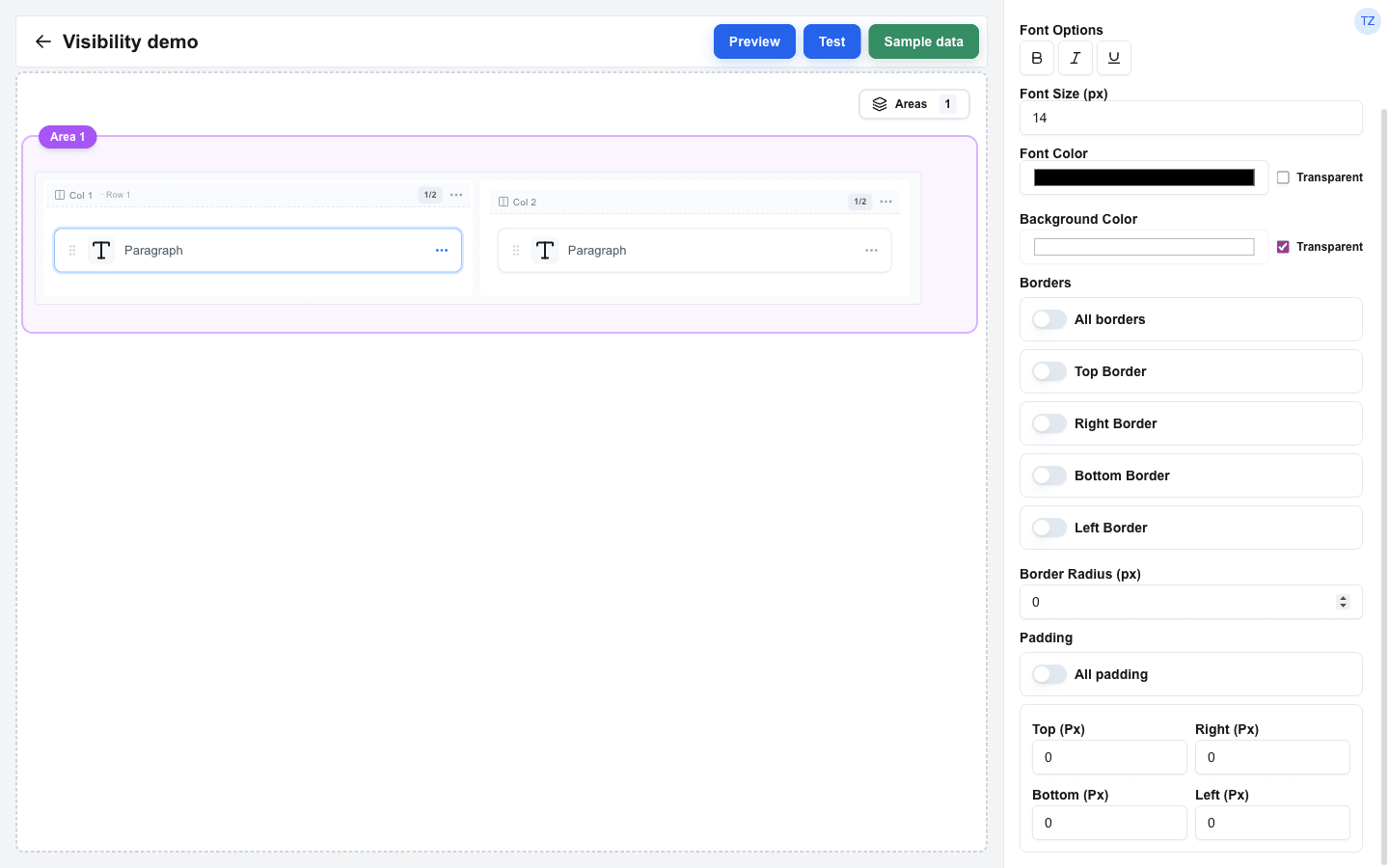
Background and Text
Section titled “Background and Text”| Setting | Description |
|---|---|
| Background Color | Picked through a colour swatch, with a separate Transparent checkbox to clear it. Default: transparent. |
| Font Size (px) | Text size in pixels. Default: 14 px (Title blocks default to 22 px). When a global Font Size is active, the field is disabled and a Use custom style switch appears next to it – toggle it on to override the global value with a per-block size. |
| Font Color | Picked through a colour swatch, with a separate Transparent checkbox. Default: black. The same Use custom style switch appears here when a global Font Color is active. |
| Font Options | A toggle group with Bold, Italic, and Underline. |
The Image, Avatar, and Divider blocks omit the font-related controls (no text to style). The Image block also omits Background Color.
Borders
Section titled “Borders”The border section has up to four sides for normal blocks: Top, Right, Bottom, Left. Each side has its own Top border / Right border / Bottom border / Left border switch. Turning a side on reveals:
| Setting | Description |
|---|---|
| Width (px) | Border thickness in pixels. New blocks default to 1. |
| Style | Line style: Solid, Dashed, or Dotted. |
| Color | Border colour swatch. |
All borders
Section titled “All borders”| Setting | Description |
|---|---|
| All borders | Master switch above the four side switches. When on, the four per-side cards are replaced by a single Width / Style / Color card whose values apply to every side. Per-side configuration is preserved while All borders is on, so flipping it back off restores the previous side values. Hidden for Table blocks (which keep their six-toggle UI). |
Border Radius
Section titled “Border Radius”| Setting | Description |
|---|---|
| Border Radius (px) | Corner radius in pixels. Higher values round the corners more; large values produce circular shapes (useful for Avatar and Image). |
Padding
Section titled “Padding”Block padding sits between the block’s content and its outer edge – visible once a border is drawn. Each side has its own pixel input.
| Setting | Description |
|---|---|
| Top (Px) / Right (Px) / Bottom (Px) / Left (Px) | Per-side padding in pixels. Default 0. |
| All padding | Master switch. When on, the four per-side inputs are replaced by a single Padding (px) input that drives every side. Per-side values are preserved while All padding is on, so flipping it back off restores them. |
Table-specific borders
Section titled “Table-specific borders”The Table block adds two extra border switches inside the Borders section:
- Row border – lines between rows.
- Cell border – lines between cells.
Each uses the same Width / Style / Color controls as a side border.
Table cell padding
Section titled “Table cell padding”Tables also expose a Global Cell Padding switch under Borders. When on, it reveals Top / Right / Bottom / Left pixel inputs that apply to every cell unless overridden by a column-level padding setting.
Button-specific settings
Section titled “Button-specific settings”Button blocks show two extra controls in the Style sub-tab:
- Button Size – Small, Default, or Large.
- Button Variant – Default, Destructive, Outline, Secondary, Ghost, Link, or Custom. The other Style controls (font options, font size, font colour, background, borders) only apply when the variant is Custom; otherwise the variant decides the look. See the Button block reference for what each variant looks like.
Defaults
Section titled “Defaults”A freshly dropped block starts with:
- Background: transparent
- Font Size: 14 px (Title: 22 px)
- Font Color: black
- Bold / Italic / Underline: off
- No borders enabled (each side defaults to 1 px Solid black when toggled on)
- Border Radius: 0
- Padding: 0 px on every side
The Divider block is the exception – it starts with a light gray background colour so the line is visible.
Conditional Visibility
Section titled “Conditional Visibility”Conditional Visibility lives on its own Visibility sub-tab in Block Settings, not under Style. See Conditional Visibility for how it works.